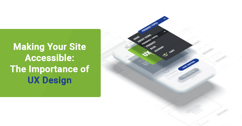
Accessibility is a single, yet crucial, component of User Experience (UX) Design. UX Design accounts for the branding, design, usability, and functionality of a website. Incorporating one of these components involves planning to integrate with the others. Without that, a company’s website will be ineffective at portraying a cohesive, effective, and accessible website.
To develop a website that accounts for all components of UX Design, including accessibility, start by accounting for why users are visiting, what they’re visiting, and how they're visiting your site.
- Why are users visiting refers to the driving motivation that leads them to the site. Whether it’s to answer a Google search query about “what is UX Design” or they have clicked an ad for custom websites, they need to know they can find answers on your site.
- What users are visiting for is in relation to what is keeping them on the website. The primary functionalities of the website and the features that enticed them to enter the site needs to be planned ahead. This ensures they are suitably showcased or easily accessible. This could be finding resource materials, or using software on the website.
- How users are visiting the website refers to the accessibility and portrayal of the information. Portrayal refers to the aesthetic means in which information is laid out and provided. Accessibility refers to how users are capable of accessing the information. Is it through the navigation bar only or are there alternatives? This is where accessibility compliance comes into play.
What Does Accessibility Compliant Look Like?
This depends on where your company is based and where your users are located! Depending on where you’re located in Canada or the USA, legislation mandating accessibility for websites can vary. For this blog, we will be referencing the AODA, also known as the Accessibility for Ontarians with Disabilities Act. In 2019, under the AODA, the Ontario government announced the Web Content Accessibility Guidelines (WCAG) 2.0 that places the new standard set in place for website’s operating within Ontario.
Based on the WCAG 2.0, there are a handful of practices that need to be abided for websites created in or later than 2012. However, it boils down to the following: be accessible for physical, sensory and intellectual disabilities.
Now, there are a few exceptions for the accessibility being required. For example, tools or softwares that aren’t commercially available for accessibility elements do not need to be altered. Otherwise, use the following techniques to incorporate accessibility guidelines that maintain your website’s representation!
How To Implement Accessibility With UX Designs
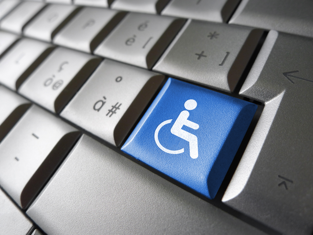
Accessibility For Those With Physical Disabilities
Individuals with physical disabilities make up a significant part of the Ontario population. Accommodating to this audience is essential for not only accessibility, but inclusivity. Online shopping or browsing is one of the most convenient ways for physically impaired individuals to explore new things.
One major yet simple way to make your website accessible for these users is by including keyboard navigation. A website can be programmed to allow for users to alternate between mouse-navigation and keyboard-navigation. This allows users to do simple actions with a click of the keyboard. This can be as practical as scrolling through the website with the arrow keys. Or, it can be as complex as hitting CTRL + C to select the contact us button from anywhere on the page. Either way, it enables users with physical disabilities to navigate the website with ease!
Accessibility For Those With Sensory Disabilities
- Visually Impaired Users
- Visual disabilities affect approximately 217 million people with moderate to severe impairment, according to the World Health Organization. Implementing accessibility guidelines enables these users to gain value from your website while still maintaining your appearance. Now, how can this be done?
First, ensure there is contrast of colours on your website. For example, don’t use a grey don’t on top of a white background. Not only will this be difficult to read for visually impaired users, but also, this will hurt your SEO as it has low readability for all users!
Second, ensure that colour coding is just one of multiple methods used to emphasize data or distinguish sections. For example, if you have an illustrated chart, ensure that you have it clearly labelled in a way that doesn’t rely on the colour distinction. This can be viewed in the chart shown below. It uses colour coding, but it also utilizes category labels and numbers to represent the data.
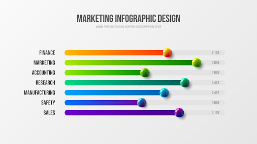
Finally, and most importantly, please ensure that you are utilizing effective alternative text across your website! All images and non-text content (ex. charts) should use this. Alternative text is a description that is noted in the backend of the image/content that is read to visually impaired users when scrolling through a website. This description should effectively explain to the user what is being shown to them and why it is shown to them. For example, if we added alternative text to the above chart, it would say something along these lines: This chart shows marketing has the most employees (3,089) and safety (1, 686) has the least employees, which demonstrates the importance of marketing.
- Hearing Impaired Users
- When accommodating hearing impaired users, it becomes significantly more important for images to be incorporated. However, it also becomes more crucial that videos are made accessible before adding them to the website. All videos used on your website should have a closed caption option. This ensures that additional information or value propositions are not being overlooked due to inaccessibility.
Accessibility For Those With Intellectual Disabilities
Meeting requirements for users with intellectual disabilities incorporates standard best practices for websites. The first simple improvement that can be made for accessibility and UX Design is utilizing high imagery to portray information. This can be in graphs, images, videos, or other creative ways. This method looks great, speaks to all audiences, and meets the requirements for WCAG 2.0. The second simple improvement is keeping everything consistent! This is basic best practice for websites but also supports intellectually disabled users. For example, instead of using 3 different terms for “Contact Us” or having 2 different button types, use the same wording and design across the website. This keeps things recognizable and reduces the risk of confusion.
Make Your Next Website Accessible
Thankfully, businesses with websites created before 2012 do not have to comply with the WCAG 2.0 requirements. Neither do businesses with less than 50 employees. However, improving accessibility is an effective means of reducing bounce rates and ensuring businesses are capitalizing on their potential audience. Contact TechWyse today to learn more about how to make your website compliant with the Web Content Accessibility Guidelines 2.0!


on
Hello,This is really too useful and have more ideas from yours. keep sharing many techniques. eagerly waiting for your new blog and useful information……nice…….