

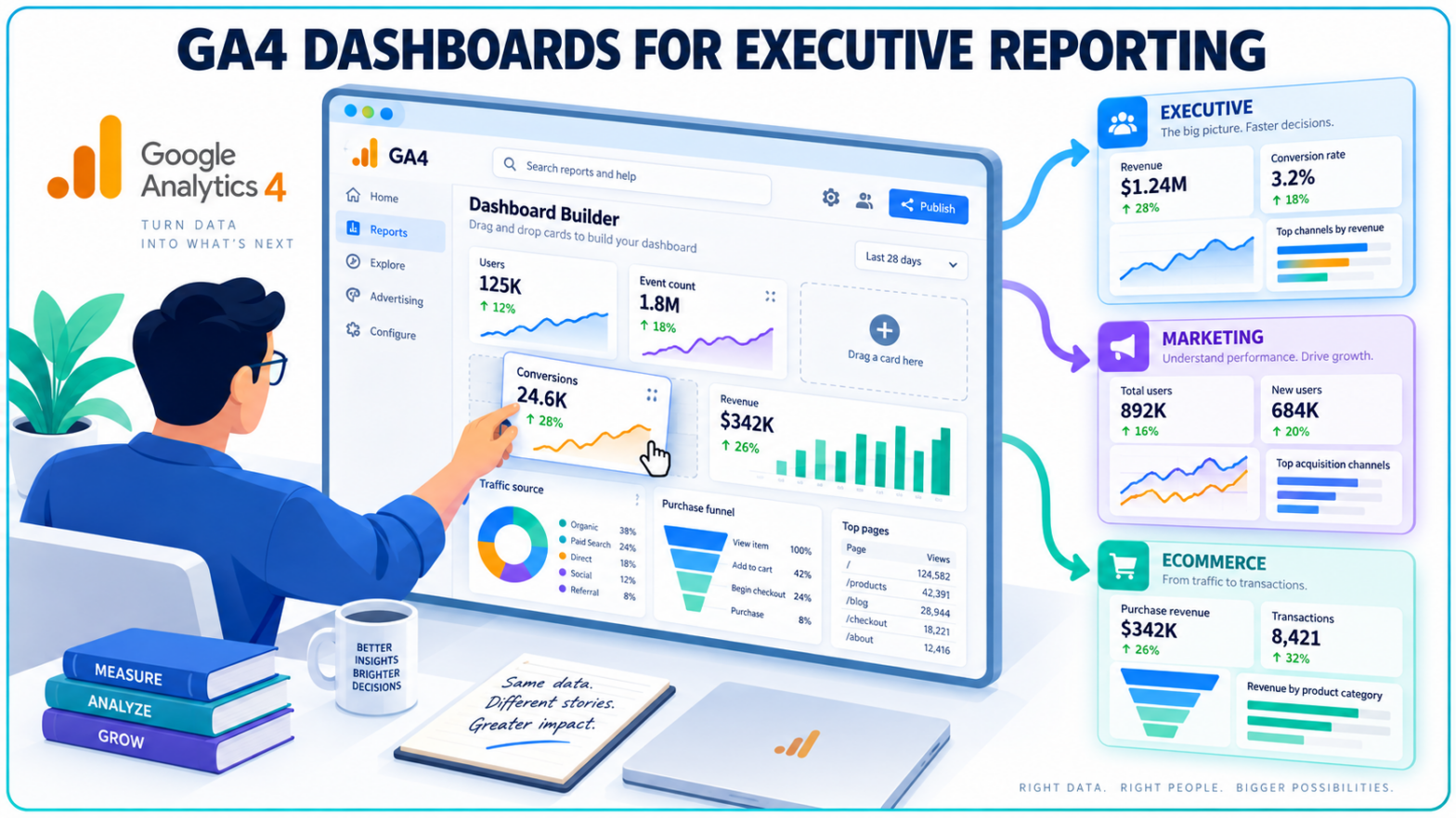
An executive does not need the same Analytics screen as a paid media manager.
Google Analytics is finally making that distinction easier to build around. New customizable dashboards let businesses assemble selected KPIs, charts and conversion data into a single reporting surface inside GA4, reducing the need to send every stakeholder through the same collection of standard reports.
Google confirmed the dashboard launch on September 9 in its Google Analytics release notes, describing the feature as a flexible way for businesses to view key performance indicators in one report. The release introduces a grid-based canvas, drag-and-drop report building and several visualization formats directly inside Analytics.
For teams that spend time turning GA4 data into recurring management reports, the bigger change is not another chart type.
It is control over what people see first.
GA4 Can Now Be Built Around the Questions a Stakeholder Actually Asks
Standard analytics interfaces have an unavoidable problem: they expose far more information than most people need at once.
A marketing director might care about acquisition, conversions and revenue. An ecommerce manager may need product and funnel performance. Senior leadership may want a much narrower view of revenue, leads, conversion rates and changes against the previous period.
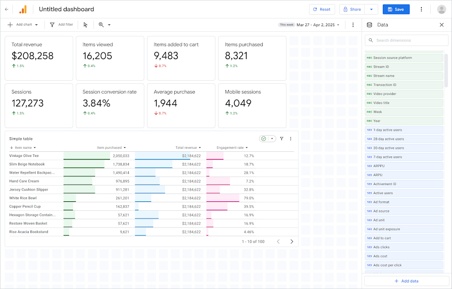
Google's new custom dashboard documentation confirms that teams can consolidate cross-functional metrics on one page rather than moving between separate reports. Cards can be positioned on a grid, resized and aligned, while dimensions and metrics can be dragged directly into individual charts.
That gives GA4 reporting a more deliberate presentation layer. TechWyse previously covered Google's expansion of GA4 reporting through the Analytics Data API, which gave developers programmatic access to cross-channel conversion data. Dashboards address a different reporting problem: how people consume the information once it is inside Analytics.
The distinction matters for organizations where executives, analysts and channel specialists may all use the same property but require very different levels of detail.
Six Visualization Types Cover Most Routine KPI Reporting
Google is launching dashboards with six visualization formats.
Scorecards are designed for headline KPIs and can show percentage changes when date comparisons are applied. Tables provide more granular reporting with pagination and shaded bars. Line charts display performance trends at daily, weekly or monthly intervals.
Bar charts handle comparisons between dimensions, donut charts show proportional breakdowns, and funnel charts can track conversion steps and drop-off points. Google's dashboard feature documentation outlines all six formats.
That combination makes the dashboard useful for more than top-line executive reporting.
A performance team could place traffic, conversion and revenue trends together. A lead-generation business could prioritize sessions, qualified conversion events and funnel progression. An ecommerce team could build a narrower commercial view around revenue and conversion behaviour.
Google does not automatically decide which KPIs belong together. The dashboard is a presentation layer for data already available in the property.
That puts the reporting model back on the team building it.
The launch also fits into Google's broader expansion of marketing analytics inside GA4. Earlier this year, Google described a wider direction for Analytics that places more emphasis on cross-channel measurement and business decision support. TechWyse examined that strategy when GA4 began moving toward a broader business decisioning role.
Publishing Is Shared, Not Role-Based
There is an important limitation for businesses considering separate dashboards for executives, channel managers or other stakeholder groups.
Dashboard design can be tailored by audience.
Dashboard access cannot.
Under Google's dashboard roles and permissions, users need Editor or Administrator access to create and publish a dashboard. Once it is published, anyone with access to that Analytics property can view it through the Reports navigation.
So an organization can create an executive-focused reporting view, but it cannot currently publish that dashboard only to executives while hiding it from other property users.
That makes governance part of the setup.
Teams with several reporting audiences will need clear dashboard names and a sensible publishing structure so that a simplified management view does not become another crowded reporting menu.
The consideration becomes more important as Google brings additional data sources into Analytics. In June, GA4 added direct Google Business Profile connections, allowing Search and Maps engagement metrics to appear alongside website and app reporting. TechWyse covered the Google Business Profile integration with GA4, including its reporting limits for multi-location organizations.
Custom dashboards give teams more control over presentation. They do not change who has access to the underlying property.
The New Dashboard Still Stops Short of a Full BI Layer
The flexibility has clear boundaries at launch.
According to Google's current dashboard limitations, standard properties can include up to 15 cards on each dashboard, while premium properties support up to 30. API support, segments and card-level comparisons are not currently available.
Those omissions draw a line between GA4's native dashboard and more complex reporting environments.
A team that needs heavily segmented analysis, blended data from multiple business systems, tightly controlled stakeholder access or programmatic access to the dashboard itself may still need an external business intelligence or reporting layer.
The dashboard solves a narrower problem: turning existing Analytics data into a faster, easier-to-read operational view.
It also does not replace Explorations. Google's GA4 Explorations remain the deeper analysis environment for work involving techniques such as free-form exploration, funnels, segments and more detailed investigation.
One surface is built for digging into the data.
The other is increasingly built for checking it.
Routine Reporting Can Move Closer to the Source Data
For marketers, the practical change is straightforward. Recurring KPI views that previously required users to navigate several reports, or manually assemble a simplified snapshot elsewhere, can now be maintained directly inside the Analytics property.
Teams should still decide which metrics belong in each dashboard before treating the feature as an executive reporting solution. A dashboard built for senior leadership should answer a smaller set of business questions than one built for an acquisition team. Putting every available metric on the screen defeats the purpose of having a customizable view.
The launch also arrives as Google develops more automated reporting tools across its advertising and analytics products. TechWyse recently reported on Google's AI-powered Ads and Analytics reporting tools, including generated insights, benchmarking and prompt-driven reporting capabilities.
For now, the new Google Analytics dashboards remain fundamentally user-built. Editors and administrators select the visualizations, dimensions and metrics, arrange them on the canvas and publish the finished view.
There is no new attribution model behind the dashboard and no new measurement methodology.
The data has not changed.
The screen decision-makers use to read it has.