Website design and development is a challenging task. Some people consider “super cool” design in sync with latest trends as a winning option. On the other hand, some users believe web design should be minimalistic, devoid of all clutter, and boil down to usability.
Very often, designers get carried away in the flow of creativity and produce websites that lacks usability. However, website design is a highly subjective matter and often a debatable topic.
So, which approach works for you? How do you figure out what’s right and what’s not?
In this post, I will be discussing deadly mistakes that designers make on your site. The good news is that you don’t need to be a rocket scientist to avoid these mistakes. Pay close attention and try to spot out any mistakes on your website. This way, you make makes changes to your website to ensure it is optimized for customers and conversions.
Also on TechWyse
How to Avoid Website Mistakes that Scare Visitors Away
3 Mistakes That Can Sink An E-Commerce Site
Challenging a Set Pattern
Don’t challenge a well-established design principle just for the sake of creativity or gimmick. Remember, users don’t have the time to decipher or search for information from layers of navigation. They are used to certain patterns in a website and don’t always like being surprised.
For instance, they’re used to finding logos in the top left of a page, an About page to learn more about your business, and a Contact page if they want to drop a quick email or call. Think twice before you deviate from the set pattern. Don’t experiment without applying any strategic thought, especially when it can risk alienating your customers.
Content is an Afterthought
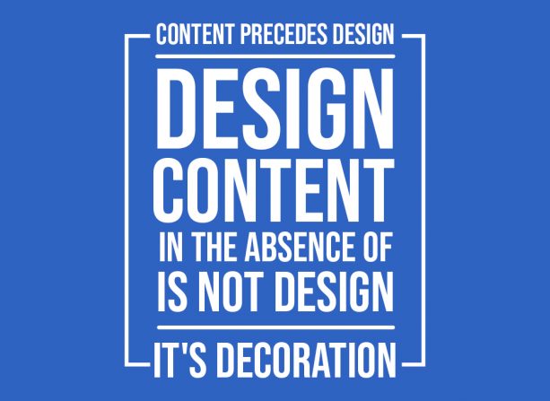
Content is king. Think content from the word go and don’t make it an afterthought. It will determine the success of your site, increase traffic, and conversions. Ensure that the content on your site is unique and informative. Remember to write for users and not for search engine or crawlers. You want to provide valuable and resourceful information for your visitors because this way, you can rank higher in search results.
When you provide users what they want they will stay engaged for more time and your site will improve its conversion ratio. Update your content at regular time interval. Stay away from the temptation of stuffing keywords. This approach is a fad and simply doesn’t work anymore. Also, make sure your blog design is simple and legible to ensure readability and easy navigation.
Just Trying to Create a Wow Experience, Not a User Experience
Many entrepreneurs and designers fail to create user experience and instead, they focus too much on aesthetics. Website design isn’t just about creating a visually stunning experience. In fact, it’s about improving the bottom-line results and conversions. Therefore, focus on spectacular user experience. It is important that users are able to find information they are looking for at minimal clicks.
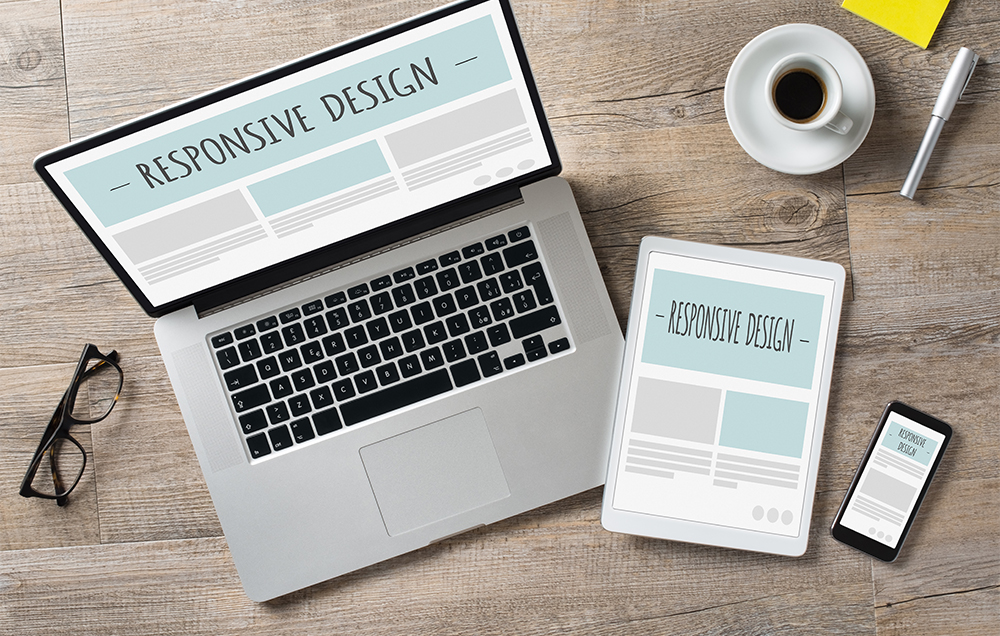
If users can’t figure out how to navigate your website efficiently, they’ll simply move on to your competitor’s website! It’s very frustrating to be forced to browse between pages to get to other areas of a site. You want your website to be convenient and user-friendly. Don’t waste your user’s time! The navigation bar should always be visible irrespective of screen resolution. In addition, your website should have very clear call-to-action button that aren’t intrusive. You want them to be simple and easily accessible for your visitors.
Overuse of Colors and Fonts
Too many colors and styles can confuse users. Your website should display stability and maturity of your organization, rather than a colorful clutter. Some designers tend to defy norms when creating websites by using different design elements for each and every web page. This could be both confusing and annoying to users. Don’t use website design to display your designing prowess at the cost of user experience. Webpages should reflect consistency and guide users.
Ignoring Mathematics
"Without mathematics there is no art," Luca Pacioli.
Line height for text is probably the most ignored aspect of web designing. A lot of web designers and developers randomly pick a font, a size, and select a line height. Unfortunately, its approach will make your font appear busy and crowded. While thinking about line height calculator, think the Golden ratio. Without getting too much into the technical details, this proportion is considered to be aesthetically pleasing.
Chris Pearson’s Golden Ratio Typography Calculator figures out line heights in a matter of minutes.
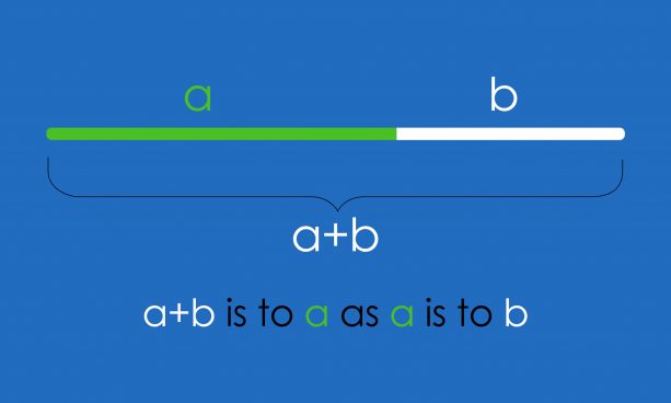
Golden ratio could be the reason behind why certain designs and font combinations are pleasing compared to others. So, get it right!
Finally - Design for Your Goals
Ultimately, the purpose of your website is to develop a strong brand and trigger responses from your target users. Stay focused on user needs and what is important for them. Remember, simplicity is the ultimate form of sophistication, so rise above all the clutter and make website navigation a breeze.
When you keep nothing but the end users in mind, your design will be consistent with what you want to achieve.




on
Thanks for your sharing
on
Thanks for posting this information, it is very helpful for all of us. Keep update with your blog.
on
It was a very good post indeed. I thoroughly enjoyed reading it in my free time. Will surely come and visit this blog more often. Thanks for sharing.
on
Hello Brian! At long last found an article that merits searching for! It is basically a gold mine! I happen to attempt a couple of apparatuses and saw them as extraordinary! Much appreciated once more.
on
Awesome Article, A lot of thanks for shairng the Mistakes of Website Design
on
Awesome blog thank you for sharing valuable information.
on
Wow! This is the perfect blog I am looking this type of blog its awesome blog here, share great information about this topic. This informative blog helps many readers with their decision-making regarding the situation.
on
Hello, I have read your article, It’s very informative and useful information because many web designers make mistakes. Thanks for the share this important information.
on
I completely agree with the points you have described but apart from providing an astonishing overall Interface experience but a well-optimized website also have to satisfy user intent too…else you absolutely nailed the topic.
on
Thanks for sharing this informative blog. keep posting
on
This is exactly what i was searching for thank you so much for this great article. The explanation is easy to understand and really helped me a lot. Once again thank you and keep up the good work 🙂
on
Great article !! As I am a web developer myself, I always look for such wonderful posts to build up my knowledge in the field.
Thank for sharing. Keep up the good work
on
Yes, your this blog is very helpful for a web developer, website design mistake is the effect on the client and may be engagement
on
Your blog is very nice.
Wish to see much more like this. Thanks for sharing your information!
on
Nice
on
yes, i am agree with you , without well develop website can not make sufficent conversion , you have shared useful things that we should keep in mind while design website.
on
Thanks for this post! As I am beginner , its provides me right information about to choose proper website design company.It gives me proper way to find one perfect among them.
on
Yes, i am agree with you, we should try to avoid these mistake for a better website creation, thanks for sharing this useful information with us.
on
Great article, exactly what I was looking for.
Thanks for sharing the infrmation!
on
Superb ! Your blog is incredible. I am delighted with it. About WordPress Web Design and Development.
on
Yes, if website have basic development mistake that really impacted on your business. And most of the customer return just because of it. Thanks for this great information.
on
Really helpful tips for website design & development. Thanks for sharing and keep sharing these kinds of informative post.
on
I think you covered most important points for the web design and these should follow by every web designer to avoid mistake and make their work really impressive. Thank you so much for such a wonderful stuff.
on
Great Tips Ian. Nowadays, many of the designers concentrate on high-level design but they failed to meet the basic standards of the website. My point is instead of focusing on a high level, make the website more simple and easy navigate menus and breadcrumbs will really increase the user satisfaction.
on
Yeah, You absolutely correct there. These kinda of mistakes must be avoided for healthy client communications and developing.
on
Nice article, agree with all the topics.
on
Great post. I like it. It will really help people to know more about web designing. Thanks for sharing it.
on
Nice article.
I was also on a team developing a website and only thing we had proper in our website was the content and everything else was out of order. But after reading this article we studied all the points you mentioned and finally now it is on the way of getting better. Especially the user experience thing. This article helped a lot.
on
if codes are not properly arranged and not in systematic manner then it could certainly cost a customera more as it have to spend a lot of time in getting website ready for changing technological trends
on
Amazing read. Great help for beginners who want to pursue a career in web designing. No matter how modern your design is, it’s not worthy if it doesn’t offer amazing user experience. Quality content is, of course, a must for your website. Too many colors don’t give websites a professional look n feel. Typography and appealing web fonts make web designs more appealing.
on
Hello,
Well, Quite a decent article.
I have made many mistakes, when I just started my career. I was not aware of the fact that, i need a responsive website, so for a long period of time, I was running website just for the desktop users.
Also, the navigation was not easy, but with time, I have improved my websites layout and design a lot.
But still many are making similar mistakes, so this would help many of them resolve issues with their website design.
Keep up the good work.
on
I agree with your words do not change the standard of web design not visitors all the time like to be surprised so be simple and creatively use of content makes your website different from other and also help to drive more visitors.