Nobody’s happy when their website feels like a party where no one’s dancing.
But it happens. We’ve all been there, staring at our screens, wondering why visitors aren’t clicking, buying, or engaging.
Your website’s UX (and its design in general) is the usual culprit here. Almost all of your visitors pay attention to it and decide whether to continue or leave. That’s the only indicator you need to know to realize that you need to spruce things up.
We’re here to help you on that mission. First, we’ll get to the bottom of eight common UX mistakes that might be turning your website into a digital ghost town.
In the meantime, we’ll arm you with the know-how to turn things around. And then, we’ll even give you genuine examples of how it’s done right. Let’s get cracking!
1. Clutter Detracts from On-Screen Messages
The Mistake
Imagine walking into a room so cluttered you can’t find the sofa. The urge to get out would be too strong to ignore.
That’s your website when it’s jam-packed with too much stuff. Cluttered designs overwhelm visitors, making it hard for them to focus on what matters.
This visual chaos confuses users, diluting your key messages and hurting conversions. If they can’t find what they’re looking for quickly, you bet they’ll leave.
The Fix
Less is more. Embrace the art of negative space (that’s the empty space around and between elements).
It’s not just blank space but a powerful design tool. Use it to spotlight your key messages.
Keep layouts clean and content-focused. Ensure that every element serves a purpose and contributes to your conversion goals.
Real-World Example
Take a leaf from Going, a premium platform offering airfare deals. Their Cheap Flights page is a masterclass in using negative space.
Instead of bombarding visitors with information, they let each message breathe. The result is instantly evident: Each offer stands out, making it easier for users to spot killer deals.
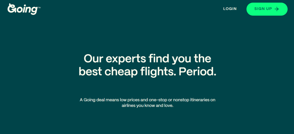
Source: going.com
This focused approach helps visitors make decisions faster, boosting conversions. Like Going, make your website a clean, fresh space where elements stand out from one another. It’ll be like finding a flight deal for your conversion rates.
2. Inconsistent Product Imagery
The Mistake
You know how pointless it is to compare apples to oranges. That’s what it’s like for users when your product images are all over the place.
Inconsistent imagery on your product category pages confuses visitors. If you’re doing this on your web pages, you’re making them solve puzzles with mismatched pieces.
That sort of inconsistency makes it tough for customers to compare products, leading to frustration and lost sales.
The Fix
Consistency is key. Ensure all product images follow a uniform style, lighting, and background.
This approach makes it easier for customers to compare and contrast products at a glance.
Remember, the goal is to make the shopping experience as smooth as silk. Consistent imagery looks professional and guides customers effortlessly toward making a purchase.
Real-World Example
Mannequin Mall, a fashion mannequin retailer, nails this concept. Check out their Display Mannequins category page.
Each product is showcased in the same style and light, highlighting differences and details crisply.
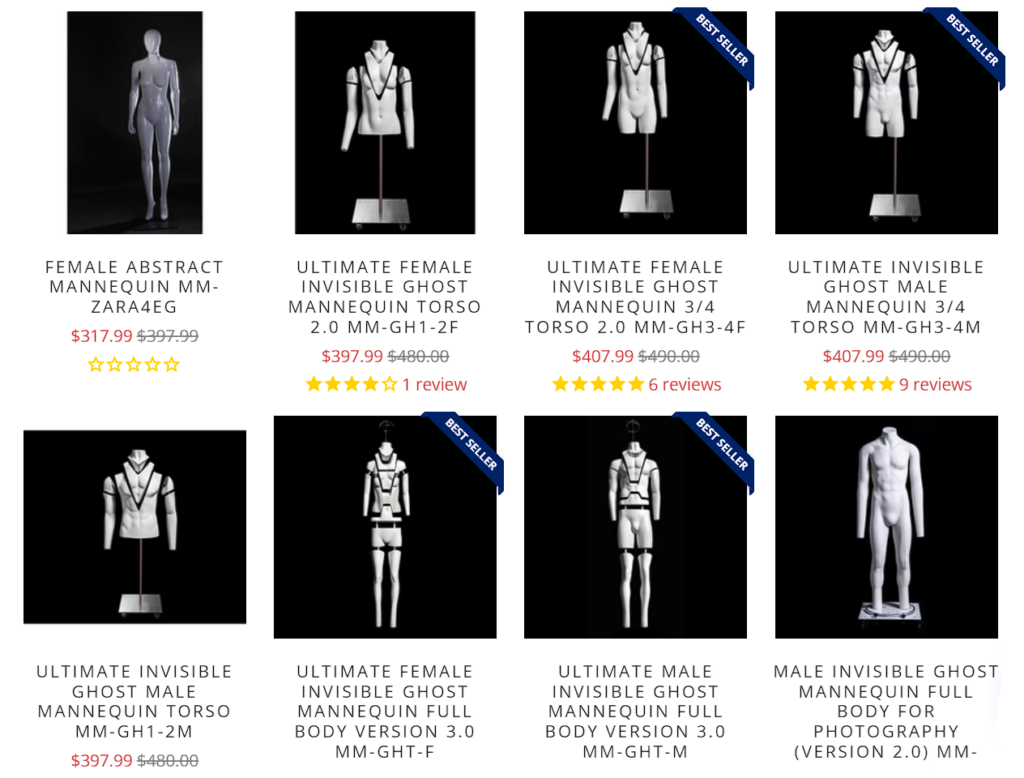
Source: mannequinmall.com
This clarity helps customers quickly find what they’re looking for, accelerating their journey to the checkout. Like Mannequin Mall, make your product pages a runway where every item gets its moment to shine.
3. Lack of Product Clarity
The Mistake
How would you feel if you finally discovered a product that seemed like a great solution to your problem, only to find its description as clear as mud?
Confusion is the enemy of conversion. When your product’s purpose and benefits aren’t crystal clear, potential buyers are left scratching their heads.
This lack of clarity can be a major roadblock, especially for innovative or unconventional products.
The Fix
Say it like you want to hear it. Your product descriptions should be concise yet informative.
Use images and text to explain clearly what the product is, how it’s used, and why it’s beneficial.
Think of your homepage as a quick pitch to a busy shopper. It should answer their questions before they even ask them, guiding them seamlessly towards making a purchase.
Real-World Example
SomniFix, a seller of mouth strips for better sleep, does this brilliantly. Their homepage layout instantly communicates what their unique product does.
A clear image shows the product in use, and its key benefits are listed alongside.
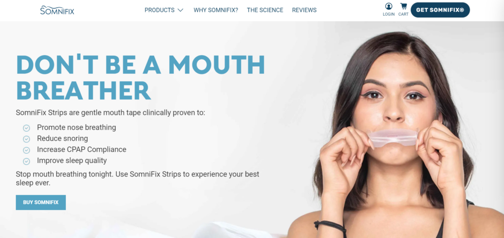
Source: somnifix.com
This straightforward presentation demystifies the product, making it easy for visitors to understand its value and how it fits into their lives.
This clarity not only educates but also paves the way for higher conversions.
4. Presenting Readers with Walls of Text
The Mistake
Confronting visitors with a massive wall of text is like asking them to climb a steep hill in flip-flops–it’s overwhelming and off-putting.
Lengthy paragraphs can bury important information, making it hard for users to find what they need.
This tsunami of text can discourage engagement and block conversions, as potential buyers might simply give up and leave.
The Fix
Break it down. Use headings, bullet points, and short paragraphs to make your content digestible.
Think of your web page as a buffet–everything should be easy to distinguish and pick up.
Collapsible sections are a great tool. They let visitors choose what they want to read, keeping your pages clean while still offering all the necessary information.
Real-World Example
Transparent Labs, a natural sports nutrition supplement brand, exemplifies this approach on its Mass Gainer product page.
They’ve smartly collapsed detailed product information under clear, visible headings. Users can expand the sections they’re interested in, which makes the page both manageable and user-friendly.
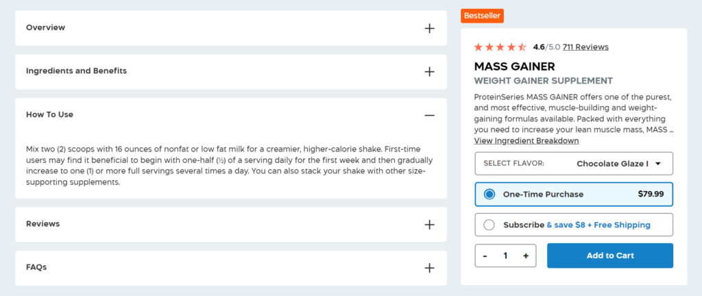
Source: transparentlabs.com
This layout respects the reader’s time and attention span, allowing them to easily navigate and absorb information, leading to a smoother path to purchase.
5. Social Proof Is Limited to Product Pages
The Mistake
Great coaches don’t keep their best player on the bench until the final whistle. In the same light, it would be a huge oversight if you limit customer reviews only to product pages.
Social proof, like reviews and testimonials, is a powerful tool to build trust and credibility.
Including these only on product pages means missing out on opportunities to reassure potential customers at different stages of their browsing journey.
The Fix
Spread the love! Incorporate social proof across your website, not just on product pages.
Your homepage and product category pages are prime real estate for showcasing customer satisfaction.
This strategy reinforces the quality of your products and the reliability of your brand, making visitors more comfortable and inclined to make a purchase.
Real-World Example
FOCL, a brand specializing in plant-based wellness solutions, gets this right. On their products for sleep category page, they display customer reviews alongside star ratings.
This validates the effectiveness of their products and builds a narrative of trust and quality right from the browsing stage.
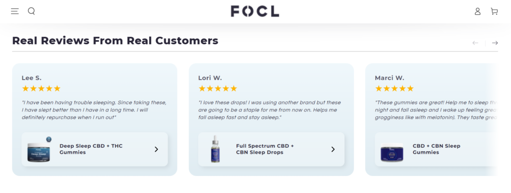
Source: focl.com
By weaving social proof into various parts of their site, FOCL enhances the credibility of their offers. That’s great for encouraging visitors to proceed confidently toward making a purchase.
6. Forcing Visitors to Read
The Mistake
Expecting every visitor to dive into dense product descriptions is a common UX flaw.
Especially in today’s overcrowded digital space, where patience is scarce and only a few have the time or desire to read through complex text.
By relying solely on text, you risk losing the attention of a significant portion of your audience.
The Fix
Embrace diversity in content delivery. Incorporate videos to describe your products.
Videos can convey a lot of information quickly and in an engaging way. They’re especially effective for explaining complex products or showcasing benefits in a more dynamic and digestible format.
This approach caters to different user preferences, enhancing the overall experience and making it easier for visitors to understand and connect with your products.
Real-World Example
Digestive Warrior, a brand selling supplements for digestive health, exemplifies this tactic on their CellCore category page. They feature a video where professionals discuss the benefits and uses of the products.
This makes the information more accessible and adds a layer of expertise and trustworthiness to the content as well.

Source: digestivewarrior.com
By offering a video explanation, Digestive Warrior ensures that visitors receive the information in a format that’s easy to digest (pun intended). It makes the product more approachable, increasing the likelihood of engagement and conversion.
7. Complex Checkout
The Mistake
A checkout process with more steps than a moonwalk is a surefire way to send customers running away from your site.
They’re tired of signing up for accounts with every brand and service they buy from. Navigating through a labyrinth of forms is also something that frustrates the hell out of them.
This type of hurdle usually leads to cart abandonment. It’s often a reason why over 70% of customers abandon ship.
Remember, a confused customer is a customer less likely to complete their purchase.
The Fix
Simplify and streamline. Offer a guest checkout option so customers can complete the purchase as quickly as possible.
If you can, revamp the checkout process to a single page. This approach respects the user’s time and desire for convenience.
Keep only the essential fields and make sure the page layout is intuitive. The easier and quicker the checkout, the higher the likelihood of sealing the deal.
Real-World Example
Bellroy, a travel accessories brand, hits the nail on the head with its checkout process. They provide customers with a one-page guest checkout.
Everything you need is on the same page–delivery details, shipping methods, and payment information, all without any unnecessary fields.
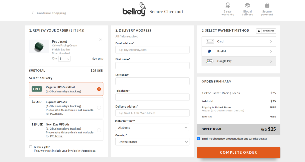
Source: bellroy.com
This efficient strategy respects the customer’s time, reducing friction and the chances of cart abandonment.
8. Poor Load Speed
The Mistake
Waiting for a slow-loading website to fully load is like watching a sloth climb a tree. It tests your patience, and often, you just don’t stick around.
In 2024, internet users will be accustomed to instant gratification. If your site takes too long to load, everyone who stumbles upon it will bounce faster than a rubber ball.
This not only hurts user experience but also significantly impacts your conversion rates.
The Fix
Speed it up. Here’s how:
- Optimize images: Large, high-res images can slow your site down. Resize and compress images without sacrificing quality.
- Minimize HTTP requests: Each element (like scripts, images, and CSS files) on your page requires a separate HTTP request. Reduce these by simplifying design elements and combining files where possible.
- Use caching: Enable browser caching so returning visitors can load your site faster.
- Optimize CSS and JavaScript: Minify and combine files. Also, use asynchronous loading for JavaScript to improve the render time.
- Choose the right hosting: Don’t skimp on getting the best service. A good host can make a big difference in load speed.
- Enable compression: Use tools like Toptal and UglifyJS to reduce the size of your CSS, HTML, and JavaScript files.
- Optimize for mobile: Desktop view on mobile looks hideous and takes a lot longer to load. So, make sure your website’s design is responsive for all types of devices and use lighter elements to do so.
- Use a content delivery network (CDN): CDNs distribute your content across multiple, geographically diverse servers, speeding up access for users far from your primary server.
- Regularly test load time: Use tools like Pingdom and GTmetrix to keep track of your site’s speed and make improvements.
Remember, when it comes to website load speed, every second counts. By shaving off these precious moments, you’ll steadily boost your site’s potential to convert visitors into customers.
Final Thoughts
Tackling these eight common UX mistakes can transform your website from a digital desert into a lively marketplace.
By keeping things simple, clear, and user-friendly, you’re crafting a journey that leads to satisfaction and success.
So go ahead, give your website the love it deserves, and watch as it returns the favour in engagement and conversions.
If you have any questions about digital marketing, don’t hesitate to reach out to TechWyse Internet Marketing today. Call 866-208-3095 or contact us here.