
When you're looking for easy conversion rate optimization tricks, your first instinct may be to tinker with your offer. And, in some ways, this isn't a bad strategy for getting web visitors to click that 'Buy' button.
After all, consumer behaviour research clearly shows that 88% of buyers want high-quality solutions, from trustworthy brands, at fair prices. However, the simple fact is that ecommerce sales depend on much more than cost or brand credibility.
The good news is that you can exponentially elevate conversion rates through subtle UX design tweaks.
Though often overlooked, user experience directly influences on-site behaviour. It determines user engagement rates. It impacts visitors' purchase intent. Additionally, it even determines whether your customers continue buying from your brand (which is the most commonly overlooked way to ensure long-term business success).
Are you looking for easy tips for convincing more people to buy from your brand? Why not focus on achieving micro-UX wins in your ecommerce store?
This blog will cover eight subtle ecommerce UX improvements that drive major conversions. Let's get into it.
Capitalize on Visitors Who Are Ready to Start the Sales Process
One of the easiest conversion-boosting hacks you can implement on your website is to look for opportunities to shorten the sales cycle.
If you look at consumer behaviour research, you'll discover that the average buying journey is getting longer.
According to Google, people took nine days longer to make purchase decisions in 2019 compared to 2015. And Salsify came to similar conclusions as well. This organization's research discovered that between 20% and 32% of consumers spent several hours or even days researching purchases, particularly for big-ticket items.
In some ways, these conversion delays aren't that much of a surprise.
For one, today's buyers have immensely more choices, which automatically demands a longer evaluation process.
Furthermore, people are also paying closer attention to their spending habits. McKinsey found that 79% of consumers will trade down in 2025 to reduce spending.
With this in mind, you need to consider tactics to help you convert customers sooner rather than later, especially as every delay increases the risk of losing qualified leads to your competitors.
One method to accomplish this through UX design is to capitalize on web visitors populating the lower stages of the sales funnel.
Essentially, these consumers are either ready to make an impulse shopping decision. Or, they've already done their research, know what they want, and are prepared to commit to a purchase.
So, why not make it super easy for them to convert with a user-friendly web design?
For instance, you could do something similar to Brickface. This brand includes a contact form in its header. After all, Brickface understands that its potential customers have pretty clear ideas about the services they need. By allowing bottom-of-the-funnel web visitors to convert upon landing on its website, the brand nudges them toward a conversion while their purchase intent is still high and they're still highly engaged.

Source: brickface.com
Explore Simpler Ways to Communicate Customer Benefits
Simplicity directly translates into higher conversion rates. Not convinced? Just check out the latest research from Unbounce.
According to the organization's latest analysis, the higher the readability of an ecommerce landing page, the higher the median conversion rate. Easy-to-read pages (reading grade levels ranging from 5 to 12) all outperformed the median ecommerce conversion rate of 4.2%.
So, if you want an easy hack to improve user experience, explore methods to make your website more accessible.
In addition to simplifying copy, increasing contrast, and enriching pages with white space, consider adding more visual content to your online presence.
For example, consumer surveys reveal that 78% of people prefer to learn about products by watching a short video. Incorporating this format in your product galleries, like July did, can be an excellent way to elevate product understanding and nudge web visitors closer to a conversion.
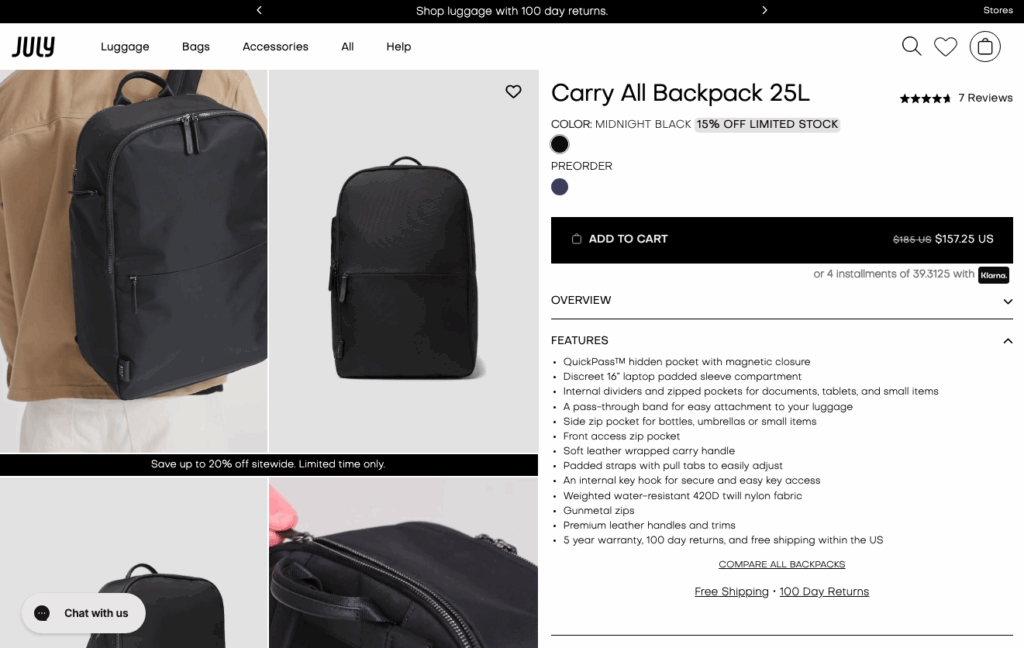
Source: july.com
Simplify Product Comparisons With Standardized Inventory Thumbnails
Simplification is an excellent way to improve website UX. However, the truth is, its place should not be limited to product pages alone.
If you consider the typical buyer's journey, you'll realize that most of your leads go through a predictable process of evaluating and choosing potential solutions to their pain points. And, for the most part, their most impactful decisions—those, where they decide what products to take a closer look at—happen on product collection pages.
With this in mind, it's not a bad idea to explore UX tactics to make product comparisons more enjoyable for your target audience.
One effective way to do this is to invest in standardized inventory thumbnails.
Standardizing these images won't just create an aesthetically pleasing web browsing experience due to a high level of consistency. It will also make it easier for potential customers to compare your products, especially since 75% of people rely on product photography to make shopping decisions.
For instance, check out how Pergola Kits USA does it. Instead of forcing shoppers to click on each product to get a better idea of what it entails, the brand relies on standardized thumbnails. These images aren't just attractive. More importantly, they effectively highlight the differences between product variants, making it easy for shoppers to choose the version that fits their needs without wasting time viewing multiple product pages.

Source: pergolakitsusa.com
Remove Conversion Obstacles With Relevant Micro Copy
When looking for UX tweaks that drive conversions, a solid place to start is to study the reasons people don't complete purchases when shopping online.
According to the Baymard Institute, three of the leading cart abandonment reasons include high delivery fees, unexpected checkout costs, and lack of brand trust.
Fortunately, you can eliminate most of these conversion obstacles with well-placed micro copy, especially if you position it near your main conversion elements.
For instance, check out all the ways Healf employs trust-building micro copy to maximize conversion rates. The brand uses its website header to communicate that it offers free UK delivery on purchases exceeding £50 and free returns. Furthermore, the area right below the main CTA highlights the highly credible payment methods the business accepts. Plus, the 'Subscribe & save 10%' section emphasizes that all recurring purchases can be paused or cancelled at any time.

Source: healf.com
Address Common Shopper Questions in Detail
The more your target audience knows about your products, the higher their purchase intent.
But here's the deal about providing web visitors with in-depth product info. Most of them won't read all of your product descriptions.
Research suggests that web users don't read online text word-for-word. Instead, they tend to skim pages until their eyes land on a phrase or keyword that seems relevant to their experience and pain points.
With this in mind, you must explore UX design hacks to showcase detailed product info without going against your web visitors' browsing habits.
One method to accomplish this is to address common shopper concerns by using formatting to attract and guide user attention.
For instance, instead of relying on shoppers to read your entire product page, use visual formatting to direct their attention toward highly relevant bits of information.
If you check out Rapha, you'll notice that the brand does this by using bold typography to emphasize product features such as breathability, fit, and construction, knowing that all of these factors impact its target audience's shopping decisions.
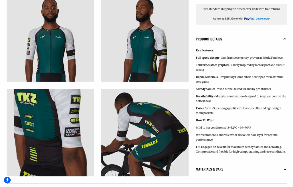
Source: rapha.cc
Or, if you're looking for an advanced, yet easy-to-implement UX hack, consider employing engaging methods to educate your audience about your offer.
This could mean adding explainer videos to your product pages. For example, take a look at how Whole Wood Playhouses employs this format to show how easy it is to assemble its products.
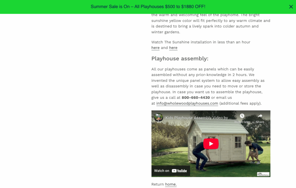
Source: wholewoodplayhouses.com
Alternatively, you may even opt to use advanced interactive formats, like Gozney does. This brand has an AI-powered FAQ section right below its primary CTA, which lets shoppers ask quick questions about the product, without forcing them to search for that info on the page.

Source: gozney.com
Provide Express Checkout Options
Sometimes, the key to driving ecommerce conversions isn't to try to convince your audience that you offer the best value for money. Instead, it's to make shopping on your website exceptionally convenient.
If you're not convinced that this approach works, just look at the data on what consumers want from online shopping.
According to Morgan Stanley, 77% of shoppers want brands to provide them with convenient shopping experiences, consisting of comfort, speed, accessibility, and availability.
So, how can you use UX design to deliver these CX elements?
Well, one method to accomplish the goal is to make shopping with your business as seamless as possible through express checkout.
According to research, digital wallets accounted for 53% of all ecommerce payments in 2024. And the popularity of this payment method is only going to increase. For comparison, only 20% of people use credit cards to pay for products online.
The best thing about incorporating this UX perk in your ecommerce store is that it's a relatively simple solution. Just make sure you highlight the possibility of one-click payment. You can do it on your product pages, near the primary CTA. Alternatively, you could take inspiration from AMP and do it on your Checkout page.
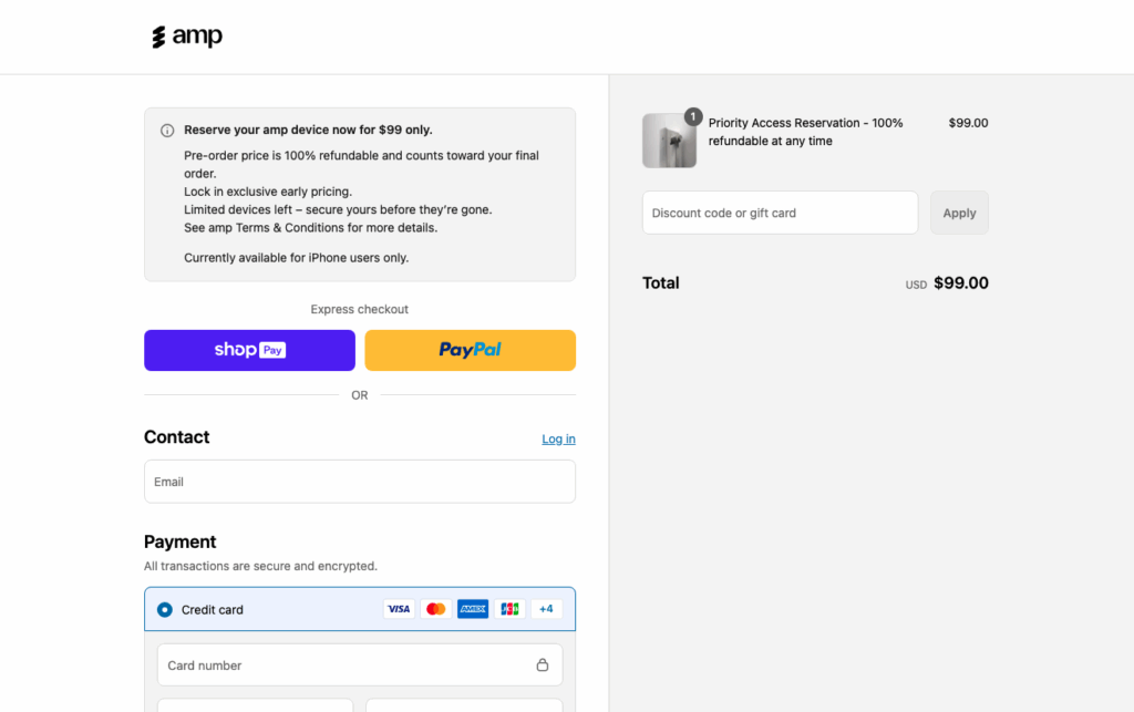
Source: ampfit.com
Ensure Social Proof Is Always Visible
When it comes to boosting conversion rates, displaying social proof throughout your website is non-negotiable.
Research shows that 99.75% of consumers check product ratings and reviews before clicking the 'Buy' button. Most people won't even consider purchasing from a brand that doesn't have at least some user feedback to recommend it.
But here's the deal. Employing traditional social proof throughout your ecommerce website is a solid start. Nevertheless, it's not necessarily sufficient to differentiate your business as a trustworthy entity that offers high-quality solutions.
You need to explore ways to maximize the impact of social proof throughout your ecommerce store.
One efficient method is to utilize as much UGC as possible. Research shows that this format is more trustworthy than branded content. Thus, it's one of the best methods of encouraging your target audience to put their trust in your business.
As for additional micro-UX hacks to elevate conversions, consider making subtle changes to how you display traditional social proof.
For instance, something as elementary as making social proof always visible on your site—as Bay Alarm Medical does with its Google Review element—can be exceptionally effective at highlighting your credibility and making your prospects feel safe when deciding to convert.
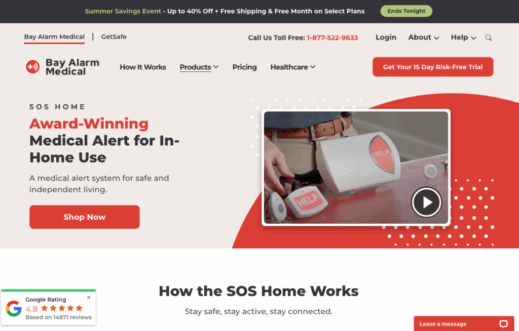
Source: bayalarmmedical.com
Turn One-Time Purchases Into Loyalty
Last but not least, as you explore UX tactics to drive major conversions, you have to consider the true value of an ecommerce sale.
You see, a one-time transaction is great. But the secret of success, particularly for brands that sell consumables, lies in convincing people to remain loyal to your brand.
Elevating customer loyalty is great for increasing customer lifetime value. Furthermore, it's an excellent way to receive a higher ROI from your marketing campaigns and secure a more dependable cash flow that can help your brand to grow.
The simplest UX design hack that can help you accomplish these goals is to include a subscription incentive on your product pages.
Olly, for instance, invites people to buy a subscription by pointing out that it's 15% cheaper. Then, to minimize their risk aversion, it allows them to choose the frequency of delivery, using the UI element to show shoppers that they have complete control over their CX.

Source: olly.com
Final Thoughts
Optimizing ecommerce conversion rates via UX design can seem daunting. But the truth is that you can boost sales even with a few subtle tweaks.
The only thing you have to do to reach your desired results is to align your design upgrades with your audience's wants and needs.
So, don't hesitate to implement the tactics discussed in this blog. Check whether they align with what your ideal customers want from a shopping experience. And feel free to adjust them to fit your sales and marketing funnels. From there on, all that's left to do is track your CRs to see whether the changes have made a positive impact and uncover opportunities for even more micro-UX wins.
For the latest digital marketing news, check out our blog. To book an appointment, call 866-208-3095 or contact us here.


