There are numerous effective ways to boost brand and product awareness. From SEO to social media marketing to paid ads, reaching your target audience and convincing them that your solutions offer the benefits they seek has never been more accessible.
However, if your business has a large inventory of versatile products, advertising each of your solutions may not be possible. Firstly, this could necessitate an exorbitant marketing budget. Secondly, it's important to remember that bombarding prospects with conversion-oriented content often leads to diminished trust, not conversions.
With this in mind, it's essential to create systems that will encourage your target audience to discover your products organically and at the right stage of the buyer's journey.
By designing your website for discovery, you can effectively nudge site visitors into your online category without appearing aggressive. So, if you want to make it easier for potential customers to discover your solutions (and perceive them as effective at removing their pain points), here are the best design tactics to reach your goal.
Create a Wide Variety of Inventory Categories
Consumers want to be sure that brands understand and care about their needs.
If you look at research conducted by Salesforce, you'll find that 73% of consumers expect brands to understand their unique needs and expectations. Additionally, 75% of people trust businesses that act with their customers' best interests at heart, which is a core factor for encouraging sales in the first place.
To ensure that your site visitors dive into your offer when searching for relevant solutions, your inventory categories need to genuinely reflect their wants and needs.
One of the best ways to do this is to avoid generalized product categories. Instead of just doing the basics when organizing your inventory for collection pages, consider a more need-based approach to guiding web visitors through the buyer's journey.
Think about how your ideal customers will use your solutions and consider whether there are any specific outcomes they want to accomplish when purchasing your products.
For example, check out how Mannequin Mall implements this product discovery design strategy. On the surface, the brand uses typical product categories common in its industry. However, it also creates more distinctive classes that resonate with specific segments of its audience. The Sports Mannequins page, for instance, targets the sports and gym subset of fashion brands, knowing that these buyers tend to search for more niche dress forms that show off garments in dynamic settings instead of the more static poses used for traditional fashion displays.
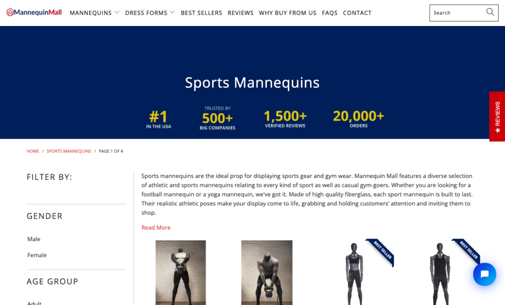
Source: mannequinmall.com
Place a High-Value Inventory Link in Your Header
When shopping, the majority of consumers prioritize value for money.
A 2023 survey conducted by Edelman discovered that 91% of people approach the shopping process by prioritizing value. Value is more important to them than both quality and convenience.
With this in mind, when categorizing your products and looking for ways to encourage web visitors to explore your online inventory, explore methods to highlight that value to your prospects.
The great news is that there are several effective methods to emphasize consumer value.
On the one hand, knowing that price is an important conversion factor, you can use your website's header to call attention to products currently on sale. For example, the OrthoBracing limited-time 75% off banner is a marvellous example of how easy it can be to encourage product discovery by offering a type of value (in this case, savings) that your prospects seek.
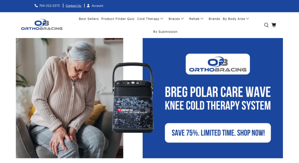
Source: orthobracing.com
Or how about emphasizing effectiveness? If your target audience wants high-quality solutions with high customer ratings, you could do something similar to The Inkey List. This brand includes a Bestsellers category just below its website header (along with product highlights), knowing that browsing these items could inspire shoppers to discover new solutions and try some of them out.
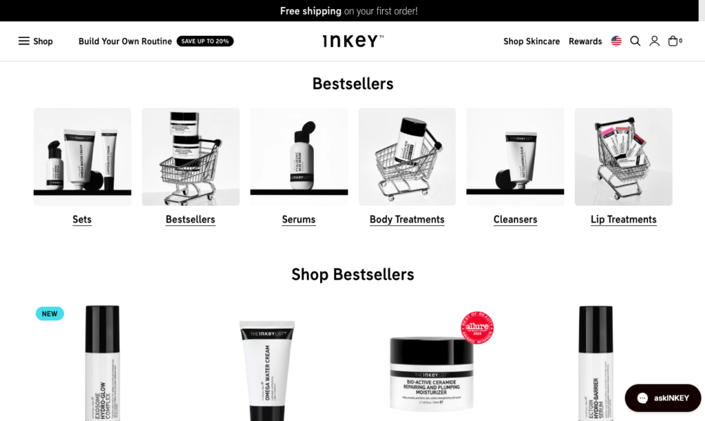
Source: theinkeylist.com
Showcase an Interactive Product Finder Early in the Visitor's Journey
One of the most frustrating aspects of searching for solutions is not feeling competent enough to make a solid choice.
If you look at scientific research, you'll discover that most people give up on making a decision when they have too many options. The primary reason for this is that their decision-making confidence is minimized by the following four factors: choice set complexity, decision task difficulty, preference uncertainty, and decision goal.
With this in mind, it's no wonder that creating clear product categories plays such a crucial role in facilitating product discovery.
But how do you take a further step in assisting your web visitors to find solutions that could be the right fit for their needs?
Well, one strategy you could try is to provide some expert guidance by creating interactive product finder elements for your website.
For instance, knowing that it offers a large selection of items, Sewing Parts Online includes a "Shop Your Machine" section in the most prominent section of its website. Here, visitors can enter the make and model of their sewing machines and easily find the right parts without having to sift through hundreds of items that aren't even relevant to their needs.
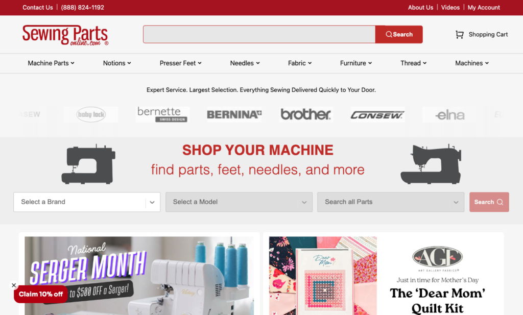
Source: sewingpartsonline.com
Or, you could make this product discovery process even more user-friendly by creating a custom product discovery quiz.
The Fit Finder quiz from Levi's is an excellent example of how a few well-posed questions can help you present your prospects with hyper-relevant product recommendations. Ultimately, this doesn't just nudge site visitors into your online inventory. It helps maximize their likelihood of converting, as it presents them with personalized recommendations that align with their needs and expectations.
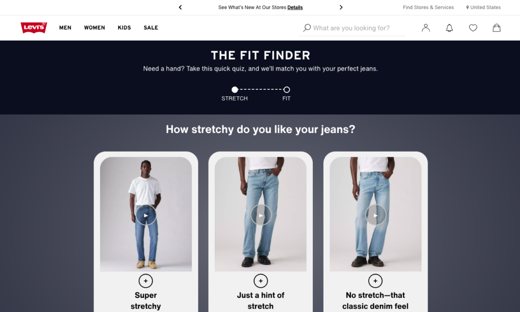
Source: levi.com
Align Products with Specific Customer Objectives and Needs
Why do people buy things?
According to research, 39% of all consumers are aspirational shoppers who make purchase decisions based on an ideal vision of themselves. And that vision can include numerous goals, including their lifestyle, authority, fitness levels, etc.
So, how does this data come into play when designing your website to facilitate product discovery?
One marvellous tactic you could use is to align your products (or product categories) with your customers' specific objectives and needs.
For instance, if you check out the Transparent Labs Protein Series collection page, you'll see that it includes a "Shop by Goal" filter on the left-hand side of the screen. By associating specific products with products that can help distinct fitness objectives like losing fat or building lean muscle, Transparent Labs creates a mechanism allowing shoppers to find more relevant products, instantly boosting the likelihood of a product page visit and conversion.
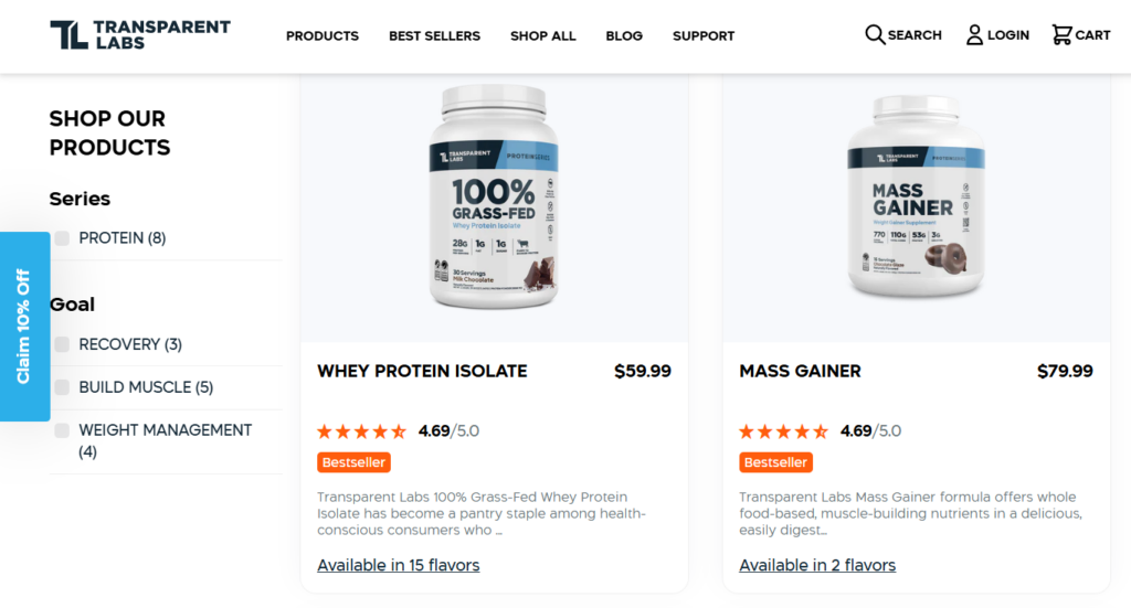
Source: transparentlabs.com
Don't Be Shy with Product Filters
Sometimes, the best way to nudge site visitors into your online inventory is to guide them through the product discovery journey. However, other times, the best thing you can do is leave your prospects to find what they need by themselves.
To make this possible, you'll need to present them with functional methods of narrowing down the number of items shown on product collection pages, especially if you sell many solutions.
What's great is that filters can be exceptionally effective at aiding the discovery process in these cases.
By empowering your web visitors to narrow their search results, these UI elements can effectively avoid the consequences of choice overload and maximize your audience's ability to find products that fit their needs.
What's essential about incorporating filters into your product collection pages is that you shouldn't fear complexity.
If you target B2B buyers or technical experts, going into specific details can be a great way to provide them with a straightforward and enjoyable shopping experience.
The Golf Cart Tire Supply site does precisely this. At first glance, the sheer number of filters may seem overwhelming. Nonetheless, it quickly turns out that the UI elements are key to guiding shoppers through the thousands of items on offer, allowing them to quickly find what they need without wasting time browsing irrelevant products.
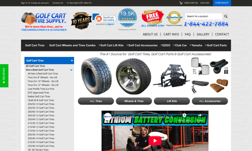
Source: golfcarttiresupply.com
You can adopt this web design strategy even if your target audience doesn't consist of experts. However, in that case, you'll need to ensure that the filters contribute to streamlining the buyer's journey and don't cause unnecessary overwhelm or choice paralysis.
Check out how Barebarics does it on its Mens Sneakers collection page. Knowing that regular people usually have broad requirements when shopping for shoes, like size and colour, the brand includes these filters (plus a couple more specific ones) to ease the discovery process without creating a too complex buying journey.
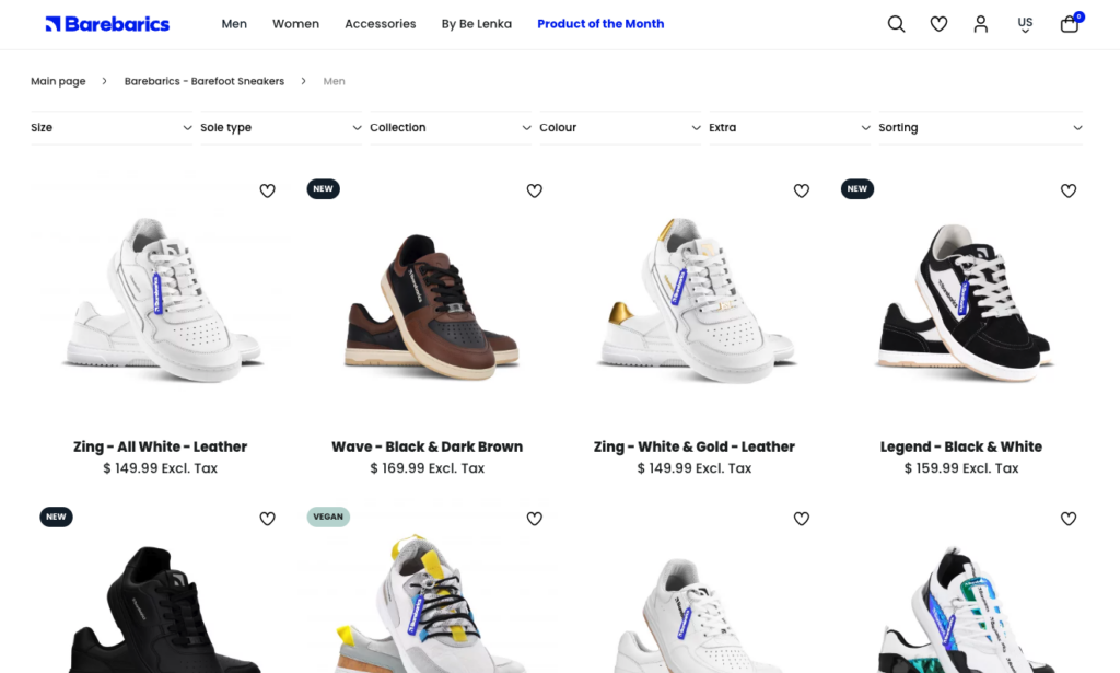
Source: barebarics.com
Supercharge Your Search Bar with Product Discovery Features
Finally, as you explore tactics to nudge site visitors into your online inventory, don't forget to optimize your search bar.
Data shows that 69% of web visitors go straight for this UI element upon landing on a website. It's equally important to remember that the modern buying journey usually begins with a search, whether on Google, Amazon, a price comparison site, or a retailer's homepage. That's why your search bar has to be not only prominent but also highly functional and optimized for conversions.
The Sill offers a prime example of a search bar that aids product and content discovery and shortens the sales cycle. What's great about this brand's search bar is that it doesn't just help discovery when web visitors type in a specific type of plant. It also works with attribute searches thanks to its advanced language processing features. This allows shoppers to discover items by entering an attribute (like a colour), showing results from multiple categories like flowers, houseplants, and fruit trees.
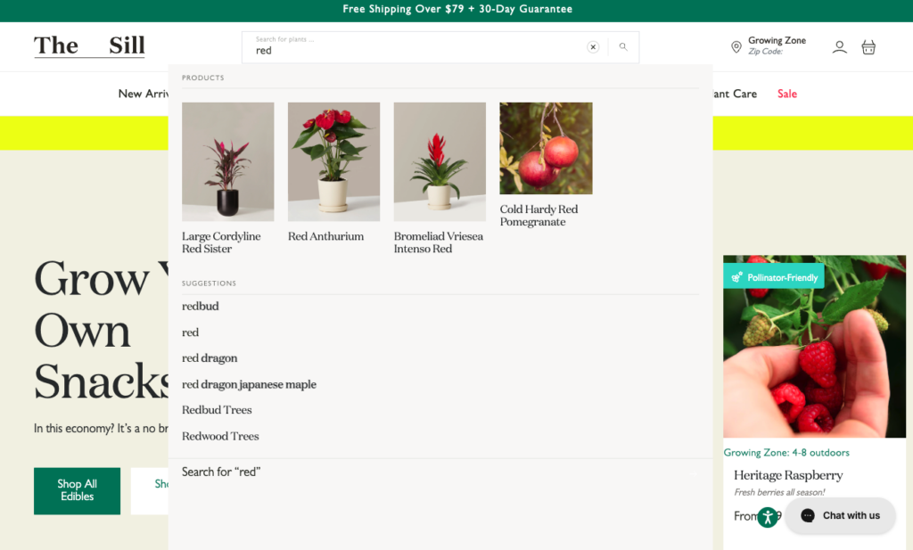
Source: thesill.com
You could also take a step further and combine the functionality of your search bar with the convenience of filtering options. This is what Amazon does, letting shoppers immediately filter search results by size. However, you could expand this UI design tactic and allow web visitors to narrow down their searches by price, product category, or any other factor that could help elevate their shopping experience.
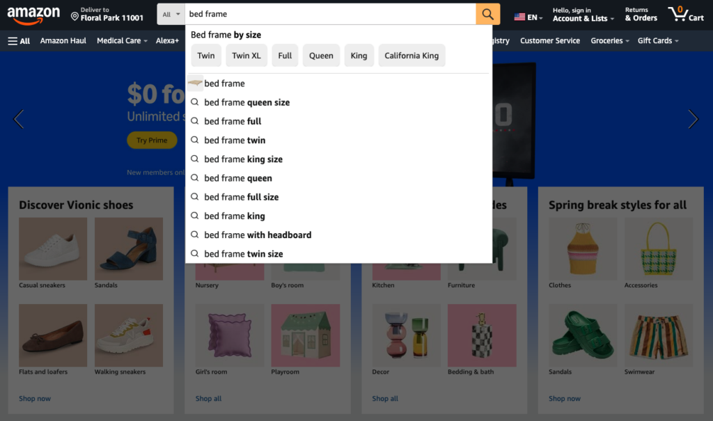
Source: amazon.com
Final Thoughts
When it comes to supercharging a website's ability to convert customers, most marketers and business owners overlook its role in the product discovery process.
In some cases, this makes sense. After all, if people find out about brands and solutions on search engines or social media, it can be safe to say that the role of a website is to convert customers who already know what they need. Nevertheless, you need to prepare for scenarios where your website visitors don't have a specific product they want to buy but are browsing for potential solutions.
The design tactics covered in this guide are a great way to ease the process of finding relevant solutions without becoming overwhelmed. Whether you implement one or all is entirely up to you. But no matter how you go about designing for discovery, ensure that you prioritize your target audience's unique needs, create an enjoyable browsing experience, and use product discovery design elements to ease and shorten their buying journey.
To stay in the loop on the latest digital marketing news, visit our blog. To book an appointment, call 866-208-3095 or contact us here.