Web design trends articles are everywhere. Most of them list the same things, like bold typography, dark mode, or AI-powered chatbots. You’ve probably read three of them already this year and remembered none of them.
This one is going to be different because the stakes are actually worth paying attention to.
Optimized web design can move conversion rates by up to 400%. That kind of lift doesn’t come from chasing aesthetics. Such websites know how design decisions shape the way people behave on their pages.
Digital marketing now depends on how well a site explains itself to both humans and machines. Design sets that tone before a single word gets read.
This piece focuses on the design shifts that earn attention, support discovery, and lead to action. We’ll cover trends that are changing how digital marketing performs, and what you can actually do with them.
Above-the-Fold Design That Explains the Brand at a Glance
Most visitors decide whether to stay or leave before they’ve scrolled an inch. We’re not exaggerating here. That’s just how people browse.
If your above-the-fold content doesn’t immediately tell someone what you do, who it’s for, and what to do next, they’re gone.
The good news is that clarity doesn’t require a redesign from scratch. It requires intention.
Here’s how to apply this to your site:
- Lead with a headline that states exactly what you offer. Skip the clever tagline if it sacrifices clarity.
- Use visuals that show the product or service in action rather than abstract imagery that looks nice but says nothing.
- Include one CTA above the fold. Make it specific. “Start Now“ converts better than “Learn More” because it signals a process, not a commitment.
- Cut anything that doesn’t answer “What is this and why should I care?” That means trimming welcome copy, auto-playing videos with no context, and navigation-heavy headers that bury the point.
- Test your above-the-fold section on mobile first. That’s where most of your traffic is coming from.
A brand doing this well is Custom Sock Lab. They make fully customized socks for companies wanting branded merchandise and individuals looking for something personal and unique.
Their homepage above-the-fold gets straight to the point. The headline tells you exactly what they make and where it’s made. The visual shows multiple sock designs side by side, so you immediately understand the range of what’s possible. And the CTA, “Start Your Project,” nudges you forward without pressure.
There’s no ambiguity about what the site offers or what to do next. That’s what matters. When visitors don’t have to figure anything out, they’re far more likely to stick around.
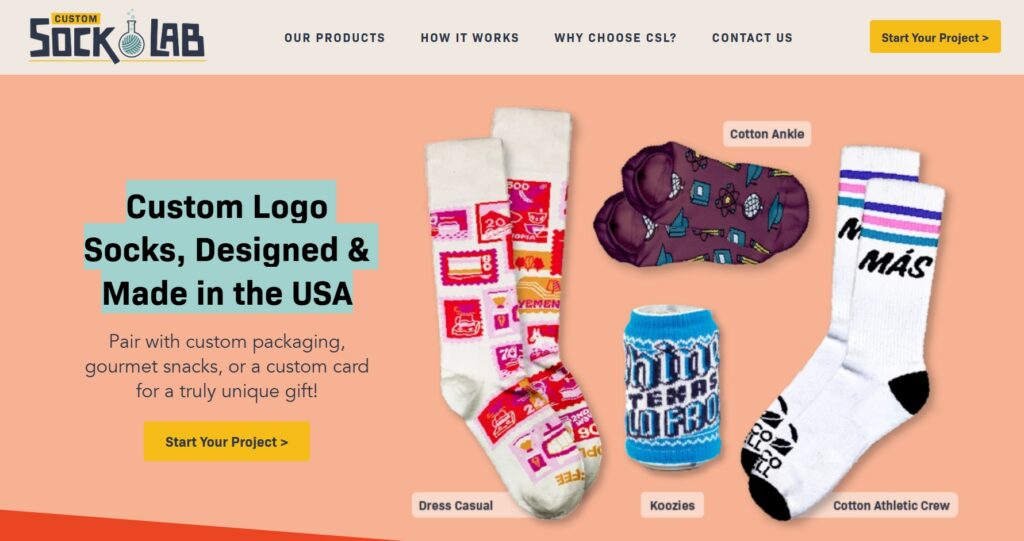
Source: customsocklab.com
Trust-Building Design Cues That Reduce Uncertainty
People don’t hand over their contact details, money, or trust to a website they’re not sure about. And in most cases, uncertainty doesn’t come from the product but from the overall design.
A cluttered layout, vague messaging, or a page that jumps straight to a sales pitch without establishing credibility will quietly push visitors away.
Trust-building design is functional instead of decorative.
Here’s how to apply this to your site:
- Lead with credibility before you ask for anything. Show credentials, experience, or social proof early, before the CTA appears.
- Use clear, specific language about what you do and who you help. Vague service descriptions create doubt.
- Break down your services into digestible sections. Pair each one with a relevant visual or icon so the page feels structured and easy to scan.
- Avoid designs that feel rushed or templated. Thin fonts, low-contrast text, and stock imagery that doesn’t match your brand all quietly signal low effort.
- Make contact options visible and easy to find. A buried phone number or contact form tells visitors you’re not that accessible.
- Use layout hierarchy intentionally. Guide the visitor through context and value before presenting a conversion point.
Freeburg Law handles personal injury cases and criminal defense, and their Wyoming Criminal Defense Lawyer landing page is a strong example of trust-first design.
Before asking visitors to reach out, the page walks them through what the firm does and why it matters. All of that is supported by clean visual icons that make the content easier to absorb.
This is the right approach for a high-stakes service. When someone is looking for legal help, they need confidence in who they’re hiring before they’re ready to make a move.
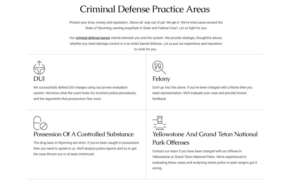
Source: tetonattorney.com
Visual Storytelling That Helps Visitors Understand What You Offer
In 2026, successful brands rely less on long explanations and more on visual clarity to get their point across fast.
People skim. They scroll quickly, absorb images before words, and make decisions based on how well a page communicates at a glance. If your visuals aren’t doing heavy lifting alongside your copy, you’re making visitors work harder than they should.
Here’s how to apply this to your site:
- Use real product imagery that shows context (how something is used, worn, or experienced) rather than isolated shots on a white background.
- Break down how your product or service works into a short step-by-step format. Three to four steps is the sweet spot. Adding more than that will make your format resemble a manual.
- Pair each step with a short video clip or animation where possible. Motion naturally draws attention and demonstrates function better than static images.
- Keep the copy tight. Each section should answer one question: What is it, how does it work, or why does it matter? Don’t combine all three into a single block of text.
- Let the layout guide the visitor through a logical sequence. If someone has to hunt for basic information, the page structure needs work.
A great example here is Spotminders, a brand selling ultra-slim tracking devices designed to fit inside everyday items like wallets and bags.
Their Trackable Passport Cover product page is a clean example of visual storytelling done right. Instead of explaining the product through paragraphs, the page walks visitors through three simple steps, each accompanied by a short video showing exactly what the product does and how it fits into daily life.
The result is a page that educates quickly, without demanding much from the visitor at all.
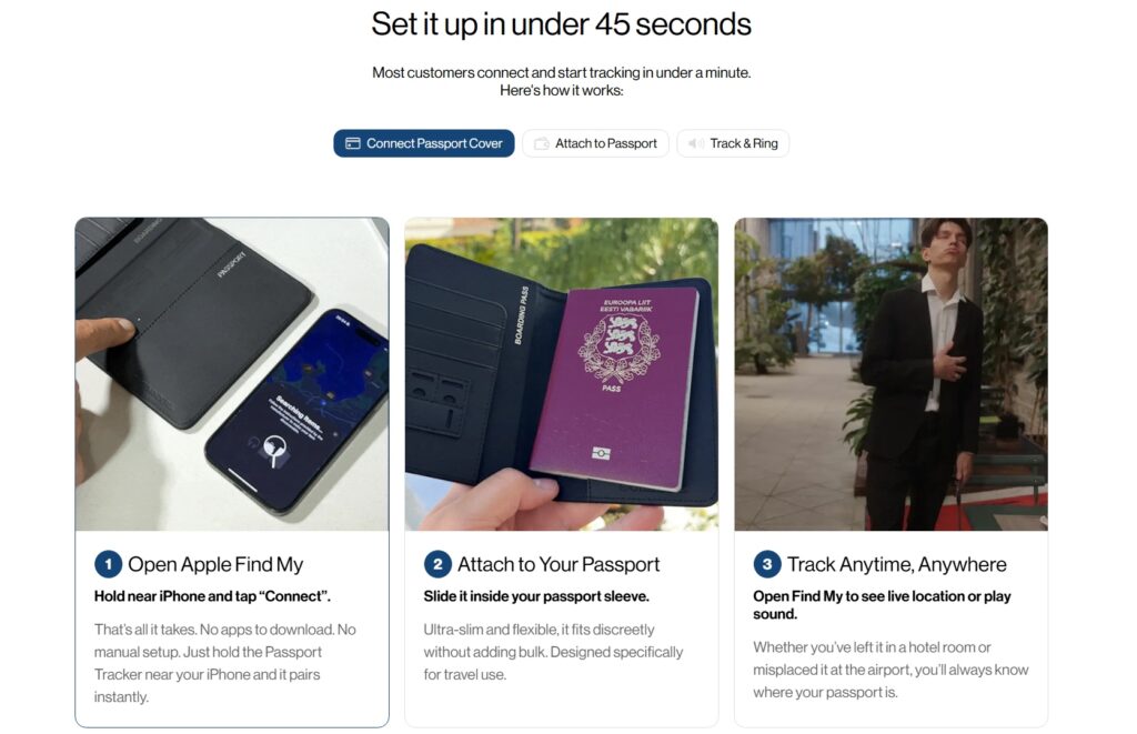
Source: spotminders.com
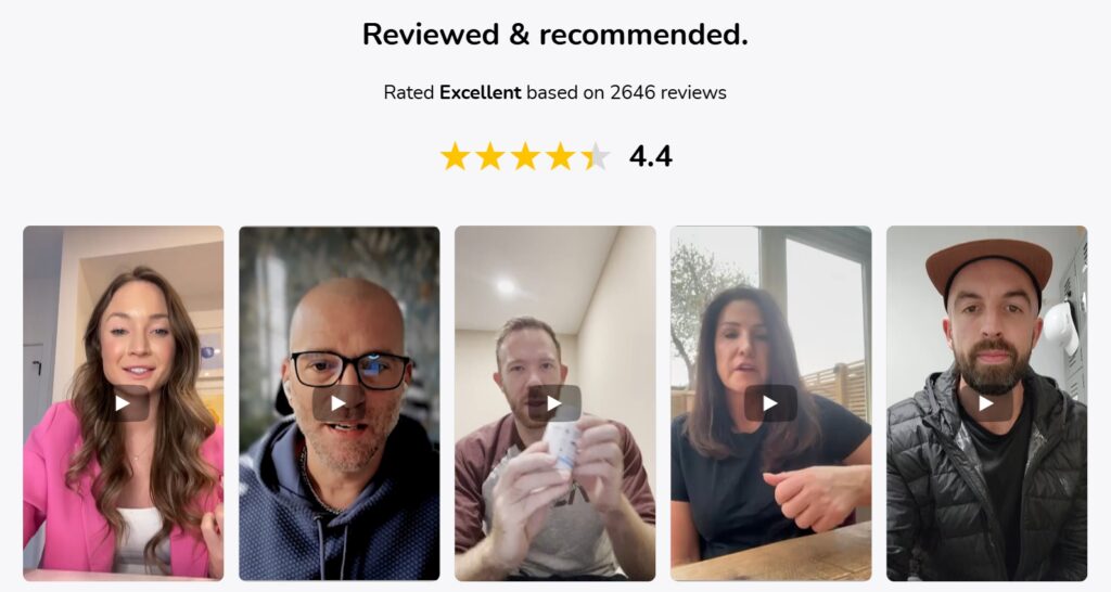
Integrated Social Proof That Supports Decision-Making
Social proof influences 90% of buyers when they’re comparing products. That’s nearly everyone. And yet, a lot of websites treat it as an afterthought, dumping reviews into a single section at the bottom of the page where most visitors never reach it.
In 2026, the brands getting this right are weaving credibility signals throughout the entire page, not parking them in one place and hoping for the best.
Here’s how to apply this to your site:
- Don’t silo your reviews. Place them near the points in the page where doubt is most likely to surface, such as next to pricing, near CTAs, or alongside product claims.
- Use specific reviews over generic ones. “Great product!” does nothing. A review that mentions a real problem your product solved carries actual weight.
- If you have press mentions or expert endorsements, treat them as content, not just logo strips. A short pull quote from a credible source does more than a row of media logos.
- Display trust badges and certifications close to conversion points, where reassurance matters most.
- Don’t manufacture urgency with fake social proof. Visitors notice, and it damages trust fast.
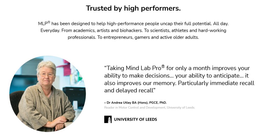
Mind Lab Pro provides a cognitive enhancement supplement designed to support mental performance across a range of functions. Their homepage doesn’t choose a single dedicated section to showcase credibility. Instead, it layers it throughout the entire scroll.
Expert endorsements, scientific positioning, press mentions, customer reviews, and trust badges appear consistently as you move down the page, each one reinforcing the last.
This structure never feels like a hard sell. It helps the brand to be confident in what it offers and urges you to have every reason to agree.
Source: mindlabpro.com
Source: mindlabpro.com
Fast, Lightweight Design That Keeps Users Engaged
A slow website frustrates visitors and loses them. But speed alone isn’t enough in 2026.
Websites with interactive features see 70% more user engagement, and that gap is only growing as visitors expect more from the pages they land on.
The winning combination is a site that loads fast and gives users something meaningful to do when it does.
Here’s how to apply this to your site:
- Compress and properly format every image on your site. Oversized files are still the most common reason pages load slowly.
- Audit your plugins and third-party scripts regularly. Every unnecessary script adds load time, often invisibly.
- Use interactivity with purpose. Calculators, quizzes, and configurators work because they give visitors a personalized result, not just because they’re engaging.
- Keep interactive features simple to use. If someone needs instructions to operate your calculator or tool, it needs a redesign.
- Build interactive elements around high-intent moments, such as pricing pages, product pages, or anywhere a visitor is likely weighing a decision.
- Minimize visual clutter around your interactive features. The tool should be the focus, not competing with surrounding content for attention.
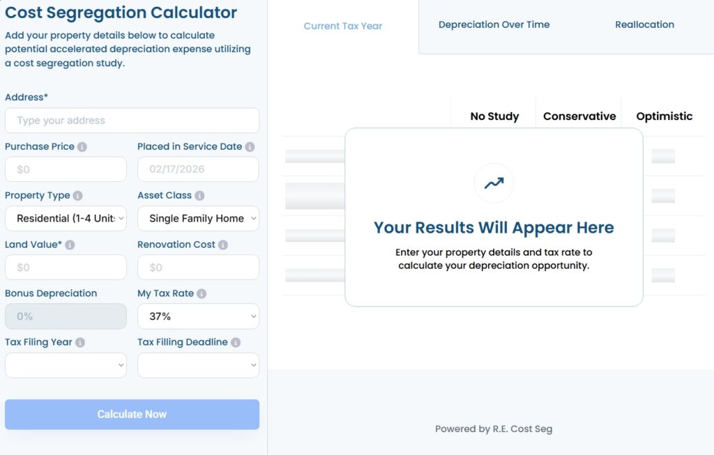
R.E. Cost Seg, which provides cost segregation services for real estate owners, demonstrates this approach effectively. Their real estate cost segregation calculator page is built around one thing: Letting visitors find out how much they could save.
The layout of this tool is clean, the inputs are straightforward, and there’s nothing on the page pulling attention away from the tool itself. Visitors get immediate, personalized value without having to speak to anyone first.
That’s exactly how high-intent interactivity should work.
Source: recostseg.com
Personalized Experiences That Make the Website Feel Relevant
72% of consumers feel more drawn to messages tailored to their interests. That’s a significant majority, and it reflects something pretty straightforward: People pay more attention when something feels relevant to them specifically.
In 2026, personalization has moved well past showing someone’s first name in an email. The brands pulling ahead are building website experiences that adapt to who’s visiting and where they are in their journey.
Here’s how to apply this to your site:
- Start small. A single personalization touchpoint, like asking one relevant question and adjusting content based on the answer, is more effective than overwhelming visitors with options.
- Use the data you collect to trigger relevant follow-up communication. Personalization doesn’t end when someone leaves your site.
- Gate personalized content behind a simple, low-friction input. An email address in exchange for genuinely useful, tailored information is a fair trade that most visitors will accept.
- Align personalized content with where the visitor actually is. A first-time visitor needs different messaging than someone returning to compare options.
- Don’t make personalization feel intrusive. If it’s useful, visitors won’t mind. If it feels like surveillance, they will.
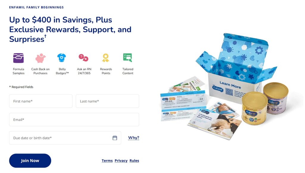
A strong example of this trend comes from Enfamil, a company focused on baby formula and feeding solutions designed for different stages of early development.
Their homepage includes a section asking visitors for their baby’s due date or birth date. It’s a small ask, but it opens the door to something much more useful: Personalized updates on pregnancy milestones and baby development, delivered over time.
This gives visitors genuinely relevant content. In return, Enfamil gets an email address and a direct channel for well-timed, personalized communication. Both sides walk away with something worthwhile.
Source: enfamil.com
Flexible Page Structures That Support Different User Goals
A homepage that tries to speak to everyone equally often ends up connecting with no one particularly well.
Different visitors arrive with different problems, different levels of familiarity with your product, and different thresholds for what it takes to convert. A flexible page structure accounts for that. It gives each type of visitor a path that actually matches what they’re looking for.
Here’s how to apply this to your site:
- Identify your distinct audience segments and map out what each one actually needs to know before they convert.
- Build dedicated landing pages for each segment rather than forcing everyone through a generic page. Specific messaging consistently outperforms broad messaging.
- Use real data and outcomes relevant to each audience. A metric that matters to a nonprofit means nothing to a real estate business, and vice versa.
- Include resources, case studies, or content that’s genuinely useful to that specific audience, not just repurposed general content with a different headline.
- Make sure that your navigation and internal linking structure give each segment a clear, logical path through your site without dead ends.
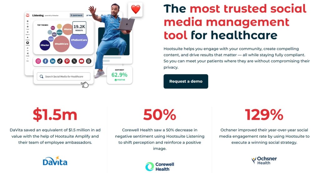
Hootsuite builds software for managing and scheduling content across social media platforms, used by teams across virtually every industry.
And that’s exactly the challenge their page structure solves. Rather than pushing every visitor through one broad landing page, they’ve built dedicated pages for industries like healthcare, financial services, nonprofits, higher education, and many more.
Their healthcare landing page, for example, speaks directly to companies in that space. It addresses their specific challenges, backs claims with real performance metrics from healthcare clients, and offers resources built for that audience.
As a result, visitors in that industry see a page that feels built for them, because it is.
Source: hootsuite.com
Final Thoughts
Web design and digital marketing have always been connected, but in 2026, the relationship between the two is harder to ignore.
The trends covered in this article aren’t about aesthetics at all. They focus on building websites that help people make decisions faster and with more confidence.
You don’t have to implement everything at once. Pick the area where your site is losing people right now, whether that’s a confusing homepage, a slow page, or a lack of social proof, and start there. Small, deliberate improvements compound over time.
When design decisions align with real user intent and modern discovery systems, marketing stops pushing and starts guiding. That’s where consistent results come from.
Want a website that does more than look good? Let TechWyse help you turn modern web design into measurable marketing results with a site built to attract, engage, and convert in 2026. To get started, call 866-208-3095 or contact us here.