There is no doubt that we are visual creatures. We interpret visual information much quicker than other content, like text.
Ever wondered why Instagram, Snapchat, Vine, TikTok are so popular? Visual, easy to digest content. Be it many pictures running on your screen in a row or a couple of seconds videos that constantly change -- we just like to look.
The goal of the brain is to conserve energy and do as little as possible. That is why images are such a big part of our everyday life. Particularly in an advertisement, the use of imagery is close to an art or alchemy, depending on your point of view.
This post will go over several tips on choosing and creating more engaging images to increase conversions. An image can make or break the success of your page. So, with the introductions past us, let’s dive in.
Stop Using Unnatural Stock Photos
As you can see, we are starting with some basics. We have all been on the internet for a very long time; the chances are that your visitors have also seen a page or two.
It is hard to explain how it works, but we know a stock photo when we see it, and in most cases, it is really bad. Here are a couple of examples:

These come from IstockPhoto, search term handshake, and are sorted by most popular. To add to this mystery, you have to pay for them to use them.
These come from Pexels, which is a free service where you can download pictures for your use:

It seems that the main reason why Istockphoto looks set-up and Pexels pictures look natural is that in Pexels, many content creators are submitting their work to the site for free.
The lighting and the people themselves look natural. Most importantly, it looks relatable. If the pictures from Pexels where the team is sitting down were on a startup page, you would think it is the real team.
Visuals in life are not perfect; through day to day life, we do not see perfect lighting and perfect scenes of people posing. That is why Pexels seems appealing; it is closer to life and closer to the visitor.
When using stock visuals, have this in mind. Also, you can get your visuals from a wide range of free sources such as:
Leverage the Hero Image
A hero image is usually positioned under the headline's main menu and gives an overall feel to the page and sets the theme.
Here is an example from Apple:
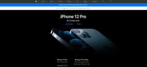
It is crystal clear that the iPhone 12 Pro is the hero; it is the main actor and the main event. And now, you have a chance to own something as fantastic as a “hero iPhone.”
In contrast to that, Northwestern Mutual, a life insurance company, has a different approach to business:

The hero image contains a man with a child, a young woman, and presumably a mother and daughter. The hero is you. The picture tries to connect with you directly and make you think of people in your life whom you need to take care of. Notice how the middle picture is looking right at you.
Many great websites are designed around a hero image.
Bigger engagement equals conversions. On cheap products where you have a volume of visitors coming in, you can use simple imagery, as engagement plays a slightly smaller role. For more expensive products (as premium phones and life insurance), you have to create that bond between your product, service and the visitor.
A hero image gives you this opportunity. The goal is to make the visitor imagine that they already have the product. Make them feel the same sense of calmness and security as people on the life insurance page radiate. Or make them feel special by owning such a unique and high-end device as the iPhone.
When visitors are projecting themselves using or owning what you have to offer, the engagement levels increase significantly, and so does the probability of conversion.
Point The Visitors In The Right Direction
In continuation of our discussion about the hero image, there is an additional important thing to consider when choosing your main or secondary images.
We presume that your page has a goal. You want to collect emails, get leads, sell events through webinar software, and so on. To do so, you must make the visitors notice a particular area where the call to action is. It has been repeatedly proven that we tend to look in the direction of the image we are viewing.

In this example, the baby is looking at you, so your main point of focus is the baby. Notice the change in the heatmap when the baby is looking at the sale headline:
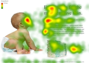
We are subconsciously following the direction in which the baby is looking, leading us to the sales text that will call us to action or otherwise fulfill the page's goal.
Throughout the whole post, the theme is to increase the visitors’ engagement with your site and with particular elements of your page that will make the conversion happen.
Using the hero image to direct the visitor's attention to the CTA is a sure way to further increase your conversions.
Make It Personal
If you want to make your page personal and connect with your visitor on a personal level — use faces (but of course, avoid using stock faces).
Depending on what is available to you, when preparing your design in the landing page builder, make sure to leave space for personal photos. It may be just your profile photo, pictures of the team, or a picture of a customer representative — depending on your goal, of course.
This is not just a gut feeling. There was a study conducted on 15 radiologists confirming that all of them felt more empathy when they had a picture of the patient attached to the folder. Suddenly it is not Patient 1, Patient 2 but it is John Smith and Marry Stevens.
The same logic applies to your page. When you use photos of yourself or your team, you are not “Company Which Is Trying To Sell Me Something, Number 45”, but you are Abby, a specialist in interior design, and you have this great report that you wrote and now share completely free via email.
Use Customer Photos
Testimonials of your customers are great, it is even better - when you have a chance to put a customer photo on your website. The format of the picture and the way it will be presents of course depends on the line of your business.
Real customer photos can increase your conversion rate by over 30%. Here is a study to prove it:
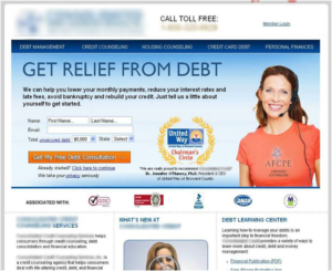
The first image is a landing page with the use of a stock photo.
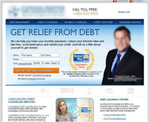
The second image is the same landing page with a real client and his statement. The results were astonishing. The second lander had nearly 35% more conversions than the first one.
In this example, we can see that:
- Cheesy stock photos are identifiable and do not work that well.
- Real customer photos increase conversions significantly.
Focus The Attention of Visitors
First of all, an image creates an opportunity to add a statement or a CTA on it. A small test was conducted on a post about online course platforms. Here is Example 1:

The picture has a correct theme; the text is not too far away from the main concentration point on the image. Here is Example 2:

It goes without saying that number two performed much better. The image is there to support your page, not to overwhelm it. This change took just a couple of minutes. Most importantly, with a fading white background and emphasized colours under the headline, they focus the visitor's attention on what is important.
In addition to that, these types of images are easily shareable, and if they are indexed, it will also help you, as all the important information is right there in big, bold letters.
You may want to consider branding all your images, so if they reappear somewhere — the source will be obvious.
Follow the F Pattern
The F pattern is a way our eyes scan a page; it looks like this:
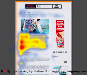
In their study, NN Group presented many examples of how we scan the page in an F shape. It makes sense if you think about it. You start reading from the left, and when you are done skimming the sentences or lost interest in it, you drop down and repeat the process.
Keep it in mind when creating a page: everything on the left side is seen first. This is why you usually have pictures and sales copy, and right at the end of your eye movement, there is a call to action.
The same applies to why a live chat tends to be on the right bottom side of the screen — nobody looks there, so it does not interfere with the customer experience, but at the same time, it is handy when the customer needs it.
NN Group also presents how to break down the F skimming habit by structuring your page, so it invokes so-called layer cake pattern scanning.
In E-Commerce, go for Big Pictures and Detail
This tip is for those who are active in e-commerce, whether it is your online store, dropshipping, or something else. If you have to present a product of any kind, you should give this tip some thought.
While there is a debate going on if big pictures help conversions on landing pages or if you should go for mid-size / smaller images, in e-commerce, there seems to be a clear winner — big pictures.
It makes sense, as visitors have concerns about purchasing online. Since it is not possible to touch or otherwise measure how the product feels — the accompanying photos are the only source to build their decision on.
In a test performed by eConsultancy, they increased the product image several times, completely moving the description under the landing page's fold, leading to over 60% more conversions.
If we compare two extremes — online sales of hats and English courses, we can see the reasons. While in the courses, you would concentrate on listing all the teacher's advantages and professionalism (maybe even making a showcase video of the course). For hats' sales, you would concentrate on the actual product.
Test, Test, Test
As you could repeatedly see from some of the examples provided here -- testing is crucial.
The great thing about A/B testing images is that it does not take much time to test. For example, testing a whole landing page would be much more demanding in terms of resources, and therefore the impact of the new page not working as expected is higher.
With images, the situation is different; you can switch visuals quite quickly and here also is a problem. Due to the ease of such a switch, you may be inclined not to test the new visuals. You have to give it time, see how the engagement, time on site, conversions, and bounce rate are behaving.
Depending on your business's nature, you might need at least a full week to properly see if the visuals work better or not before you can say a final verdict.
Conclusion
In this post, we looked at various tips for improving your on-page conversion with images. Most of these tips can also be applied to your ad campaigns and social media marketing.
Sometimes it may seem that figuring out which visual will work best is a challenge, and that is possibly true to some extent. But throughout digital marketing history, it seems that there are various patterns or rather common denominators for images that convert.
This post shared several of them, and we hope that they will help!
