
The elusive website header–it’s like the digital handshake of your site, the first thing people notice as they virtually step through your front door.
Instead of invoking your visitors’ side eye, a well-designed header should feel like a warm, inviting welcome that says, “You’re finally in the right place.”
It may sound simple, but what if we told you that you only have about 50 milliseconds to demonstrate that kind of hospitality online? Things start to feel a bit confusing, right?
But, no pressure! Below, we’ll unravel the mystique of crafting headers that captivate, connect, and convert. This guide is the treasure trove you’ve been waiting for to give your brand the spotlight it deserves.
Choose Visuals That Are Consistent with Your Brand Voice
When someone lands on your site, you want them to immediately get a sense of what you’re all about, right?
That’s where consistency comes into play. Especially in the B2C realm, visuals can pack an emotional punch.
Here’s a quick rundown on how to achieve a great level of brand consistency:
- Curate your colour palette: Choose colours that align with your brand’s emotion and message. Blues often signify trust, while reds can evoke excitement or passion. Stick to a consistent colour scheme throughout your entire site, not just the header.
- Select fonts wisely: Typography aids readability and conveys personality. A serif font may give off a traditional vibe, while a sans-serif could be more modern. Whatever you choose, make sure it’s legible and fits with your brand voice.
- Leverage quality images: Invest in high-resolution images that showcase your products or services in the best light. Ensure the images aren’t just eye candy but help tell your brand story.
- Keep it cohesive: The key is to have all these elements work together harmoniously. When you get it right, your header becomes an effective tool for engaging your audience at an emotional level.
For example, take FOCL, a brand that’s crushing it in the plant-based wellness solutions space. One look at their header, and you’re in tune with their vibe. It’s as if every design element (from fonts and colours to buttons and product images) is part of an orchestrated performance. It all radiates aesthetic and emotional alignment.
That’s how they’ve mastered the art of creating a visual experience that instantly resonates with their target audience.
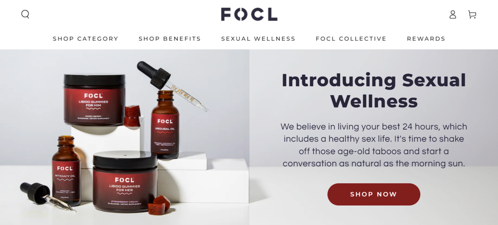
Source: focl.com
Highlight Social Proof
We often look to others for cues on what’s trustworthy or cool. That’s why social proof (think customer reviews, star ratings, and testimonials) is like digital gold for brand engagement.
Plug this into your header, and you’ve got yourself an instant trust-booster right where you need it most.
Amplify trust from the get-go with these power moves:
- Feature star ratings: Got stellar product or service ratings? Show them off! A highly visible star rating in your header instantly signals quality and reliability.
- Utilize testimonials: Short, impactful quotes from satisfied customers can work wonders. Consider using a rotating carousel format to showcase multiple testimonials without cluttering your header.
- Showcase partnerships or accolades: If you’ve teamed up with well-known brands or received industry accolades, don’t hide it. Icons or badges can subtly convey your market cred.
- Make it dynamic: Consider a real-time ticker showcasing recent purchases or positive reviews. This adds an element of urgency and the sense that people are actively engaging with your brand.
Dress Forms USA, a pro in the world of professional dress forms, totally gets this. Their website header comes with a sleek customer reviews flyout that showcases both star ratings and written reviews.
Nothing says “you can trust us” like a five-star rating and rave reviews from real people–right at the top of the page, and Dress Forms know it.
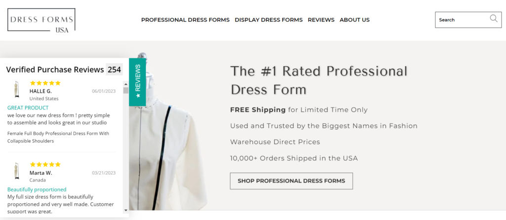
Source: dressformsusa.com
Prioritize Value Propositions Over Product Functionality
Visitors landing on your site are essentially asking one big question: “What’s in it for me?” That’s what you need to answer, front and centre.
At this early stage, people are only scoping out what value you bring to their lives. Your header is prime real estate for making this clear.
You can craft your value proposition by performing the following:
- Speak your customers’ language: Use simple, relatable words that resonate with your target audience. If your visitor feels like you “get” them, you’re halfway to engagement city.
- Be benefit-centric: It’s tempting to feature your shiny features and innovative tech. But remember, at this stage, it’s all about them, not you. Lead with benefits and results.
- Keep it short: Your value proposition should be a quick read. A sentence or a short phrase that packs a punch is ideal.
- Use visual cues: Whether it’s an eye-catching icon or a short video snippet, visual elements can reinforce your message and make it more memorable.
- Test and tweak: Use A/B testing to find out what really clicks with your audience. Small changes can lead to significant improvements in engagement.
Take Nextiva, a brand providing business communications software, for instance. Their header doesn’t dive into jargon about VoIP, cloud solutions, or advanced features. Instead, they hit you with a straightforward value proposition.
In one sentence, they’ve told you the problem they solve and the value they offer–no tech manual required.
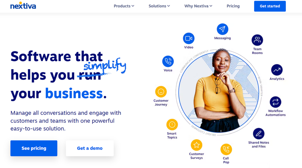
Source: nextiva.com
Enable Intuitive Search
Believe it or not, the search bar holds immense power in shaping a visitor’s experience on your site. If you’ve ever found yourself frustrated with a clunky search feature, you know what we mean.
A well-executed, intuitive search can make the difference between a quick exit and a deeper dive into what you offer.
Here’s how to optimize your search functionality:
- Offer real-time results: Give users what they want, and give it to them now. Real-time search results make for a quicker, more satisfying search experience.
- Use imagery: Text is good, but text with images is better. Thumbnails can make a world of difference in quickly helping users identify what they’re looking for.
- Add structure: Don’t just throw a list of results at your user. Categorize and filter to guide them through the search process and help them zero in on the perfect find.
ManoMano, a DIY and home improvement brand, has this down to an art. When you start typing, a drop-down list swoops in with real-time results and suggestions. You also get thumbnail images alongside product names, adding a layer of visual recognition to your search.
To top it off, they offer structured guidance by categorizing results. That’s intuitive search in action.
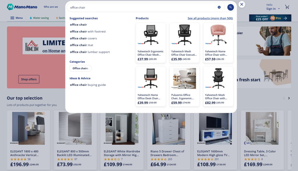
Source: manomano.co.uk
Be Incredibly Clear about What Your Site Does
In a time when the internet bursts with content from all sides, clarity is your best friend.
Your header has one job here: tell visitors exactly what they can expect from your site. No riddles, no gimmicks, just straight facts.
Distill your site’s essence into a clear-as-day header message. Here’s how:
- State your purpose: What’s the primary action you want visitors to take? Whether it’s comparing products, reading articles, or making a purchase, make it obvious.
- Keep it simple: Avoid industry jargon or complex phrases. Aim for a sentence that even a complete outsider to your industry would understand.
- Test for clarity: Run it by a few people who aren’t familiar with your business. If they get what your site is about immediately, you’ve done an excellent job.
- Resist the urge to over-explain: Your header isn’t the place for a paragraph-long mission statement. One line that captures your site’s core function will do.
Check out Medical Alert Buyer’s Guide. They review medical alert systems, and their header couldn’t be clearer: “Compare Pros & Cons of the Top Medical Alert Providers.”
No fluff, no distractions, just a straight-up value proposition. You know instantly what you’re there for, and that’s powerful.
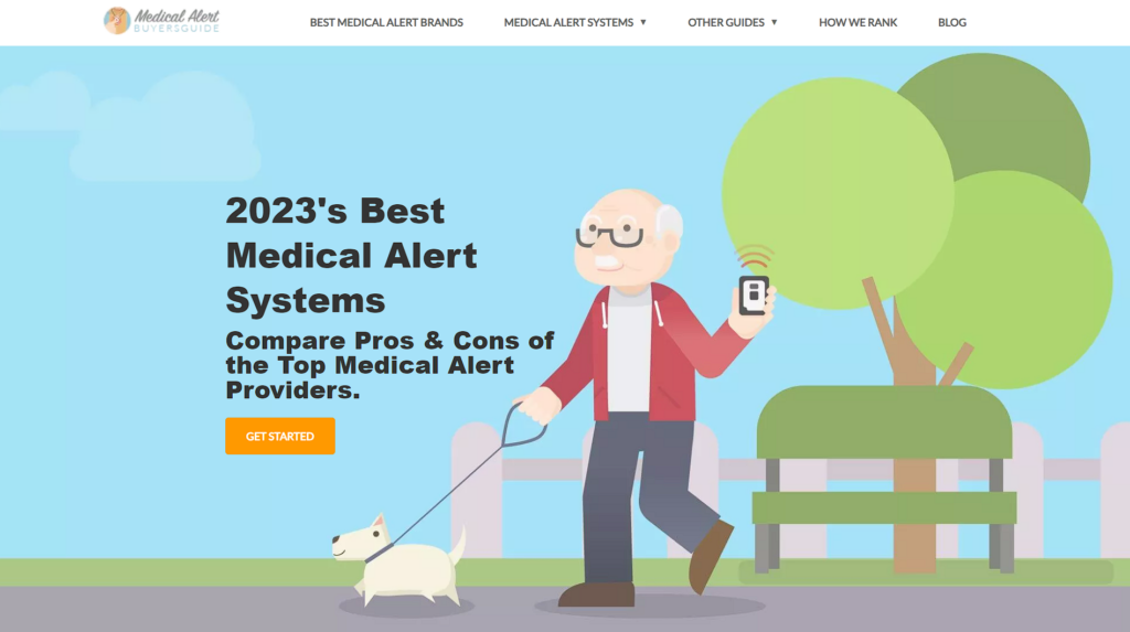
Source: medicalalertbuyersguide.org
Highlight Your Availability
There’s something incredibly reassuring about knowing you can talk to a real person when you have questions or issues. Offering a level of personal interaction can often seal the deal.
Making your availability super clear establishes credibility and greases the wheels for conversion.
Here are some tips on how to highlight your availability like a pro:
- Feature your contact info: Whether it’s a phone number, a chat icon, or an email address, make sure your primary contact method is easy to find.
- Be consistent across pages: Feature your contact details throughout your site to make it as easy as possible for people to get in touch.
- Use visual hierarchy: Make sure your contact info doesn’t get lost in a sea of elements. Use colour, font size, and layout to make it a focal point in your header.
Take a cue from Anytime Baseball Supply, a purveyor of top-notch baseball gear. They prominently feature their phone number and operating hours in the header.
But this isn’t a homepage-only tactic. You’ll find details on other pages deeper within the site, such as their pitching machine balls category page.
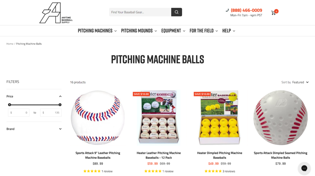
Source: anytimebaseballsupply.com
Be Bold with Calls to Action
Utilize your header to guide your visitors’ next steps, nudging them toward meaningful interactions that can lead to conversion.
Bold, clear calls to action (CTAs) can work like magic here, especially when you consider that the first impressions are often the strongest.
To level up your CTA game, you’ve got to:
- Make it visible: Place your CTA where it can’t be missed. Whether it’s a button, a link, or a drop-down menu, it should be one of the first things a visitor sees.
- Be specific: A vague “Click Here” won’t cut it. Your CTA should tell visitors exactly what they’ll get by taking action.
- Keep it fresh: Switch it up now and then. Whether it’s a new product launch or a special promo, keeping your CTAs current can attract even more eyeballs.
First, we’ll examine Basecamp, a notable project and team management platform. They don’t just have one, but three CTAs in their header, all designed to guide you to a free trial of their service.
Simple yet effective, they’re leveraging the header’s high-visibility real estate to fuel instant engagement.
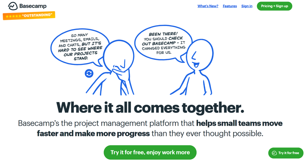
Source: basecamp.com
Another example is eTraining, a leader in online workplace safety courses. Instead of the standard “Click Here” or “Learn More,” they’ve taken a different route.
Their CTA is a UI field that acts as a drop-down menu, listing their product categories. It’s a subtle yet smart way to guide visitors directly to what they’re interested in, and it works like a charm.
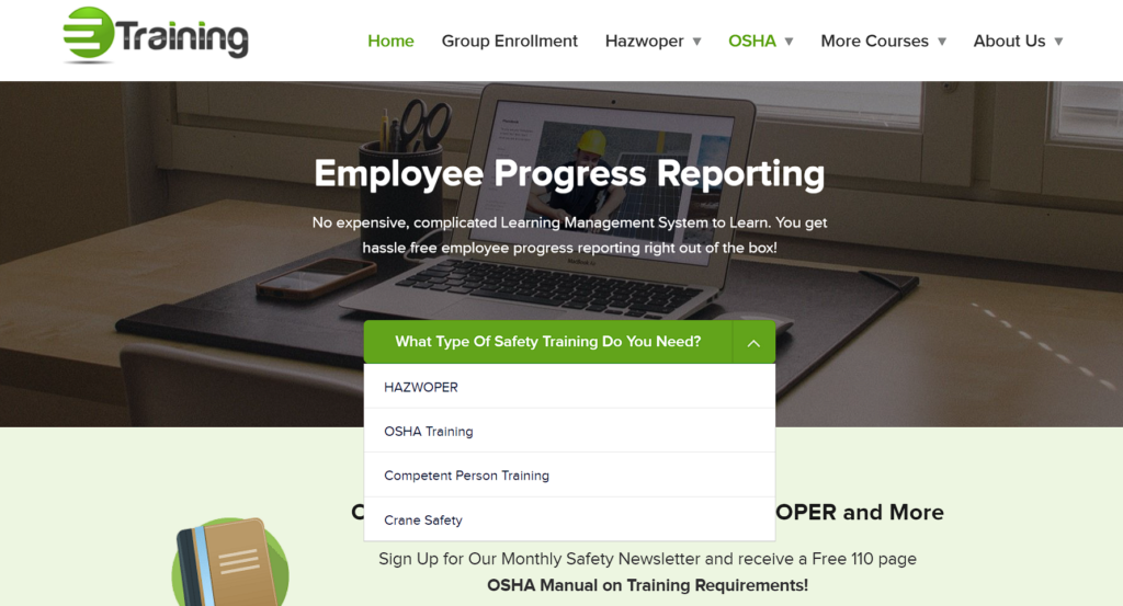
Source: etraintoday.com
Use Negative Space to Highlight Important Messaging
In design, sometimes less truly is more. Negative space (that empty area around your content) can be both a design choice and a strategic tool.
When you maximize the negative space around your key messages or CTAs, you’re putting them in the spotlight. No fuss, no clutter, just focused attention on what really matters.
Here’s your game plan to make negative space your new best friend:
- Declutter the canvas: Start by stripping away any non-essential elements. Icons, excessive text, or any other decorations that don’t serve a purpose should go.
- Centre your key message: Whether it’s a CTA or a value proposition, place it where it’ll get the most eyeballs–usually the centre or upper half of your header.
- Choose colours wisely: A light background usually works best for negative space. It gives the eye a break, making your key message pop even more.
- Know when to stop: Negative space is about balance. You want enough empty space to highlight your message but not so much that your header looks barren or unfinished.
We love how Dribbble, a go-to platform for hiring digital designers, nails this approach. Their header is a minimalist dream: just their value proposition and a central CTA, all set against a white background. It’s a lesson in the magnetic power of simplicity.
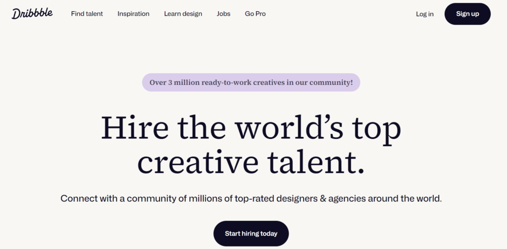
Source: dribbble.com
Final Thoughts
Now, it’s time to turn that top-of-the-page real estate on your website into a high-performing asset.
These header design and copywriting strategies aim to boost conversion and drive action.
So, give your header the makeover it deserves, and watch your engagement soar.
For superior website design services reach out to TechWyse Internet Marketing today! Call (416)-410-7090 or contact us here.