
A case study showed that altering and balancing colour while designing your website can boost conversions by 24%. This is something that is often overlooked.
One cannot imagine how powerful a website with the perfect selection of colours can be for your business.
Selecting suitable colours can draw attention, express intent, create excitement, push conversions, and even earn a customer's loyalty. Good colour selections take thoughtful planning and, when done right, can impact how the audience interprets what they see as much as the layout and copywriting.
We have mowed down some of the vital basics of colour in website design to understand how you can use colour to optimize results and influence your visitors.
Why is colour important in website design?
Selecting the right colours for your website's design is vital for your online success. You can utilize colours to stimulate your visitor's emotions or prompt them to respond to a call-to-action on your website.
Colour encourages us to remember images more vividly than colourless (black and white) images; this can further build brand recognition and encourage your website's visitors to take further actions. Judgement is subconsciously based on colour schemes, so your palette must not contradict your brand's philosophy.
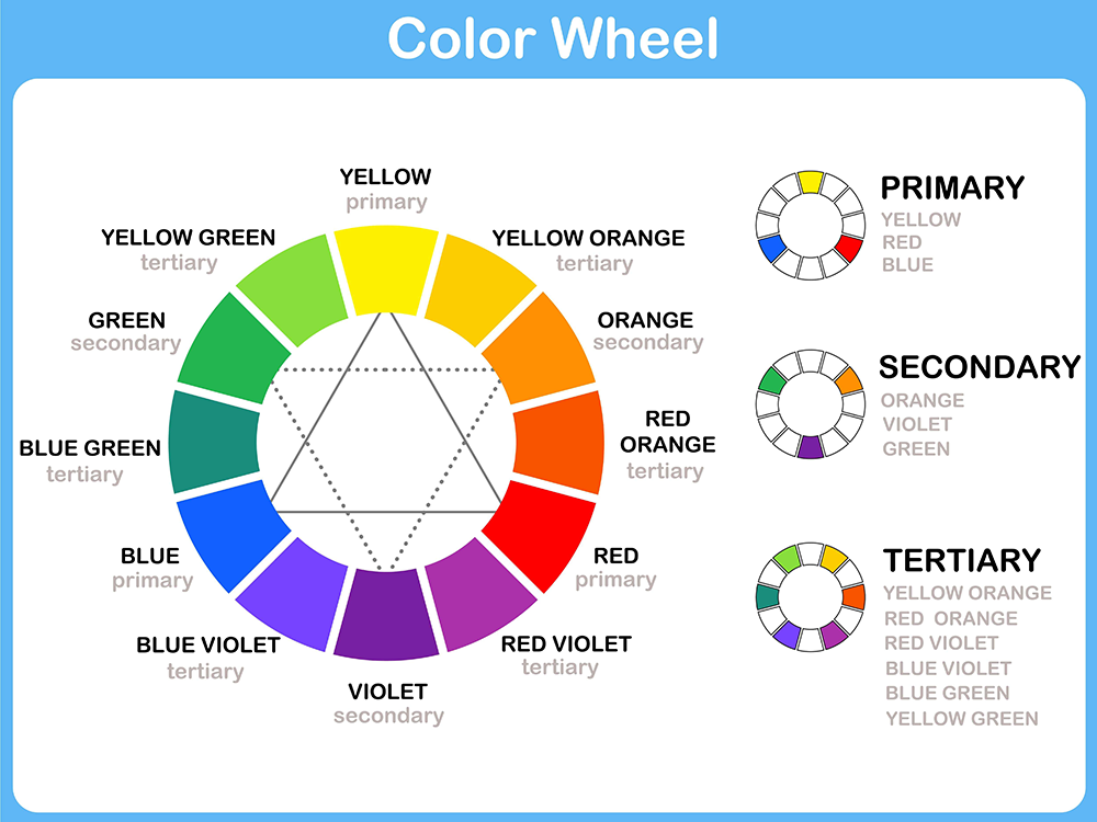
The Anatomy of Colour
Understanding fundamental colour theory is an excellent place to start. It can be a little technical but will support you in understanding the basics of colour relationships. To be extraordinary with your colour selection work, you first have to know the rules and theories, so here is a basic sketch.
The Colour Wheel:
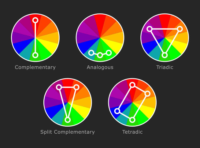
How to Pick Colour Harmonies
The simplest method to select a colour blend or palette is to utilize the colour wheel and implement analogous, monochromatic, complementary and triad colour harmonies.
Understand What Each Colour Stands For
The colour should be relevant to the products and services you are highlighting. As mentioned, it is crucial to associate your product or service with a colour pertinent to your business.
- Red is powerful and attractive. It works well for websites concentrated on products intended for children and encourages visitors to take actions with a "Book now" and "Reserve now" button or call-to-action. Red evokes emotion.
- Orange is usually applied to websites that sell food products. It is acknowledged to increase positive thought and enhance creativity. The colour also appeals to younger audiences. Several professional companies utilize the colour orange.
- Yellow signifies happiness and creativity. It fascinates children and is practiced in sites that sell leisure products. However, yellow can strain the eyes and should be used as an accent colour in most cases.
- Green is pleasing to the human eye. It's great for tourism sites and websites related to nature. Green signifies prosperity and wealth. Green also invokes trust and is one of the most popular corporate colours.
- Blue is a conventional colour with incredibly high trust value. It is known to ease the nervous system. It is fit for websites offering high-tech products and also for nutrition and diet products. Many people mistakenly apply blue as a text colour. This should be avoided as it is not a standard colour for the human eye to read.
- Black is beneficial for websites relating to photography and art.
- Purple is usually used on religious websites and vacation sites.
How to Select the Right Colours for Your Website
Learning the theory behind colours is one thing; picking a thriving colour palette is another. Start with what you know.
Branding: If you have an existing business, start with your brand colours and then think of new colours to incorporate to complement your brand.
Your Audience: The colours you use must also express the emotions that your business aims to communicate. Identify your target demographics and study what colours they respond to.
Trend: Knowing colour trends gives you excellent insight when designing your websites and supports you in creating a new and successful website.
Emotional: Analyze what sort of emotion you want to elicit in your audience when they land on your website.
Balance: Study the colour harmonies; usually, when settling on a colour palette, you'll begin with the dominant colour. Then, you layer your colour palette. Darker colours favour to be seen first and offer more visual weight, then layer, or introduce, lighter colours.
Conclusion:
Colours are everywhere, and when applied accurately, they can support any emotion or action you’d like from your audience. While colours present an essential element in web design, they are not the only website design solution. Colour theory is only one part amongst many that should be considered when designing your website.
Now you know how colours can perform an essential role in your website and logo by helping your brand get noticed and connect with your audience.
Colour is a passionate representation of human personality. It holds a significant influence on the audience’s feelings and behaviours and can make viewers subconsciously uncover feelings and thoughts. With this knowledge, you can create an impact and influence the human mind to benefit your business. Practice colour psychology as your guidepost, but don’t be hesitant to trust your artistic abilities.


on
Hey everyone! I really wanted to make my site by myself – taking into account my preferences. But I also wanted the design of my site to appeal to visitors. I have tried many patterns and combinations. Thanks for your advice guys! With this article, I found a solution that I really like!
on
Its a nice post bro.
on
Just the thing I’ve been looking for! I’ve been on the internet for almost half a day looking for the importance or meaning of each color or what it represents on the website. Thank you so much for this.
on
Awesome post. The choice of color during the designing of website is really important.
on
Participants WOn’t need to bother about getting bombarded or staying eaten using these crack tools.
on
I think the choice of color should directly reflect the essence of ‘passion’ and ‘feelings’ a person shared. This is the reason why red is for love, grey for dullness, white for purity/peace and green for freshness. Every color has a story to narrate and an idea to express. Just understand it 🙂
Thanks for sharing this wonderful post.
on
The site really looks great. Very important information about colour selection in website design.
on
Great Post! I think web design is incomplete if it doesn’t have clear navigation, readability of text and forms to contact.
on
Great and informative post. I found how Importance Color Selection is in Website Design. Thanks for sharing.
on
Had no idea that colors are that important. This should give web designers a better understanding of the importance of colors, that there might be more to colors than it meets the eye. Thanks for the post Cyriac.
on
Done a nice Job Cyriac! Explains color attributes in adequate details. I wonder how color communicates effectively in areas where words fail to reach out. I love green and its shades. This article would help web designers get a better understanding of the importance of colors. Its more striking if you could have added examples for each one mentioned.
on
Good post. As the post explains color is the main element in a website that sets a visitors mood. To convey the proper mood a judicious choice of colors must be made. Your tips would certainly help to pick them proper!
on
It has been reported that companies like McDonalds spend considerable sums of money on color surveys and designing labels that match with their products. Like they say “if a Swiss banker jumps out of a window follow him, he is up to something” so companies like McDonalds must surely know what they are doing. Pay heed to color combination; it is an important option!
on
As it is said ” The first impression is the best impression”a good color combination can create a good impression on a site visitor and make him stay longer. A visitor may discard the site altogether if he doesn’t find it appealing. Yes, taking care of color elements in website design is worth attending to.