In the digital age, having an online presence is essential for almost every business. Naturally, the first step is to build a website, but, before you go any further, make sure that you’ve really thought about the user experience that your website offers.
Whether you’re an online retailer, a service provider, or a software company (or even an agency, for that matter), the impression that your website has on the people who decide to stop by will be a huge factor in what they decide to do next.
If the user experience is poor, they are not likely to convert. They aren’t going to buy your latest pair of designer jeans if the image is cut off, they aren’t going to find the shoes they want if the navigation is not clear, and they certainly aren’t going to call you to fix their toilet if they can’t even find your phone number.
Let’s go over a few ways to ensure that your site provides the type of experience that isn’t going to scare away potential customers.
1) Have Clear Call To Actions
Make sure that your Call To Action (CTA) buttons are accessible and distinguishable from other elements on the page, as well as from each other.
In the header, it’s always a good idea to have a link to your booking form and a click-to-call number if you would like for your users to call you to make an inquiry. For some online businesses, phone communication will not be a priority, but for many service industries, this is the fastest way to connect with potential customers.

If you have two CTA buttons next to each other, it’s a good idea to make sure that the primary call to action (the one that is most important to you as the site or business owner) stands out more than the secondary CTA.

We will talk more about visual hierarchy below, as this will apply to several aspects of your website.
2) Use a Clear Visual Hierarchy
What is visual hierarchy? Visual hierarchy is the practice of making the most important parts of your site the most noticeable so that the user is effectively guided toward whatever it is that they’re looking for (or what you’re looking to get them to do).
Many people tend to read in a Z-pattern, so along the way, we need to make sure that their eyes stop where we want them to. Let’s take a look at the (admittedly corny) example that I’ve put together below.
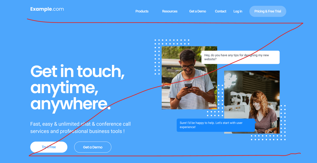
The goal of Example.com is to get users to sign up for a free trial in order to rope them into becoming long-term users. In the header, our eyes start at the brand logo, scan across the navigation menu, and stop at the “Pricing & Free Trial” CTA button.
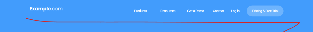
The button’s hierarchy over the other items on the nav bar is established by its background, which makes this nav item stand out among the rest. The element’s “weight” is determined by its size and thickness. Heavier elements are more likely to capture the user’s attention, so keep this in mind when adding buttons as well as text.
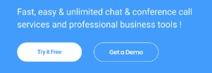
Next, we have the images, then we are drawn to the banner text. There are two text blocks here, with the primary text being much larger than the text below. This is because we want the main value proposition to be read first.
Notice that the “Try it Free” button is given more weight than the smaller text block above. That is because we want the CTA to stand out to the user, so we need to make it heavier than the subheading. The subheading is there to provide additional selling points, but it’s often better to get the user to take action as soon as possible.
3) Use Consistent Fonts, Alignments, and Imagery
As you’ve no doubt gathered by now, the flow of a website is extremely important to user experience. One of the most important ways to ensure that your site’s content flows properly is to be consistent in how you lay it all out.
For example, you should try to stick to one or two fonts across the entire site. One for the headers, and one for the body text. If a user goes from page to page and they all have different fonts and colours, the site may come across as disorganized. Try to keep alignment consistent as well. If you like it centred, keep it centred. If you align it to the left, that’s fine too! Just keep it consistent.
With colours, you can certainly use more than two; just be sure that they complement each other and that the same colours are used throughout the website. The same goes for images - you do not want to have cartoon images on one page and then candid photos on another (or both on the same page).
Pick a theme that suits your site and stick with it! This may seem like common sense to some, but you would be surprised by how often this aspect of a design is overlooked by web developers.
4) Employ A “Mobile First” Design Strategy
With smartphone technology becoming more and more advanced, as well as more and more common, an increasing percentage of your site’s visitors are going to be browsing on mobile devices.
In fact, there’s a good chance that you’re reading this on a mobile device right now, which is why we’ve made sure to make the TechWyse website as mobile friendly as possible. If we look at the screenshot below, we see all the same design principles at work even though there’s less space to work with on a mobile browser.
Make sure that your site is responsive, meaning that it still looks and feels good across all the different dimensions that a smartphone may have, since they do tend to come in all shapes and sizes. For example, if you set specific pixel dimensions for your site’s lead forms, they may be cut off on smaller devices. To avoid this, you could use minimum and maximum dimensions and have your forms adjusted based on the size of the user’s screen.
The Importance of UX Design
We're currently in an era of unprecedented market saturation. No matter what your business or service is, consumers likely have a ton of options to choose from. That's why now, more than ever, it is essential to focus on user experience. It's no longer enough to simply sell a great product or offer a great service. Even competitive pricing may not be enough on its own. Users must be able to visit your website and find it easy to navigate, well-organized and aesthetically pleasing. If they can't find the information you want them to on your site, users will simply go elsewhere.
For this reason, these four tips for user-friendly web design are critical to your success. If you're looking for an example of effective UX design, browse around the TechWyse website. We encourage you to explore our website, take notes, and, if you're in the market for a new website, give us a shout to learn more about our professional website design services!


