Call to actions (CTAs) are an essential part of your overall marketing process. You have probably thought through elements such as your sales funnel and how the CTA button can work to drive conversions. However, there are some specific types of CTAs that drive more conversions than others.
1. Use First Person
Using first-person phrasing could increase your conversions. For example, instead of using words such as “start your free trial,” you would use “start my free trial.” When ContentVerve made this one simple change, it saw a 90 percent increase in click-through rates.
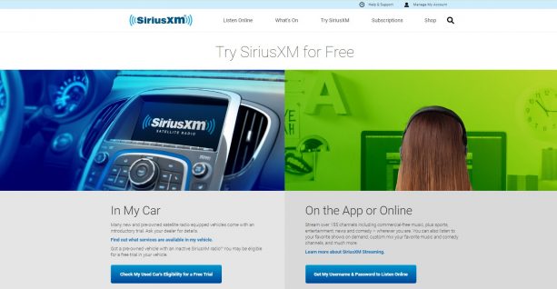
To see how this looks in action, take a look at SiriusXM Radio. They offer a number of CTAs on their landing page. However, one that stands out is the button with first person language that says “Get my username and password to listen online."
2. Add an Arrow
Adding something as simple as an arrow to draw attention to your CTA button can improve conversion rates, but might not be something you’d think to add off the top of your head. In one example, Helzberg Diamonds added an arrow to its CTA and saw an increased conversion rate of 26 percent just by adding this one small detail.
3. Double Call to Action
There are different philosophies about the best placement for a CTA. Some will argue that above the fold works best and there are some statistics to back this up. Others argue that if you want a highly targeted mailing list of people who are the best leads, you’ll want to place your CTA near the bottom of your page with the thought that anyone who makes it that far is truly interested.
The truth is, it likely varies from site visitor to site visitor. So to capture the most conversions possible, it's best to use a double call to action. Place a CTA both near the top and at the bottom of the page. This way, you’ll grab as many site visitors as possible and convert them into potential customers.
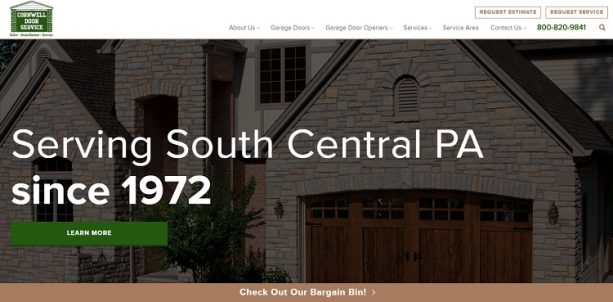
One example of an excellent use of double call to action can be found at Cornwell Door. There is a green CTA button that invites people to "learn more" placed in the top half of the page. Then, at the bottom of the page, there is a sticky bar that says “check out our bargain bin.” This double invitation is certain to reel in more people than using only one CTA on the page.
4. Use Action Words
One thing you’ll notice about most of the examples already offered is that they focus on action words — “learn more” or “get my username.” Using action words entices site visitors to respond and do what you’re calling them to do. There isn’t any confusion over what will happen if they click on that CTA button.
In one example, simply adding the words "place item in cart" helped create 9 percent more conversions than other words. It can be difficult to know which exact words will resonate with your readers. So try different combinations and do some A/B testing to see what works best for your particular audience.
5. Put the Focus on the Call to Actions
Many home pages are completely cluttered with so many different choices. It becomes difficult for readers to cut through the noise. Clear out some of the clutter. Put more of the focus on the CTA to funnel site visitors where you most want them to go.
In one instance, The Weather Channel wanted to encourage site visitors to sign up for its premium services. It cut out all the other clutter on its home page and put the focus on the CTA. Making that change helped them increase conversions by 225 percent, which is an amazing result.
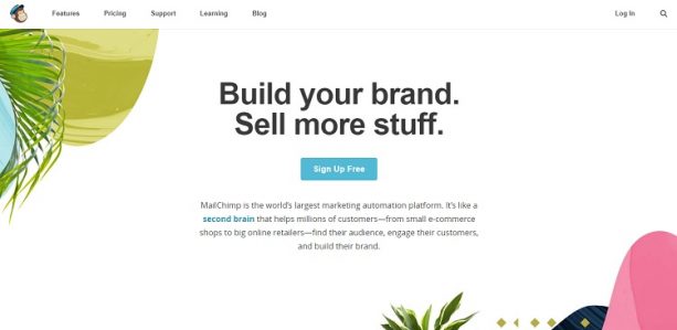
An excellent example of making the CTA a focal point, can be found on the MailChimp website. The page is narrowed down to a blue CTA that reads “Sign up Free.” It is simple and to the point. The assumption is that most people coming to its landing page likely already know they want a mailing list subscription service. While you can still access features, pricing and other info, the focus is on that button and converting visitors into customers — even free ones.
6. Get Specific
While you want to keep the wording fairly short and to the point, don’t be afraid to get specific. When readers know what they’ll get out of the proposition, they’ll be more likely to click on your CTA button and take the step you’re asking them to take.
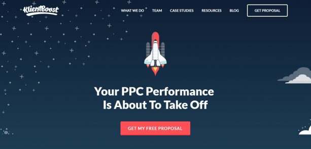
One example of a specific button versus a generic "download now" is the one KlientBoost uses. Instead of something more generic, it got really specific with "get my free proposal." Readers know exactly what they are going to get from KlientBoost when they click on that link. The conversions might not be as high with an extremely specific button. However, they will be high-quality leads who are likely to require your services.
There are many factors that come into play when you’re creating a CTA button for your website. Not only does the wording need to be perfect, but the colour and shape of the button can also have an impact on your conversion rates. Take the time to think through which of these elements works best for the visitors who come to your site.
You’ll also want to consider what exactly you want to accomplish with your CTA. Are you simply collecting leads for future outreach? Do you want to sell something? Do you want to offer a proposal and try to form a future relationship? As you make various changes, take the time to test each one. See what converts better with your customer base to achieve your marketing goals effectively using call to actions.





on
Our search engine optimization plans are designed to hit the target at the right place.
on
“6 Types of Call To Actions That Drive The Most Conversions” Thank you for sharing this use full post on this topic