How many times have you run a paid campaign on social media thinking it will generate results only to realize it was a colossal waste of money?
Your ad campaign’s failure can be attributed to a variety of factors, but in this article, we will talk about one of the main reasons social media ads fail — poor ad creatives.
It’s interesting to note that while social ad impressions are up by 20%, the average global social click-through rates are down 30%. This means that even though people might be seeing your ad, they aren’t clicking on it.
The key to creating an engaging, click-worthy ad lies in its design. It’s important to constantly update your creatives to capture attention and generate interest.
Venngage recently compiled the biggest graphic design trends that will dominate 2021. This article will tell you more about how you can apply those trends to refresh your social media ads and design better ones that attract clicks.
1. Muted Color Palettes
It’s common to think that using bold and vibrant colours in your creatives is the easiest way to stand out in a noisy timeline, but that’s not always the case.
There was a time when bold colours were the go-to option but not anymore. There has been a gradual shift to muted colours in the recent past.
Muted colours are vivid colours that have been saturated with a hint of black, white, or any other complementary colour.
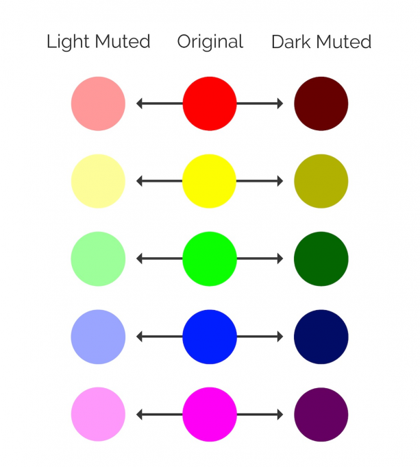
Source: Venngage
Their ‘desaturated’ look makes them feel more genuine and organic, leaving viewers with a safe and secure feeling. It makes your brand seem more authentic, making it easier for your audience to trust you.
Another positive to be gained from using muted colour palettes is that they blend well with light and dark-coloured text without overpowering your ad’s key message.
Here’s an example of an Oscar Health ad that uses muted colours in its creatives.

2. Simple Data Visualizations
While using lifestyle imagery or showing your product in action is great, one of the most effective ways to get people to stop scrolling and click on the ad call-to-action is by using data visualizations.
We can all agree that data is powerful. It engages readers and inspires them to take action.
According to an Econsultancy article, “with data presenting a complex and often confusing picture, it can be much more effective to build a narrative based on that data – one that communicates the argument and conclusion much more clearly than a set of numbers can.”
How do you do that? With the use of effective data visualizations.
They let you convey complex information and weave a meaningful story without overwhelming the audience. Here are some types of data visualizations you can use in your social media ad creatives:
- Infographics
- Charts and graphs
- Maps
- Diagrams
What’s important is using a simple data visualization that is focused on a single data point or statistic. This makes it easier for readers to grasp and comprehend it with ease.
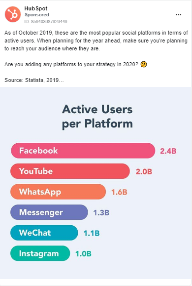
Here’s an example of an ad by HubSpot. They’ve used a horizontal bar graph to highlight popular social media platforms.
3. Flat Icons & Illustrations
If you’re still using run-of-the-mill stock imagery in your social media ad creatives, you’re doing it wrong. They are unrelatable, uninspiring, and entirely missable.
Nielsen Norman Group’s eye-tracking study further reaffirms this. The study revealed that stock photos are largely ignored compared to photos of real people.
One of the best ways to upgrade your visuals is by using icons and illustrations instead.
As per the latest graphic design trends, flat icons and illustrations have grown to become hugely popular. They are visually appealing, easy to consume, and engaging.
Icons and illustrations are all the more useful for brands selling intangible products because they help you explain abstract concepts effectively.
Let’s say you are promoting lead generation software. You can use icons to clearly articulate features or reinforce the benefits with illustrations. This will give the audience a better idea of your software.
Here’s an example of Salesforce using a flat illustration to communicate the message.

4. Classic Serif Fonts
Most of the time, visuals alone do all the talking, but there will be instances when you might feel the need to overlay text on the ad creative to reinforce the message and give it more context.
The font you choose for the text can make a huge difference in its impact on the viewer. It needs to be appropriately sized and placed such that it complements the visual and doesn’t overpower it.
The classic Serif fonts are a safe and reliable font style to opt for. They come across as classic and elegant while being easy on the eye.
Mailchimp is known to use Serif fonts in their visuals. Notice how the text in the ad is to the point and well-placed.

5. Social Slide Decks
You must have seen multi-image organic posts doing the rounds on Facebook, Instagram, and LinkedIn. It’s a good idea to include them in your social media paid campaigns too.
The team at Venngage noticed that slide decks get about 10-20x more impressions and clicks than a simple visual.
Carousel posts or social slide decks let you condense a lot of information in one post while keeping the reader engaged. You might also want to combine a mix of static images, GIFs, and videos to strengthen the story and get your audience to keep swiping through.
Make sure every slide is focused on one key takeaway, making it easier for people to grasp the information.
Take a look at this slide deck ad by UpWork. It uses this format to demonstrate the range of remote developers companies can hire on their platform.

6. Text-Heavy Videos
Whether you’re trying to build brand awareness, generate leads, or promote a contest, video ads are always more effective.
Not only do they have higher reach, but they also drive more engagement and improve conversion rate optimization.
What is interesting to note is the rise of text-heavy videos. These videos combine motion graphics and text overlay. Considering the fact that 85% of Facebook videos are watched without sound, this isn’t surprising.
So, the next time you’re creating a video ad for social media, consider adding text along with video clips or animations. The text needs to be legible and crisp so that it doesn’t distract the viewer from the video.
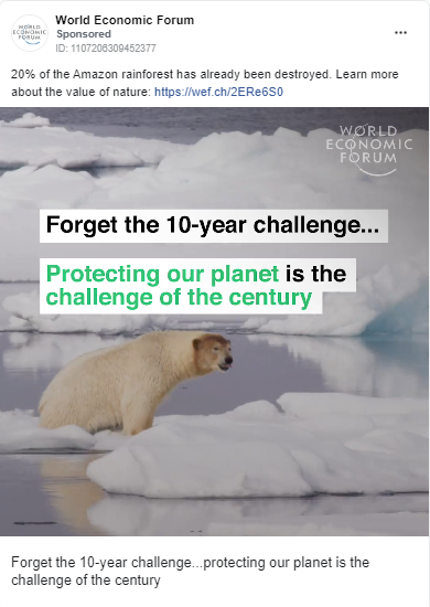
Here’s a text-heavy video ad by the World Economic Forum. They combine text, video clips, and background music to create an engaging story, compelling people to know more.
The takeaway: design engaging social media ads with the newest graphic design trends
If you’ve been rehashing creatives from the previous years, it’s time to do things differently.
These latest graphic design trends of 2021 will help you design more engaging social media ads that generate clicks.
To further optimize your ad campaigns, it’s also a good idea to use A/B testing tools. This will help you understand which ad creative variations are most effective while increasing conversions in the process.


on
Useful Post. Thanks For sharing