Back in 2015, Google’s first mobile based search algorithm update sent shivers down the spines of web masters and SEO specialists across the board. The term “Mobilegeddon” was thrown around with free abandon and hinted at the huge downside that non-mobile friendly sites were about to face. While less fearful than anticipated, non-mobile friendly sites saw a 12% dip in organic traffic post the update. When these penalized sites tried to make up lost traffic with paid traffic on Google, they found that their CPC went up by an average of 16%. How’s that for a double whammy!
That first brush with Google’s mobile update prepared marketers to acknowledge the importance of the mobile user and optimize their content with this new breed of users in mind. With Google’s latest mobile-first index announced in March 2023 and rolled out to the majority of websites across its various country code TLDs in September 2023, the spotlight on mobile has only intensified.
Today, over 55% of all web traffic comes from mobile devices, as per data from StatCounter. Surprisingly however, conversion rates have not kept up. Desktop visits still account for a higher conversion rate than mobile. Which means marketers are leaving money on the table with a huge majority of mobile visits that is up for grabs.
When the traffic’s already there, why not capitalize on it and convert it to revenue? All that’s needed is a little mobile-first thinking when building and optimizing sites for conversions. Here’s how to take those first, steady steps towards mobile-first landing pages.
CRO Mobile Location: One Purpose, One Message
Today’s web user is a famously distracted species. This is even more true on mobile than desktop. Cater to your distracted mobile user by telling them exactly what you want them to do, in as few words as possible.
Let the golden rule of landing pages guide you here. Your landing page should have just one clear message. Period.
Avoid confusing users with multiple Calls to Action (CTAs) and a load of interesting but maybe not really relevant content. Keep your sentences short and your content skimmable. Large headings with text broken up into easy-to-read blocks of one to two sentences each are ideal for use on landing pages.
Virgin America took this approach and restricted their mobile landing pages to just one simple CTA – book a flight. They did away with all offers and distractions on the page – and voila – mobile users on the Virgin America site could now book flights twice as fast as before, resulting in a 14% increase in conversion rate!
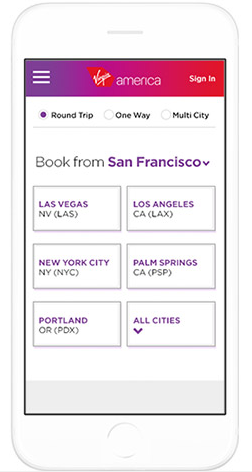
It is important to streamline your website conversion optimization process – it’s not something you always can leave up to your web or app design/development team. For instance, Virgin America used the services of an agency called Work & Co. which focuses on “collaborative concepting” where team members with both technical and soft skills don multiple and varying roles as per the needs of the project, as opposed to an account-driven approach to managing client expectations. Such a bottom-up methodology is fundamental to getting your message across and convincing the end customer via any digital platform.
Personalized Journeys
Personalization has long been a buzzword for marketers, web designers and developers alike. Trouble is, not many know what to personalize or even how to do it. Most just leave it at exit pop-ups or product recommendations on e-commerce sites.
Here's the good news first. We know that personalization, when done well, does help convert more visitors.
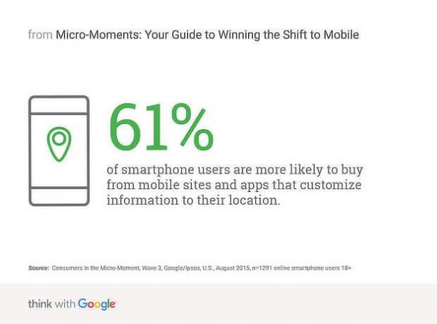
Now for the hard part. How does one personalize landing pages to push up conversions?
You could start with a simple, yet super-effective personalization tactic: geo-targeting. Identify your users’ location from their mobile device and serve them messaging that is directly relevant to where they are. This could be as simple as a custom greeting like “Hey there, New Yorker!” or a personalized offer like “Use coupon code XYZ123 at the Starbucks on 5th Avenue to get 15% off your order!”
A tap-to-call option is another great way of personalizing your landing pages. In this context, the personalized tap-to-call feature checks for the time of a user’s visit and serves up the appropriate message accordingly – your visitors could have the option of calling your office during work hours or leaving a short message via a form if they want to get in touch after hours.
Once your marketing team has an idea of how your website content guides the typical customer journey, you can implement trigger-based personalization using a web builder tool such as Duda. Based on the location, time, number of visits, or campaign URLs that drive your mobile visitors, you can customize their experience using pop-ups, scripts, or special promotion displays and nudge them towards predefined actions.
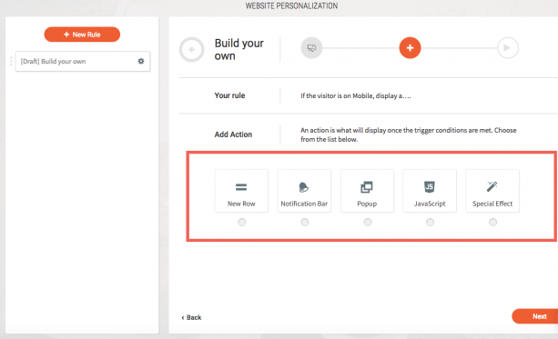
Of course, your personalization options would depend on your conversion objective, your industry, as well as practical matters like your budget. No matter, what those variables may be, there’s always a way to tell your customers how important they are!
CRO Mobile Location: Fast, Quick, Speedy
I know you’re rolling your eyes because you’ve heard this a thousand times before. Hear me out for 1,001st time. The importance of page loading speed on mobile cannot be emphasized enough. Your site speed can make or break your traffic and conversions on mobile. Data from Google shows that 53% of mobile visits are abandoned if a site takes longer than 3 seconds to load.
So here’s your target: Reduce page load times on mobile to under 3 seconds.
When Walmart’s mobile site reduced their page load times from 7.2 seconds to a mere 2.9 seconds, conversions went up by 2% for every second saved.
There are many ways to achieve these faster load times:
- Start by converting your key landing pages to AMP. Google’s new mobile-first index clearly works best with AMP pages. Take advantage of this and switch now.
- Do away with unnecessary images. Shave down the size of the remaining ones to help them load faster.
- Avoid custom fonts that slow down the page load process.
- Reduce the load on your database by setting up caching for your pages.
- Get rid of website bloat at the backend by deleting plugins you no longer use.
Go from Responsive to Mobile-First Design
It’s 2018 – you don’t need me to tell you that your site must have a responsive design! The ability to render your content seamlessly on mobile devices is non-negotiable and responsive design is an effective means to that end.
Instead of retrofitting a desktop design for a small mobile screen, it’s time that designers started with a mobile-first approach. Remember the mobile traffic data we spoke of earlier? Remember which version Google prioritizes for answering search queries? That’s right, the mobile-first index has rolled out for most sites on the internet now. Again, tools come to marketers’ rescue here – you can use Zeo’s Mobile First Index Checker to check whether your site meets the necessary parameters for mobile first indexing or not:
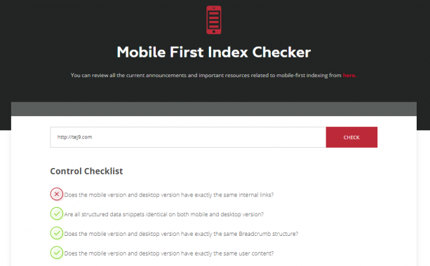
<embed GIF: https://www.producthunt.com/posts/mobile-first-index-checker>
When you start designing with a blank canvas that’s the size of the average smartphone screen, you’ll appreciate the need for brevity and white space in your web design. Aim for landing pages that have room to breathe and are easy to navigate. Think big when it comes to elements like white space, CTAs and text. Having larger buttons helps to avoid fat-finger syndrome and nudges conversions along just so.
This is all the more important for e-commerce sites, where every product page or category page is potentially a landing page. Once retailers get their SEO right, they need to level up and optimize every page for mobile browsing (and selling).
Now, a word about visuals. Designers love images. Unfortunately, not only do too many images slow down a page but they also distract users and reduce conversion rate, as the Google study we referred earlier revealed.
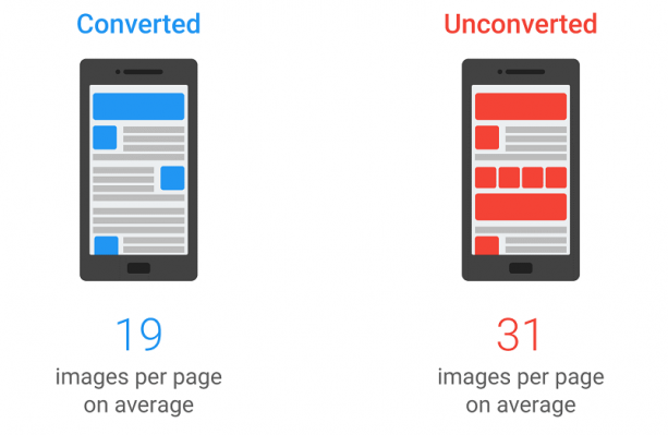
Carry this minimal design aesthetic to other page elements as well. Whittle away elements that are ornamental, focusing only on those that will actually help a conversion. That probably means the contact form stays (with lesser fields), while your Twitter widget gets moved to some page else.
How Optimized Are Your Landing Pages?
Conversion optimization is like a jungle gym for the willing marketer. The various permutations and combinations you can create to grow conversions are endless. Throw the variable of mobile devices into the mix and those options start getting even more interesting. So be it shorter contact forms or bigger CTA buttons, every step you take towards improving your mobile conversions – even testing your existing elements – is a leap in the right direction.




on
Best article thank you
on
thanks for this article. My rankings improved by using this thanks a lot again
on
Good Article. great post thank you for posting..
on
Great article !! As I am a web developer myself, I always look for such wonderful posts to build up my knowledge in the field.
Thank for sharing. Keep up the good work
on
Great post. Keep posting such kind of info on your page. Am really impressed by your blog.