Life is motion. And in the digital world, that translates into websites that use motion to attract visitors.
The concept of motion and animation in web design isn’t new, but it’s still important.
Here's how you can get started with adding animation into your website.
Animate Page Loads
Back in the day, when pages were loading, you would be stuck with a blank screen and a loading cursor.
Nowadays, when users are brought to a blank page like that, chances are, they may believe that your website isn't loading.
When visitors are waiting for your website to load, you can add a bit of animation to it - especially if you know your page loads slowly. Ideally, you would fix the page load speed. However, if that’s just not possible, then adding an animation for the loading is probably a good idea.
You don't have to stop there. Animation can also be used to let users wait for changes on the website. For example, if you're using Innovative Humans Ltd to translate your website from one language to another. You can include an animation to let users know that the content is being processed.
Use Infinite Scrolling
Infinite scrolling pages, or “single page websites,” use motion as an inherent part of the web design. Check out a demo of infinite scrolling here.
Rather than having users click on links, users scroll to get to different sections of the website. When users continue to scroll down the page, the content will load and appear on the screen.
Depending on your business, this can create a simpler and more elegant user experience.
However, keep in mind that you need to ensure you're optimizing the website correctly for search engines.
Motion In Numbers, Charts, and Graphs
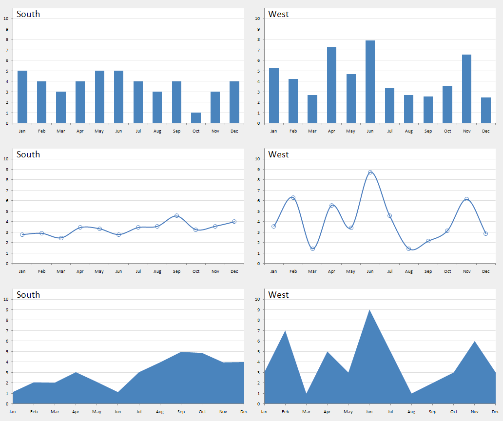
Animating graphs, numbers, and charts as users scroll helps to bring data to life. By presenting data in motion, it allows users to see the changes that have occurred over time. In addition, it presents data in a way that is more engaging and interactive.
It’s almost impossible to use animated graphs and numbers too frequently. Anytime you can simplify something that’s perceived as being inherently difficult (i.e. math), putting them into graphs and charts make it easier to digest for users. For businesses that need to show a lot of numbers and graphs, it can be an interesting and engaging way to hold a user’s attention.
Background Videos
Background videos in the header, or even throughout the website page helps to bring content alive. The trend right now is to use a title overlay on a video, which creates the feeling that the title of the page is coming to life.
Logistically, this works by uploading and looping a short video in the background. A special plugin or configuration is needed to make this happen. Most designers are able to implement this into your website. However, if you're not a web designer, you can easily purchase a theme package or template with this functionality already built in.
Using GIFs
GIFs have been a huge trend for everything online. Short animations can work within blog posts and on web pages to bring an idea to life. GIFs also have the benefit of being low-resource animations.
With video, you usually have to upload to a third party site because the video takes up a lot of bandwidths when users play it. And, a highly-trafficked site can be crashed by too many users playing the video. GIFs, on the other hand, is simple to upload and can easily be added to your content.
Background Image Scrolling
Have you ever seen websites with a background image poking through a flat color foreground? This is a design trend that has really taken off in recent years. The idea of using images as the background on websites is old. But, the idea that they can become a permanent fixture in the background, serving the purpose of what whitespace used to, is new.
And, if done right, it can be used to add dimension to your webpage.
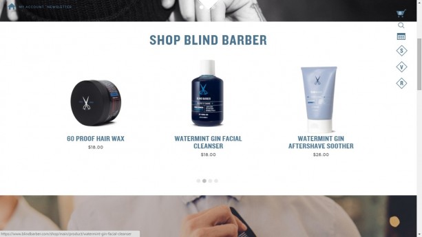
This needs to be implemented carefully. Too much of a good thing can become a bad thing. Stick to one image per page and try not to use this on every page of the site. Instead, think of it as a highlight - a way to accent certain pages of the site. Make them stand out. Otherwise, your users could experience sensory overload and bounce.
Modular Scrolling
Modular scrolling can be used to create context and allow users to move through your site without having to necessarily change views or navigate to another page. The Hotel De Rome website is a perfect example of this. You can see the left and right side of the page move independently. You’re able to navigate through multiple rooms and get a feel for what the hotel is like without loading a new page.
If you implement this correctly, you can avoid sensory overload. Instead, you can provide a much richer user experience for your website visitors.
The Major Disadvantage Of Motion Design
With all good things, there come a few bad things. Designers love the idea of spinning graphics, modular scrolling, and anything that’s eye-catching. Sometimes, that can be a problem itself. If designers employ too many elements of motion design in a website, it can become distracting to the user and may affect the loading speed of your page.
Instead of focusing on the content on your website, users are forced to pay attention to the whiz-bang stuff floating around on the page. According to Nielsen Norman Group, these kinds of high-tech designs can actually hurt usability and ruin the user experience.
If pages take longer than 1 second to load, expect readers to bounce. So, while useful graphics, images, and video can help users understand your value proposition, they have to be tempered by the realistic load times achievable onsite.
Layout and design should augment the content you’ve already written. It should present it in novel ways. It shouldn’t become the content. Unfortunately, many make the mistake of attempting to use design as the content.
Let us know in the comment below what you think about motion in web design? Have you implemented this strategy for your website? What kind of results are your receiving?






on
I love motion design. I try to implement background scrolling (I believe it’s also known as “parallax scrolling”) and animated menus and graphs everytime I can, they make the website look modern and up to date (and awesome, of course), but I’m usually forced to omit other effects to avoid slowdowns.