When you've decided that owning a website is the next step for your business, or if you’re simply interested in creating one for a personal reason, you'll probably begin your search for the best website builder.
One of the biggest problem for most of these quick online website builders is that they don’t give you the highest quality. Since you're competing with billions of websites on the web, it’s time to think about the different things you can do to make your website stand out.
1)The 5 Second Rule
No, I'm not referring to the time you have to pick up the piece of food you dropped. I'm referring to the time your visitors have to make a decision about your website.
An average website user will decide whether they are going to stay on your site or leave within the first 5-8 seconds of being on your page. This means you have a very short amount of time to make a strong first impression.
So make it captivating, make a user want to stay and tell the user how you can help them! However, make sure you're not throwing too much information at your audience because that can cause them to leave.
Also on TechWyse
What is the Current State of Responsive Web Design?
A Historical Look at the Evolution of Web Design
2)Readability
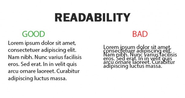
Most websites have some type of text on them to describe their products, services, and business. You want to ensure that the text is formatted properly so a reader can read and digest the information effectively.
The information and content on your website should be eligible and have optimal readability. Some key factors to consider include:
- Using easy to read typography and fonts
- Making your texts short and sweet (average readers only read 30% of text on web pages)
- Implementing bullet points and lists
- Ensuring that there is sufficient spacing between paragraphs and sentences
- Include proper headings
- Use a call to action and make sure that your message is conveyed clearly
Even though multimedia is increasing in popularity, text is still a great way to effectively communicate your message to a user.
3) Responsive and Mobile Optimized Websites

Think about the people that you will be catering to, such as the readers that are constantly on-the-go. Not everyone has the opportunity browse the web on their laptop on the train or bus, instead they’ll rely on their smartphone and other mobile devices. It is essential that your website is not only responsive but that it’s also mobile optimized for the highest level of success. When a reader visits your page, they should be able to view it just as effectively on their mobile device as they would on their computer at home.
This is especially important after Googles update in April 2015 known as Mobilegeddon. Google saw a near 5% increase in sites being mobile friendly during March & April leading up to this update. Although this update was not as dire as the name implied, some businesses saw a noticeable drop in traffic.
4) Sophisticated and Simple
When designing websites was all the rage in the past, people would flood the pages with oversized images, huge but minimal text, and other features that simply make a website look unappealing and quite unprofessional. The more sophisticated your design is, the more streamlined it will appear and customers will be more likely to want to know more about your products and/or services.
For some industries, sticking to a simple design is a better option because your information will have a larger impact than huge pictures and text. However, if you are more concerned with having a big interactive business card to show off, then there are some web design trends that are for you. There are a lot of cool tricks web developers are using that are becoming very popular. Check out a few cutting edge websites I’ve seen recently:
- http://ideasbymusic.com
- http://www.homefrontsolutionsinc.com
- http://www.ratatattoo.it
5)Delicately Placed Advertisements
It’s commonly known that unless you’re offering a product or a service, the main way to make money from your website is through ad revenue. With that being said, do not clog your entire page with advertisements, as this is not only bad for SEO purposes, but it is also quite annoying for readers. The more ads that you have placed in inconvenient locations, the less likely readers will be to return to your website in the future.
6)Imagery
An often overlooked part of webpage design is the imagery you choose.
Do I go with stock photography? Do I use custom imagery from my company’s photo library?
The main concern you should have with imagery is that it is high resolution. As much as you may want to use custom imagery, you can’t just snap a picture on an old cell phone and expect it to look good on the site. At the same time, you don’t want to pick the same stock photo that everyone else in your industry is using on their page. So be creative, think of what works for you and your business and choose accordingly!
7)Call to Action

An often overlooked but crucial part of websites. As tip #1 states, users have short attention spans. If you aren’t telling them where to click, how you can help or what to do, it is likely that they will just leave your site.
You want to clearly state to the user what action you want them to take - “Buy now”, “Request information”, “Add to Cart.” These are all popular call to actions that will increase conversions on your site. You don’t want to overdo it and annoy your visitors, but these call to actions must be prevalent throughout the site and not just on the main page.
What if a user visits your site from a search engine directly to an inner page? Do you have a relevant call to action on that page to convert that user into a lead?
These tips should be a good starting point for you to help you decide which direction you want to start with your website and some of the important things to look out for. Decide what is most important for you and your visitors and make sure it is apparent when you design your site.


on
This was an incredibly wonderful article. Thanks for supplying these details.
on
Hi. I just wanted to say that your writing is great. It is very enjoyable to read. Please keep writing.
on
I will recommend this website to everyone. Thanks for the good information, I enjoyed reading it.
on
Excellent post with excellent information. Thanks for sharing us, its very helpful for me. I have you bookmarked to check out new stuff you post. Keep sharing. Further info
on
Excellent post with excellent information. Thanks for sharing us, its very helpful for me. I have you bookmarked to check out new stuff you post. Keep sharing. Further info
on
Thanks for sharing the useful information with us. Your blog is well written and easy to understand you have skills to grab the attention of peoples towards your blog.
on
Nice tips for awesome web site design. Thank you so much!
on
Hey there, I have a question about #3. Do you think it makes sense to exclude animation effects that make the website more engaging on desktop for mobile optimization?
on
Thanks for sharing these tips with us. This blog is rally very helpful for me. Also for future.
on
All very good tips! I see websites without a clear message in the first 10 seconds of view and also readability is often not taken into account.
Thanks for sharing!
on
This is a very important article for making the web design tips and I think web design is one of the most important factors for the success of a website. I appreciate your work.
on
Thanks a bunch for the tips
on
I tried making a good website every time but for some reasons, it does not go well. After reading this article I have learnt something which will boost my skills and of course some knowledge. Thanks a lot!!!
on
Great post Mike, thanks for sharing. Adding to your tips, we can highlight or bold the main service keyword or phrase in content section that we are offering through the website. The highlighted phrase or word would get quick audience eye sight and attention and this leads to user engagement.
It is always good to place or highlight ‘OFFERS’ in homepage banner itself. This would bring more user clicks and views. Also, showing a pop-up after 3sec when a user logged into the site to remind the existing offers or hot deals.
Site search box, by providing a search box inside a website would help for a user to navigate into the inner pages without spending too much time to find required things.
on
Nice blog Mike. I was surprised you’d wait 5 seconds after food dropped on the floor. Other than that, I agree with everything you talked about on this blog!
on
Tip #7 – I agree the Call to Action (and many opportunities for the prospect to do so on the homepage is importart.
The website for home front solutions is very fresh/modern.
IDeas by Music – doesn’t seem to have many call to actions.
Ratattoo loads slowly, maybe image compression?