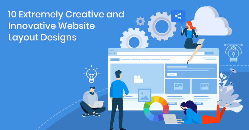
Good website design can create wonders for your business, and the layout is an essential aspect of creative and innovative web design.
If your website has a good layout, visitors will not only enjoy a smooth experience but will also admire the clean appearance of your website. The purpose of a good layout is to draw your target audience towards your website.
You must be able to serve your users' needs and enhance their experience on your website with an innovative and original layout. What will your target users want to see first? How can you get your company's message through to them? What can you add to your layout to make it stand out?
We have found 10 of the most creative and innovative website layouts to give your creativity a spark!
1. Montage
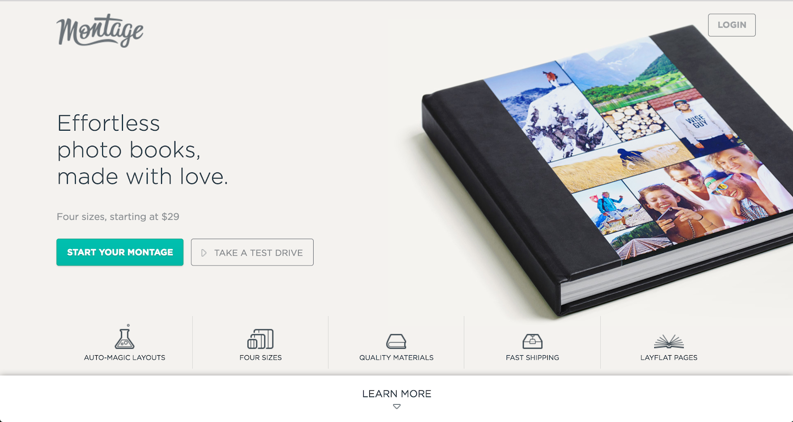
Montage makes it simple for their busy users to make a quick decision with their easy to manoeuvre homepage containing product details and testimonials. This site is an excellent example of a website that profoundly highlights its products. The sticky sub-navigation helps users to easily navigate around the page to discover what they are looking for!
2. Revols
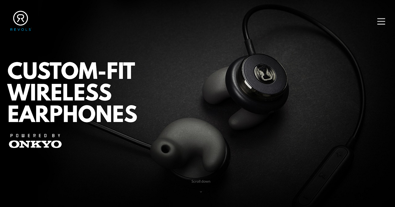
Revols has a bold website with enlarged photography and videos of its small, sophisticated headphones. The photos and videos on the site make it more product-focused, allowing users to dwell deep in the experience these headphones have to offer. The large font on the website is a nice touch as it adds to the larger-than-life earbud photography.
3. Morgan Stanley
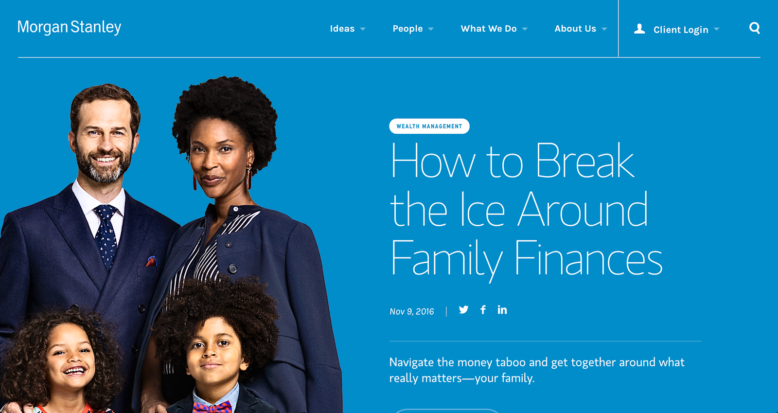
Unlike most product-focused sites, Morgan Stanley features an article on its homepage to drive a significant amount. The rest of the website's layout plays with a grid-focused design to organize all their previously published articles!
4. Boosted
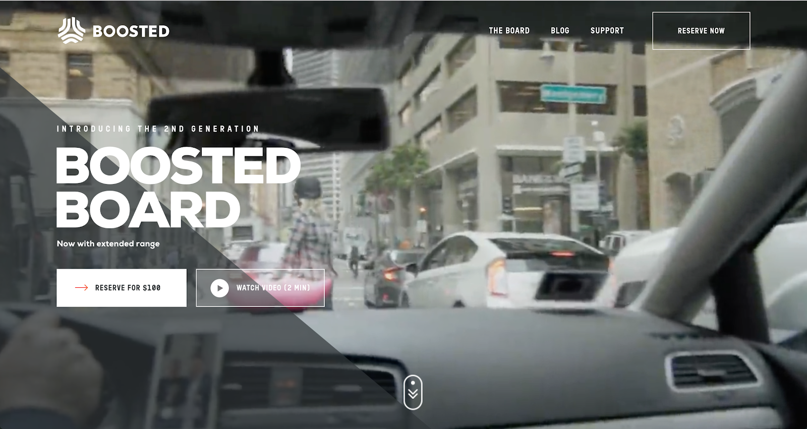
If you go through this website, you will see how Boosted took an average skateboard to the next level with amazing photography accompanied by a detailed product description. The site's grey tone with the white background allows users to focus on the orange call-to-action buttons. Boosted also has a blog highlighting any product issues, which adds a good deal of transparency to the company!
5. Wozber
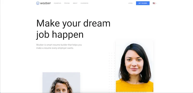
Wozber did a great job breaking down the process involved to make your resume perfect. Its homepage outlines all the steps which are further explained in individual sections. The site also displays resumes they have made to give potential customers an idea of how the finished product would look before signing up!
6. Quiver
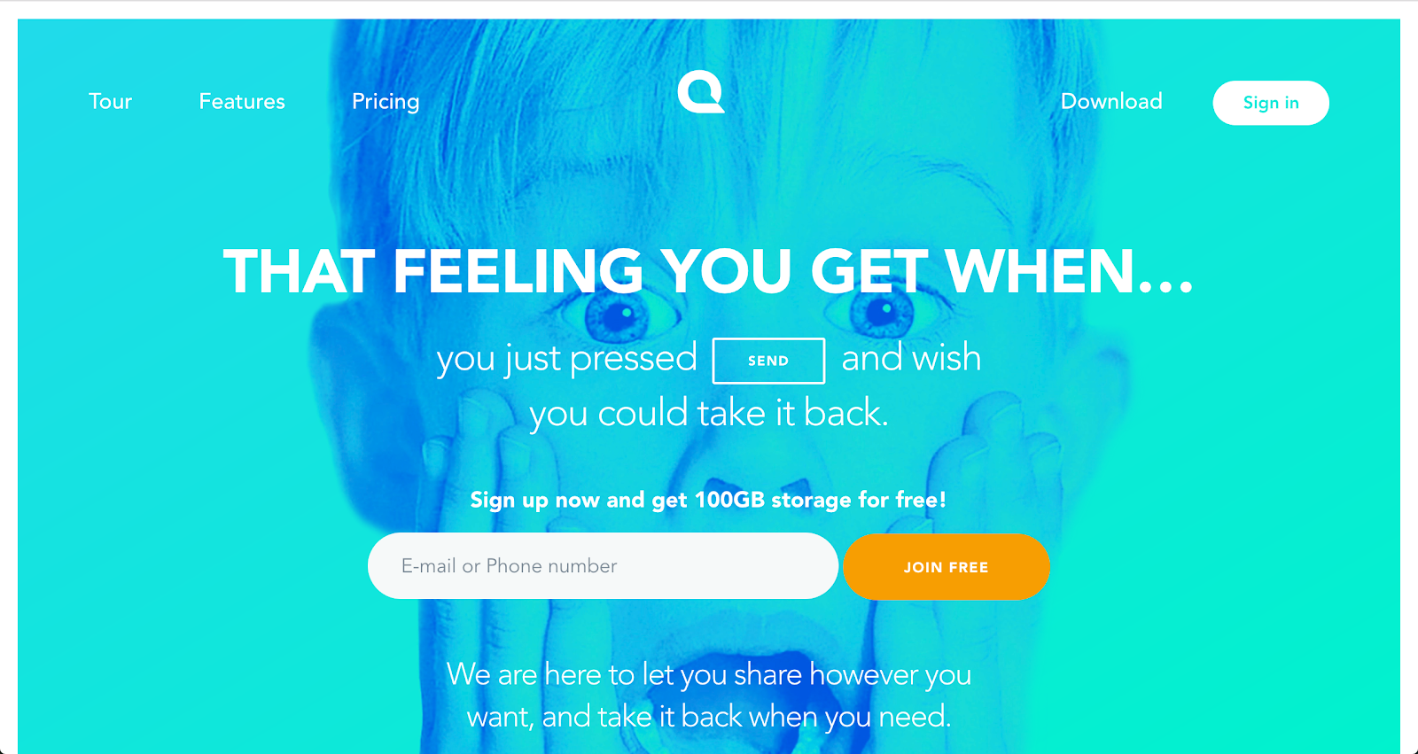
Quiver utilizes colour and emotion to grab your attention. As soon as you land on their homepage, the colourful background and bold copy is the first thing you see. They have also included a signup form above the fold, instead of a button to send visitors to a different sign page altogether.
Their product and featured pages do a fantastic job of displaying their software with small interactive elements to show how the product works!
7. Campos Coffee
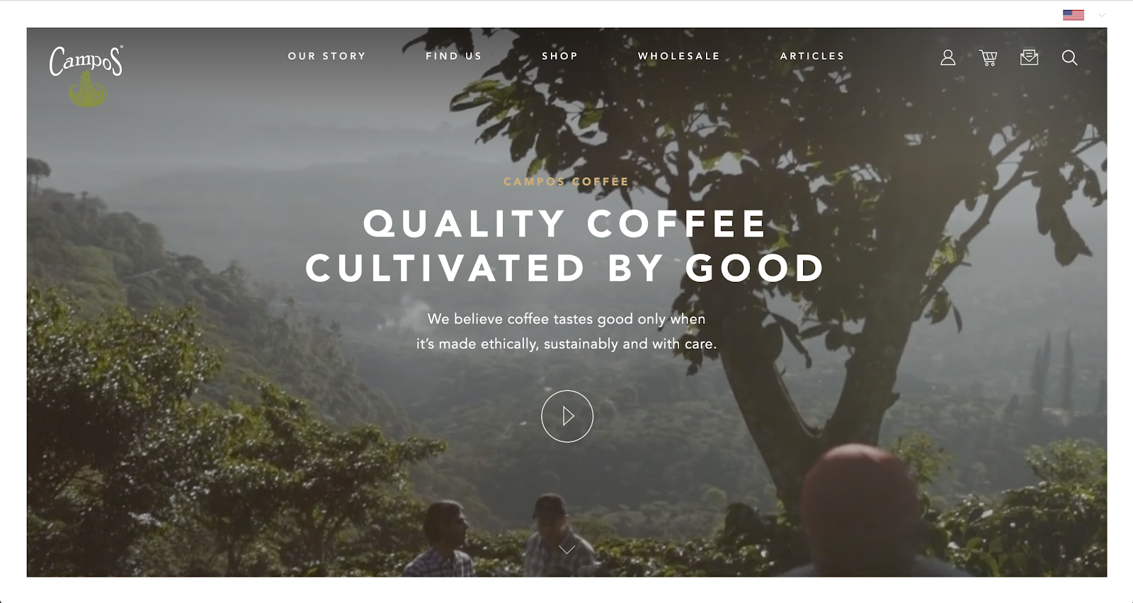
Many people love to indulge in products they know are created by companies that aim to deliver quality products. One such company is Campos Coffee, who knows exactly how to cater to their potential customers.
Their website highlights the hard work and time that their team put into their coffee, its benefits on the community, and reasons that will make you feel better after buying the product. These points are wrapped into one fantastic story that they display on the homepage and every other page.
8. Workstack
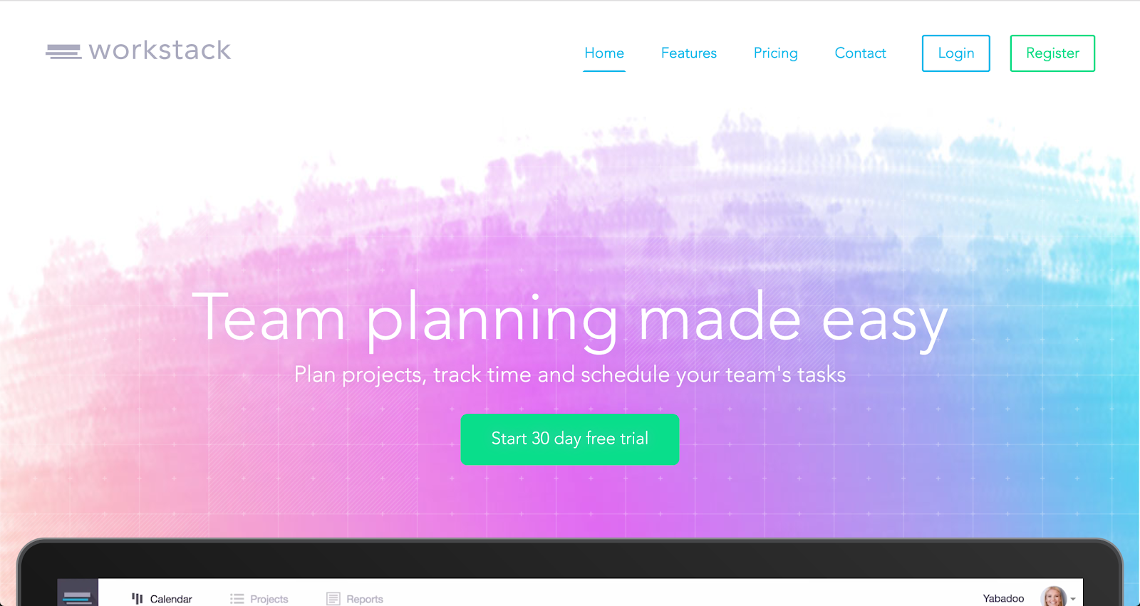
Workstack has done an excellent job keeping its website organized and condensed while also delivering its product value. The large, full-length imagery accompanied by consistent use of colour and styling throughout makes its a unique design that matches the software's colour palette.
9. Zillow
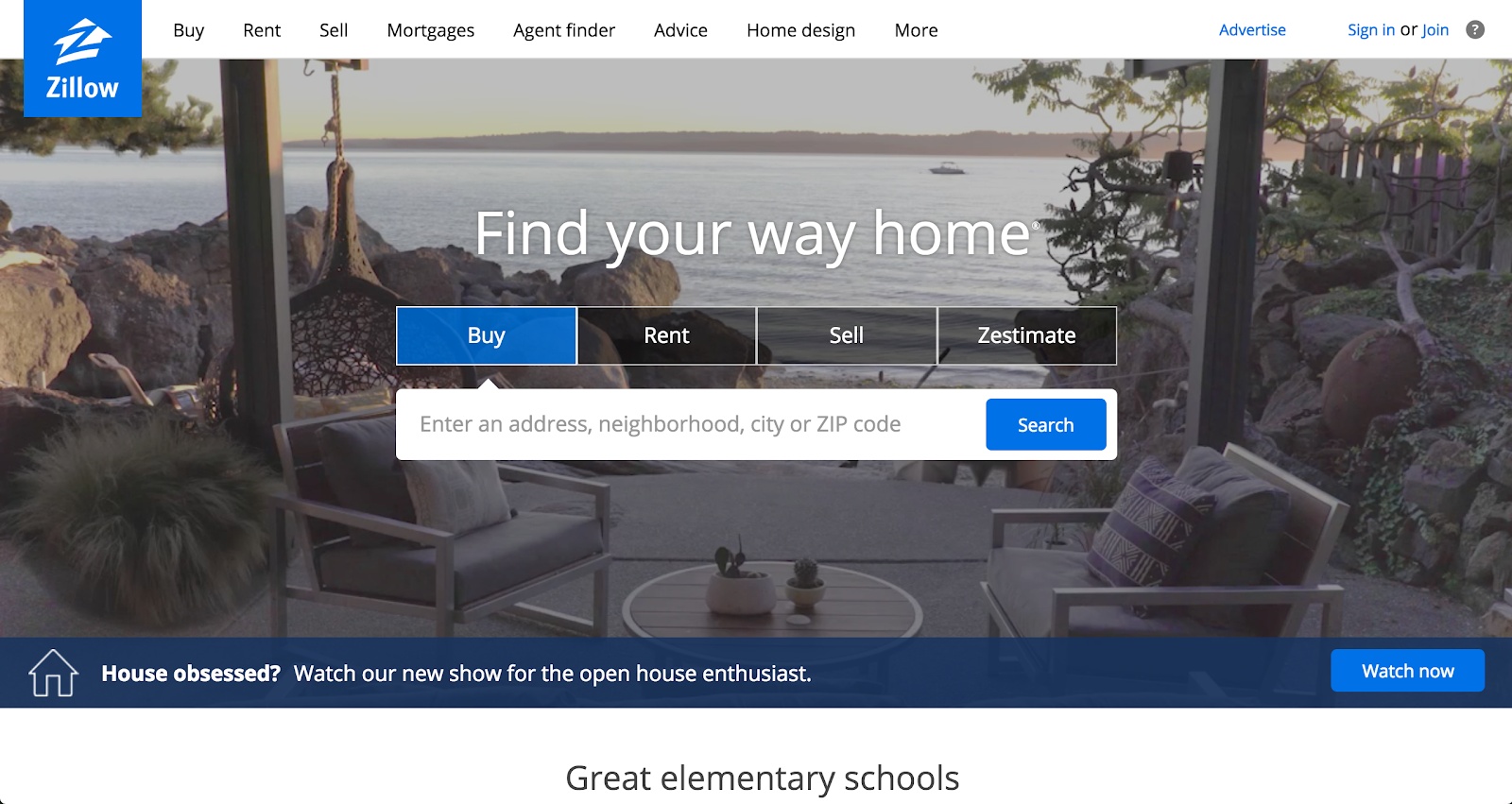
Finding your dream home is all thoroughly researching what you are looking for, saving and storing your wishlist, and making it easy to look it up later. Zillow has nailed all three points with its intuitive real estate site. The search bar in the hero area makes it very easy for first-time users to search and select listings without difficulty!
10. Shademaster
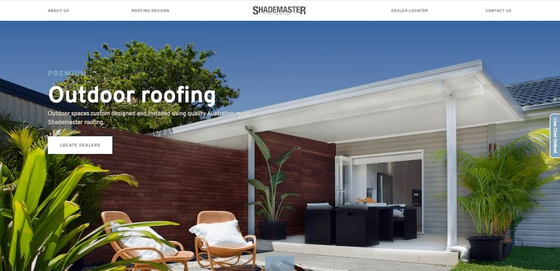
One thing homeowners hate is looking for roofing solutions, but Shademaster makes it very easy. They segment each type of work they do into the website navigation, which sends users out to individual pages where they can then plan and design their roof and receive a quote. This makes the whole roof buying process simple for customers. There is no need for anyone to visit your house to get something started!
Conclusion
Your website reflects a virtual image of your brand. It's essential to have a great website layout that can quickly grab your potential customers' attention as they navigate your website with ease.
Do you think it's time for your website to get the facelift it deserves to uplift your brand and ultimately increase conversions? Talk to our team of experts at TechWyse, and we can discuss your website's goals!


on
Hi Fiaz,
Really nice post, all of the layouts that you have shared are really cool and give a very professional vibe!
Especially Revol and Campos coffee.
Website represents your business its more like your online first impression! so its key that you have a good design.