When my company first launched our blogger outreach software, Ninja Outreach, the conversions were horrible.
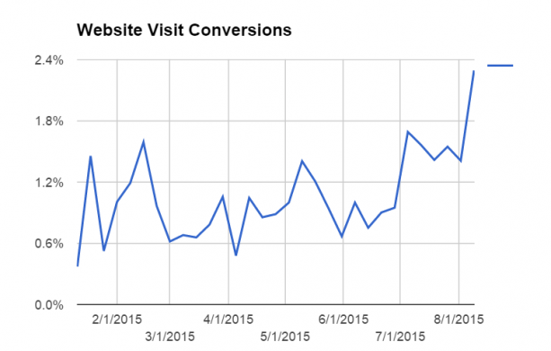
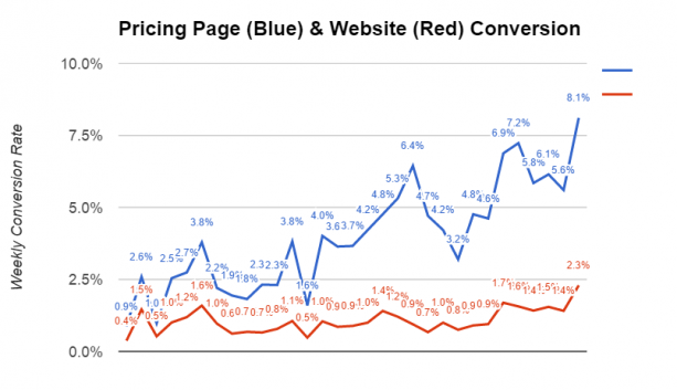
There were only 0.4% of people visiting the website signed up for a free trial. That’s only 1 out of every 250 visitors.
To be fair, I didn’t really know what good conversions were since I've never launched a digital software product before.
However, I noticed that my yearly projects didn't look too pleasing and one way to improve them was to increase the website conversions.
So, my company decided to implement different strategies to improve our website conversions. The process took 7 months, but here are the results:
From the graph above, you can see that our website conversions took a few months to finally see an increase. For the first 5 months, we were making progress, but marginal.
Finally, in the last two months, we were able to increase our conversions by over 5 times.
In this blog, I'm going to show you how we were able to increase our website conversions.
Also on TechWyse
6 Web Conversion Rate Optimisation Tips to Implement Now
5 Simple Tips to Improve Your Conversion Rate with Web Design
Talking About the Pain
I remember having a call with a fellow marketer who specialized in CRO. He went through our website and agreed there was something missing, but he wasn’t sure what.
Finally, he settled on a specific problem that we were facing - we weren’t addressing the pain. What exactly is the pain?
In our situation, we identified pain as the frustration your customer experiences by NOT having your solution. We wanted to identify what issues they are having and relate to their problems. That way, we can provide our product as their solution.
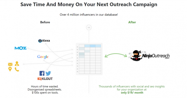
That led me to create the following image:
The pain of not having Ninja Outreach is the inability to keep track of all of your bloggers, metrics, and outreach. In addition, it was the pain of having to use an outdated spreadsheet to keep track of all your information and data.
We wanted to convey the value of saving time and money by going with us. Also, we wanted to demonstrate that our customers can take all the elements on the left and combine them into a simple solution for a reasonable cost.
We tried to take this methodology throughout our entire website. For example, instead of talking about Advanced CRM features, we talk about how you can easily manage contacts with your team.
The pain for the customers isn't the lack of features, but the trouble of managing outreach campaigns across multiple team members. We wanted to address that issue and show them a solution.
So, ask yourself - what pain are you solving? What problems are your prospects facing? How can you address their issues and solve their problems?
Explain the Value
Addressing your prospect's pain is important. However, you need to explain what your product does and educate them on how your product can eliminate their "pain".
More often than not, companies tend to struggle with this because some of their tools or products have too many applications and features to address.
For Ninja Outreach, we decided to lead with the most important application of our product: Finding influencers and getting leads.
Below, we go into more details and listed all the different ways you could use Ninja Outreach.
We wanted to let our prospects know all the abilities and benefits they can get by using our tool.
However, it's important that you understand your prospect and customers' needs. You can get more information by asking your visitors questions.
We implemented an exit pop up on our website that asked our visitors one key question: "How would you like Ninja Outreach to help you?" We listed several options for visitors to select:
How would you like Ninja Outreach to help you?
- Help me find out influencers of my industry to improve my brand positioning
- To find influencers
- Just want to see what your leads look like if I like it then I'll buy...thanks
- Searching for new guests to approach for my podcast
- We are looking for men's style and fashion bloggers
- Build my list, get on podcasts, and have more podcast guests for my targeted customers
- I am looking for alliance business partner and investor
- Help me find bloggers, influencers in the vacation home rental business that could be interested in trying a new software solution, can be a good referral source or would provide an opportunity for a guest post/podcast interview
The question allows us to gain insights on what visitors are looking for on our website. Their answers can also help us adjust our content and call to actions to cater towards their needs and wants.
From the exit pop up, our company collected hundreds of answers to the question and condensed it into the top things that interests people about Ninja Outreach.
Note: We don’t list or describe the aspects of the tool in the exit pop up. Instead, we talk specifically about different cases or scenarios, so that the customer can better relate to it.
Improving the Design
Another important aspect is your website's design. At the end of the day, if your website doesn't look nice, no one is going to stay on the page and read all the valuable content.
At first, I didn't think our website looked bad, otherwise I would never have designed it that way. However, after looking at some of the top SaaS businesses in the marketing space, I could immediately point out a few issues.
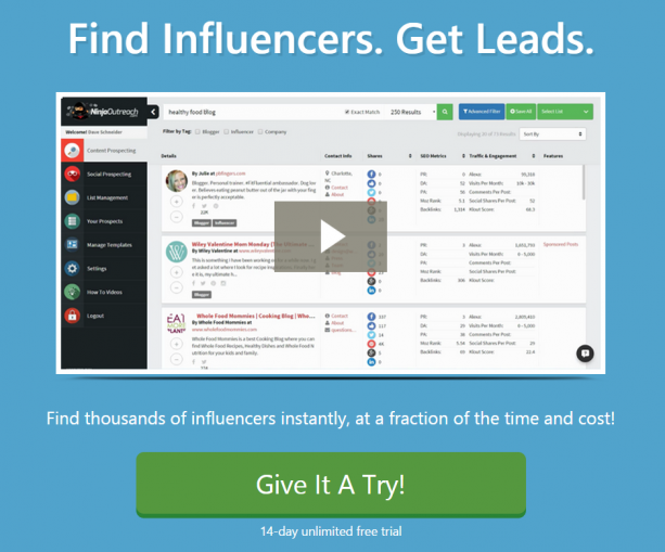
Here’s how it looked in February:
What's wrong with the February website?
- The video image is poor and pixelated.
- There is too much clutter and information being delivered to the visitor.
- It’s not clear where the visitor is supposed to look and where they should be reading.
- The use of stock images that served little to no purpose. If you’re going to show images, show images of the app itself. Otherwise, you’re just wasting real estate.
- The font is too small in the headers and subtext.
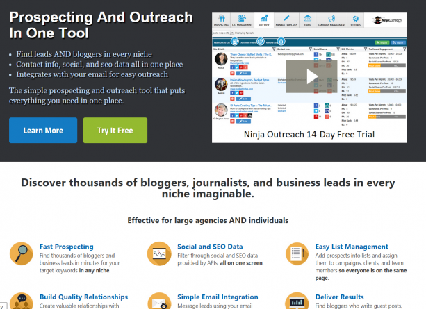
We wanted to provide our visitors with a better experience on our website. Therefore, we redesigned our website to create a simple design that was to the point. The design of our new website allowed us to showcase all the benefits of our product.
This is how it looks now:
Focusing On the Pricing Page
What is the goal of your home page? For us, it’s to get people to the pricing page.
For a while, we had different things as our call to actions. You could sign up to the newsletter, sign up for the Chrome Extension, sign up to be an affiliate, or go to the pricing page.
These are all great call to actions to navigate visitors through our site, but we needed to remove all the clutter.
Therefore, we stripped away any buttons that took people away from the pricing page and left the navigation menu to be the key pages that mattered.
Everything else, we put in the footer:
As you scroll down the page, there’s one CTA:
All of this has led to more visitors going to the pricing page, which leads to my next point.
Optimizing the Pricing Page
We’ve made a ton of progress on our pricing page. Here’s the other part of the website conversions I didn’t show you upfront:
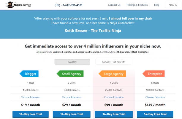
As you can see, we’ve taken the pricing page from below 1% to over 8%. We improved our pricing page conversion with a similar approach to how we handled the home page.
Our old pricing page was extremely long, containing FAQs, multiple tables, a list of every feature we offered, and several descriptions. Here’s how it looked in the way back machine.
Therefore, we decided to implement a few changes to our pricing page:
- We drastically simplified the design by removing FAQs
- Removed the competitive comparison table
- Simplified the feature table by focusing on the key differences between plans
- Added a money back guarantee message
- Increased our plan limits
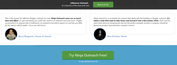
- Included positive testimonials
Here is how the pricing page looks now. It’s clean and fits all in one screenshot!
How to Apply This to Your Business
Whether your conversions are 0.4%, 2%, or 5%, your website conversions can still be improved.
The only way to improve them is to start tracking them and then testing your website.
You want to test different designs, call to actions, copywriting, and flows. However, don't adjust too many things at once because it can be difficult to track all the results from your changes.
Unfortunately, we never had the traffic to do A/B testing successfully. If you have enough traffic to do split testing, it will be a great way to further test your designs and manage your results.
It worked for us, and it can work for you.
What conversion rate optimization tips have worked for you?






on
Hi David,
I hate to say I’m only marginally aware of NinjaOutreach, prior to this blog. I will be checking it out.
Your article captured me when you equated website conversion to presenting the pain. I love the idea of the exit survey, but wonder if a smallish website – I’ve not reach 1000 pageviews in a month yet. I know I read somewhere that you have to leave survey up longer for lower pageviews.
How long was NinjaOutreach up?
Thanks
on
Hey Gina
Thanks for commenting!
We continually leave our exit survey up, because as long as we feel it is providing value to us there is no reason NOT to leave it up. I would advise the same for you.
That said, overall, at your stage, traffic generation should be a bigger focus than lead generation or conversion rate optimization.
Thanks!