A study in the Journal of Management History, concluded that it takes your prospective customers a mere 90 seconds to form an opinion of a product, and between 62% and 90% of their interaction is based on the product’s color alone.
Yet, despite that resounding call for devoting considerable time to color decisions when designing your PPC landing page, too often the question of color scheme is answered simply by a web theme’s default colors, or by unverified platitudes like "green means go".
Thankfully, there are a number of empirically based results that draw reliable conclusions about effective color implementation in landing page design.
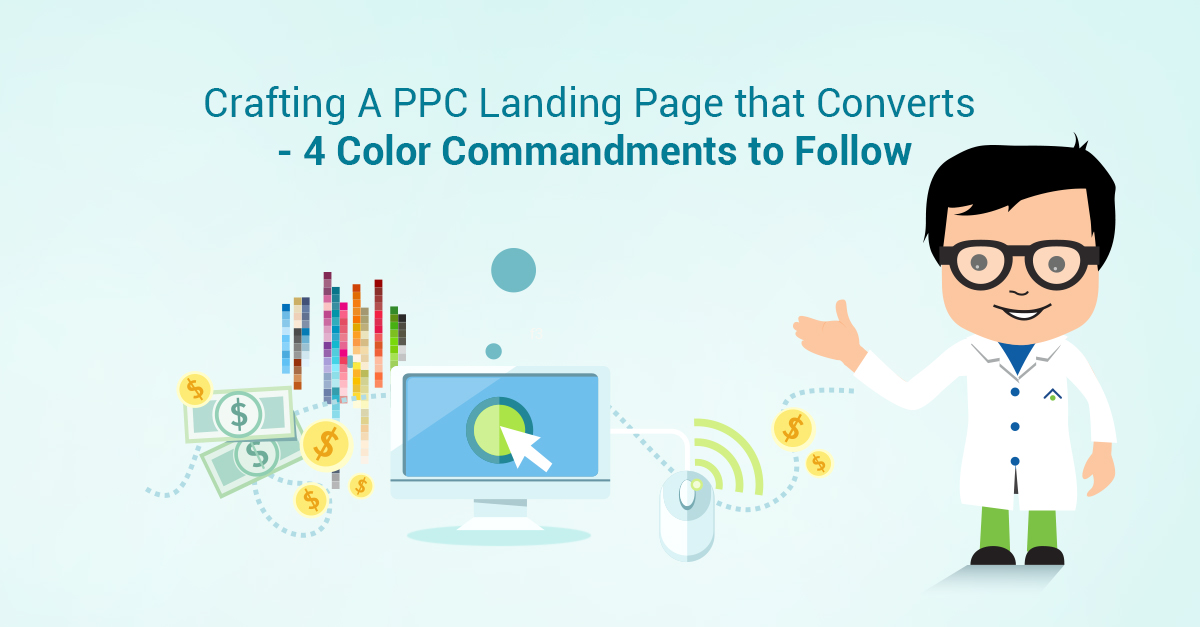
Rules to Follow While Designing a Landing Page That Converts
Before we get started, it’s important to explain to you what this article is not. It’s not a step-by-step telling you, "make all of your buttons red" or "make your contact forms light green". The reason this article isn’t that, is because effective color usage on a PPC landing page, or in any web marketing context, is highly individualized to that company and their unique audience.
That is to say, red may be the best button color, until it’s not. But just because you can’t say that some element of all sites should be a specific color all the time, doesn’t mean there aren’t some very useful statistically supported color based rules that you should be following.
In this article, we’ll highlight four rules that you should incorporate when designing an effective PPC landing page.
Simpler is better
Before turning to individual page elements such as buttons, forms, or calls to action, you should conceive of the PPC landing page holistically, and consider the overall choice of a color scheme. Thankfully, there are some reliable conclusions in this area based on large datasets of empirical data.

In a study conducted by Peter O’Donovan of the University of Toronto entitled, Color Compatibility from Large Datasets, using three datasets consisting of a total of just over 450,000 ratings.
This study indicated that most people generally prefer landing pages with a predominant color or blue or purple and dislike landing pages in which the predominant color is yellow.
Moreover, simple landing pages, typically consisting of one hue, two hues, or a blend, tend to be more popular with visitors than complex ones. And finally, the survey results consistently demonstrated that pairing several bright and dark colors is a poor choice aesthetically.
So when you’re selecting a color scheme for a landing page, you should consider choosing one which consists of one to two hues, preferably in a blue or purple color range, avoid yellows, and avoid pairing bright and dark colors.
[caption id="attachment_40124" align="aligncenter" width="613"] Image Source[/caption]
One example of effective single hue design is Thousand Oaks Dental, which uses a background of light blue, a base color of dark blue and an accent color of lime green.
While I’d argue that the two shades of blue are a bit too similar, they achieve a simple and broadly visually appealing design with what is essentially a one color website with two shades, using the most popular color with both genders, blue.
[caption id="attachment_40125" align="aligncenter" width="613"] Image Source[/caption]
This single hue implementation serves Thousand Oaks Dental’s purposes particularly well because as indicated, a single color site based in blue is going to be the most broadly appealing color scheme for a general audience.
By contrast Lings Cars is an extreme example of a web design that uses the whole rainbow of colors, creating an experience that feels chaotic, unorganized, and virtually unusable.
The 60-30-10 Rule.
Based on the University of Toronto study, it’s clear that a PPC landing page design that primarily consists of one or two hues with an accent color is generally going to be better received than a theme with a half dozen colors. Those few colors, in turn, should be deployed in your design according to the 60-30-10 Rule.
In practice, that means that your website should not, as some first time designers do, attempt to use all three colors roughly equivalently. Rather, use the most neutral color as your background (60%), your base color around 30%, and your accent color, which is typically used in your logo and call to action approximately 10%

An excellent example of a company that uses the 60-30-10 rule is BestBuy.com. Note that the only elements of yellow are the logo, the call to action, and recommendation stars, which serve to highlight those elements, and drive both attention and clicks to the ‘Add to Cart’ button.
In another example, Kingwood Orthodontics (Disclosure: the authors spouses' orthodontic practice) uses a grey background, green base color, and blue accent color in a pretty good approximation of the 60-30-10 rule.
In so doing, they provide an imminently readable website, which directs the visitors eye to the contact form.
[caption id="attachment_40127" align="aligncenter" width="613"] Image Source[/caption]
By contrast, while MSY Technology’s website uses only three colors, however, the base color, a bright red, is used to a degree that is far out of proportion with 30%. In fact, its use exceeds the background color, and as a result the website is overwhelming and difficult to navigate.

Consider Gender in Color Scheme.
Most advice on using color to increase conversion rates is typically unique to the specific implementation, and therefore of limited value outside the scope of that specific website.
One of the few broadly accepted design principles, however, is that color preferences among genders is largely reliable and consistent across age groups and cultures.
[caption id="attachment_40131" align="aligncenter" width="613"] Image Source[/caption]
Therefore, while every individual is unique, in general, women display a disproportionate preference for blues (35%) and purples (23%), and strong negatives for oranges (33%) and browns (20%).
Therefore, if your product is targeting primarily women, it behooves you to attempt to incorporate blues and purples and avoid oranges or browns in your design.
MeaningfulBeauty.com is an excellent example of gender targeted marketing. In this example, Meaningful Beauty, a makeup product targeted to women utilizes a blue-grey background, with a purple base color, and pink call to actions.
[caption id="attachment_40132" align="aligncenter" width="613"] Image Source[/caption]
These color selections cover include the three most popular colors for women, immediately signaling to consumers that this product is targeted to women.
A quick word of warning if you’re going to go this gender specific: make sure that the purchaser, not merely the intended user, is going to primarily be the gender your design is targeting.
[caption id="attachment_40134" align="aligncenter" width="613"] Image Source[/caption]
In this case, the overwhelming number of purchasers of this product will be women, and therefore Meaningful Beauty’s explicit color targeting of women should be purely beneficial for the company.
Similarly, the Billy Skinner Law website color scheme leans masculine without being overwhelmingly so. That’s because while his clientele are overwhelmingly male, (over 80%), the target audience is not exclusively so.
Consequently, a light blue background with a dark blue base color and gold accent as a color scheme has the highest appeal with men, but is also generally appealing to women as well.
Consider Accessibility in Color Scheme.
Web accessibility has historically been focused on providing equal access to disabled individuals for humanitarian reasons, but there is also a very strong economic incentive to pursue accessibility, which simply put means making your website or landing page accessible and usable to the broadest array of people possible.
Individuals with disabilities, and increasingly elderly people rely on e-commerce purchases more heavily than individuals without disabilities because through e-commerce they are able to more easily access goods and services.
Consequently, their impact on an eCommerce business generally exceeds their per capita count.
In the context of color scheme, the two most straightforward accessibility concerns are sufficient contrast, and compensating for color blindness. Thankfully, there are multiple excellent online tools which can provide instant feedback on a landing page’s compatibility, such as Contrast Checker, and Coblis’ Color Blindness Simulator.
[caption id="attachment_40135" align="aligncenter" width="613"] Image Source[/caption]
One example of a simple high-contrast design that remains visually interesting is AC Partners. The text on a white background is black, whereas the header photo is consistently a dark blue color which means that the white text is easily readable.
By contrast, the Pomona College Museum of Art provides two examples of poor color contrast design. The first is in their captions for displayed art images.
They layer off light grey lettering layered over a darker grey background, which is itself at approximately a 50% transparency, making the entire caption virtually unreadable even for individuals without any form of ocular disability.
[caption id="attachment_40091" align="aligncenter" width="613"] Image Source[/caption]
Turning to the content of the page, the Pomona College Museum of Art commits a less egregious but more common error, which is to use a font which does not provide a high contrast over the background.
In this instance, the light grey font is layered over an off-white background, which creates an experience that while not unreadable for individuals without disabilities, is still difficult and thus unpleasant to read. And for those individuals with ocular disabilities likely a significant enough deterrent to dissuade them from using the website.
Conclusion.
Given that somewhere between 62% and 90% of a prospective customer’s initial impression of a product is determined on the basis of color, devoting time to selecting a color scheme that is accessible to and best appeals to the preferences of your target audience is an imperative.
And while statements like "all buttons should be green" are inherently misleading, that doesn’t mean that some colors aren’t better than other for your particular PPC landing page.
Therefore, in addition to following the four rules above, which will provide you with a basic color palette that is generally effective, it is important to continue to A/B test individual landing page elements for effectiveness, as there are clearly some significant wins in terms of conversion rate to be had.