Have you ever wondered why your favorite food chains have a red logo, while the same color is used to exhibit warning signs? Color psychology is one of the most interesting and controversial topics when it comes to its influence in branding and marketing.
Color plays an important role in how we perceive a brand. Studies indicate that our brain processes images 60,000 times faster than simple text, and 90% of information sent to our brains are visual. Colors and visual matter the most -- and this goes for your customers, too!
What is color psychology?

Color psychology, the study of how colors influence human behavior, is a hugely debated topic. Essentially, it is the science of how we look, perceive and mix things based on specific colors. While marketing elements like promotion, pricing and providing right products for your target market is important, color plays a prominent role in memorizing the brand. When thinking about businesses like Coca-Cola, Facebook, and McDonald's, you can easily recall the way they use color.
Let’s look at the common colors used in branding and what they mean.
Red
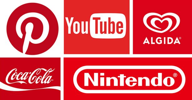
This color needs no introduction. The color red can communicate different ideas depending on the context. Red can be an emotional pigment since it is closely related to heart, and at the same time it can demonstrate warmth or danger since it is related to fire.
In branding, red is the ideal color to bring an idea to the customers attention. Red is the most appetizing color, making it obvious why fast food giants allow this color to dominate in their branding strategy.
Brands like Coca Cola and YouTube use softer colors, like white, along with red to show excitement without risking the perception of danger. For many brands, It is difficult to tow the line when using red to spark excitement since the color itself can be seen as aggressive.
Blue
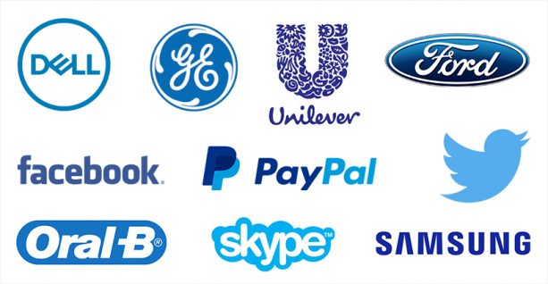
Blue, the color closely related to sea and sky communicates stability, peace, calm, and clean qualities. In Middle Eastern cultures, blue is a color represented for protection against evil.
According to color psychology, blue is a more versatile color which demonstrates trustworthiness, dependability, and security. This makes it sensible when tech giants like Facebook, Twitter, AT&T use color blue as their brand identity. Brands like Oral-B and Walmart also uses blue to position themselves as reliable and trustworthy.
Yellow

Yellow might be less popular among all the colors, but it is generally considered that people who like yellow are passionate. The color evokes feelings like happiness, positivity, and optimism. Brands prefer a touch of yellow on the background of their website design to provide a positive feeling to visitors, and to generate more engagement.
The Ikea brand uses a combination of blue with yellow in their brand logo to create a feeling of happiness and optimism for people who are taking a piece of new furniture or electronic appliance to furnish their home. The mix of happiness and optimism that yellow offers makes it ideal to associate with any brand.
Orange
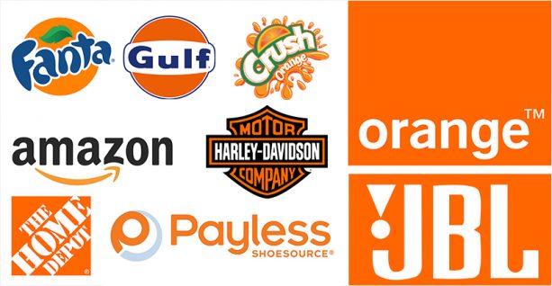
Orange, a friendly combination of the warmth of red along with the cheerfulness of yellow adds a bit of fun to any picture, website or campaign it is on. In color psychology, orange represents success, balance, adventure, and creativity.
Brands like Nickelodeon had plenty of success using orange to represent the youthfulness and cheerfulness amongst young audiences. The orange logo also represents creativity and inspires desire and hunger, which makes it color for selling goods like toys and food.
Green
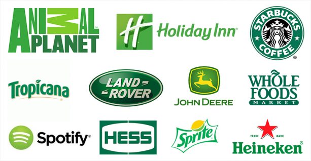
The perception of how green effects a brand typically depends on the shade. In color psychology, it is the easiest color for our eyes to process. Green is often associated with ideas of freshness, health, hope, and growth, whereas dark green represents wealth and stability.
In branding, brands who segment their products as “green,” natural, fresh, or organic often use green. If we can recall, Starbuck’s skinny-triple-shot-decaf caramel macchiato can hardly be categorized as healthy, but their intense welcoming color mix of blue and green wants you to believe their coffee is.
Purple
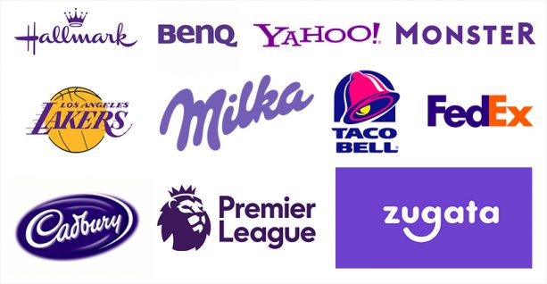
Purple was the loyal color of the Caesars. At the intersection of red and blue, purple is often associated with nostalgia, femininity, and sentimentality. Darker tones of purple denote luxury and loyalty. Even though it is not a frequent color used in branding or marketing, we can easily remember three or four prominent purple brands: Cadbury, Yahoo, Liberty London, Crown Royal, being among the most popular.
What to Consider Before Choosing a Color for Your Brand
- Choosing Colours According to Your Target Audience
While color psychology isn't an exact science, studies show that men and women respond to colors differently; the most common being pink and blue. This means the use of color may be used to target a specific gender on a website. Blue is considered the neutral color for both genders, so if you are considering selling a product that's not gender-specific or athletic wear, blue might be your safest option.
Shades of color play an equal role in targeting. Men prefer a brighter tone while women go for the softer ones. In fact, gender is not the only variable to consider while targeting -- it is important to consider the age category of people you are targeting. Yellow is considered to generate anger and anxiety in old people while the younger generation prefers bright colors.
- Customer expectations
Be sure to do research on your target audience in accordance with the product you are offering. The color you choose should match your audience's emotion. A law firm might choose colors like black, for example, which is different from what you might choose for a toy store.
- Brand Message
Just because your product matches a specific target audience, it doesn't mean you have to go for the color that they prefer. Stick to your brand’s vision and keep it real.
Sometimes brands go with the popular color that their competitors had excellent results with. However, this can pull them further apart from the audience and allow them to get lost in the pool full of competitors. Always try to make your brand stand-out!
- Consistency
How would you feel if Facebook changed its brand logo to green, or KFC started an ad campaign featuring blue? Consistency is vital for maintaining a coherent voice for the brand.
When you select a fixed palette of color for your brand and use it throughout numerous marketing channels, it strengthens the brand identity and customers memorability about your brand.
Increasing Click-Through-Rate Conversions
A conversion rate refers to people who visit your site compared to the number of people who complete a specific goal. Though it's true that there is no single best color to increase the conversion rate on a website, research clearly shows that a color that stands out is remembered far better.
A study by Hubspot A/B tested a green button vs. a red button. The red button outperformed the green button by 21 percent.

The same applies to social media campaigns. Regardless of the type of ad you are posting, the color of the action button should create a sense of urgency.
At the end of the day, marketers have to use every strategy they can to generate sales, brand loyalty, reliability, and increase conversions. The right color combination can make all the difference for your brand, and help you stand out from the competition. Human emotions and responses may change according to culture, geography and various other factors. Thorough research on your target market can give you all the information you need to make the right decision!
So, the question is, have you decided on your brand’s true color?
To learn more about how to develop your brand online, speak to an expert from TechWyse Internet Marketing today. Give us a call at 888.208.3095, or contact us here.