The ecommerce product page. It’s where the magic happens.
This is where online shopkeepers convert marginally interested, somewhat hesitant leads into confident shoppers willing to part with their hard-earned money. The stakes are high. You’ve spent untold numbers of hours and thousands of dollars to bring your prospective customers to this point in their journey.
If you drop the ball here, most of that effort will have been wasted.
To help you avoid this scenario, let’s take a look at five elements that your online store’s product pages may be lacking.
High-Quality Video
There are some serious limitations to shopping online. Naturally, the main one is the shoppers’ inability to see and touch the physical product. To combat whatever obstacles this creates on the customer’s journey towards conversion, it’s absolutely vital that online stores make the most of their product galleries.
There’s little point in discussing resolution and image quality. By now, it’s a given that product pages need to show products in their best light. Uploading a poorly-cropped, pixelated mess will do severe damage; not only to your product’s sales but also to your brand reputation.
Websites that take product galleries seriously use everything web technology has to offer to showcase their products in a way that generates excitement. For example, supplementing static images with a product video is one of the most effective ways to get your prospective customers to sit up and take notice. The stats speak for themselves.
Love Hair uses the medium to excellent effect on their product pages. Each of the haircare retailer’s products has a 40-60 second video that encapsulates the tone of the product perfectly.
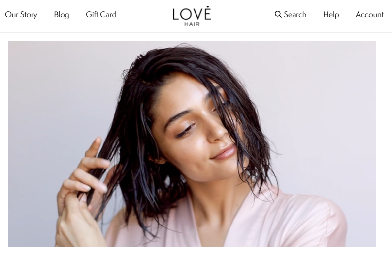
Image source: Lovehair.com
There are no complex messages and no detailed instructions – just beautiful imagery, simple words, and soothing sounds. It all helps strike the kind of comforting tone the brand wants to associate with this particular product.
Certain kinds of products just beg to be showcased in video format. These products typically have a niche application that would be impossible to illustrate with imagery and text only.
Adventure-sports equipment is probably one of the most obvious candidates here. Retailers that sell these products know that they’re selling a lifestyle and an experience as much as they’re selling a physical product.
Oclu has embraced this approach wholeheartedly. The camera manufacturer leads with a terrific video that introduces their flagship product in all its glory.
What Oclu does right with this video is focusing not only on the camera’s capabilities and the quality of its footage but also its physical appearance. Potential customers get to see what the product does as well as how it looks, how it’s been manufactured, how it interacts with the environment, and how to use it.
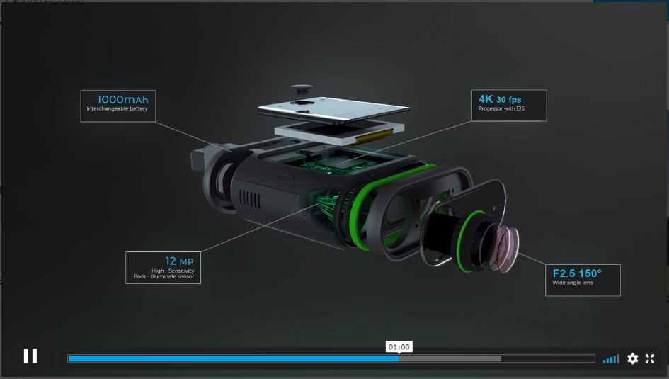
Image source: Oclu.com
Strong Reference to Value-Added Benefits
Online shoppers are a justifiably selfish bunch. A recent study by Data Reportal (as published by Oberlo) found that the top two reasons why people shop online relate to getting something for free.
Online shoppers know that thousands of eCommerce businesses are engaged in a war for their patronage. They know that these stores will do anything they can to land a loyal customer and that includes offering a ton of valuable extras for free.
If your pricing model allows you to do this, broadcast it as loud and clear as digitally possible. Don’t hide the fact that customers get something awesome for free when they do business with you. This is a huge drawcard for the millions of shoppers who are constantly on the lookout for great deals.
Bear in mind, we’re not talking about discounts here. Sales and coupons are another matter entirely. We’re looking at visual components that let shoppers know that you’re willing to do something for them at no cost.
Let’s take a look at an example from Inkable Label. The printing specialists’ product pages make it astonishingly clear that customers will not be paying for several of the services typically associated with custom printing.
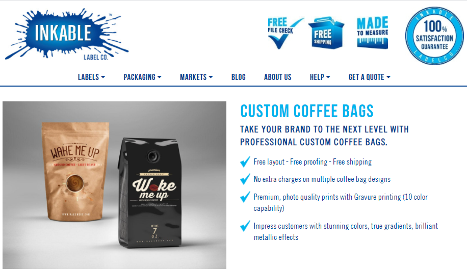
Image source: Inkablelabel.com
What works on this product page is how frequently the word “free” is used without it overwhelming the product itself. The header image uses meaningful icons to highlight what the customers are getting without paying for it. Then, the product description reiterates this in an elegant, unobtrusive way.
A Cross-Sell Opportunity
No matter how hard you focus on turning first-time customers into repeat customers, you’re not always going to succeed. In fact, research shows that only 15% of all online shoppers are repeat customers.
This means that online retailers need to do what they can to make that first (and possibly only) transaction as meaningful as possible. If 85% of your customers are unlikely to buy anything from you again, it makes sense to implement strategies that maximize the value you get from an order.
One of the most effective ways of boosting an order value is to offer smart cross-sells. If your store has a large inventory of products, don’t hesitate to recommend products that complement each other.
Rain or Shine Golf goes several steps further than simply offering product recommendations. The indoor golf equipment retailer groups the recommended products into a customizable discounted bundle and displays a prominent call-to-action that prompts shoppers to buy the entire set of products.
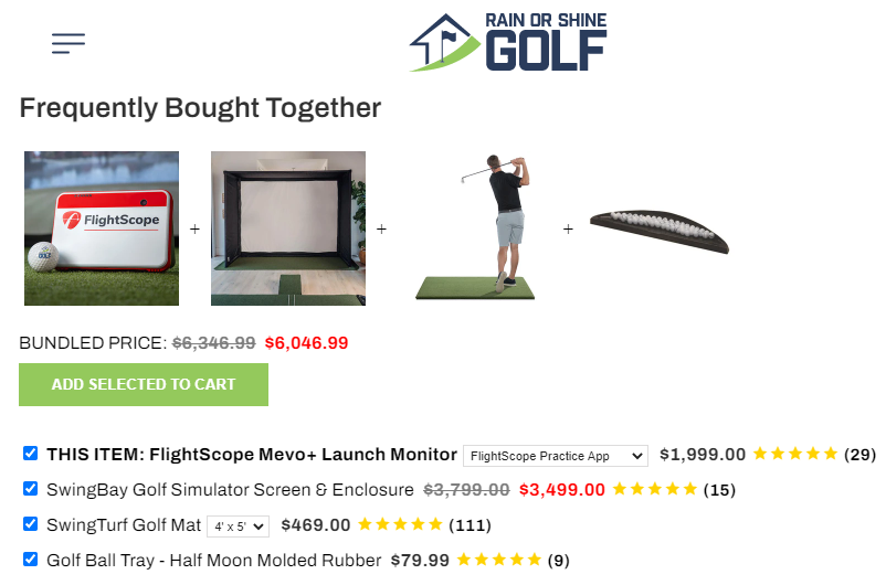
Image source: Rainorshinegolf.com
Exceptional Credibility
First-time buyers need to trust a website before they hand over their credit card details. They have concerns about fraud, product quality, fulfillment, hidden costs, and poor after-sales service. These are just five of the most common obstacles in the journey between prospect and customer.
Getting people to believe in your brand and its promises is critical for success in the eCommerce world. Nowhere is this more important than on your product page.
There are several ways you can go about generating this kind of credibility for your business. Let’s take a look at the most effective approaches.
Somnifix supercharges its credibility by dedicating a giant portion of its product page’s real estate to a content-rich, highly interactive customer review area.
This section allows shoppers to spend as much time as they need delving into the finer points of how verified customers enjoy the company’s flagship sleep-aid. This level of dedication to social proof communicates something very positive about a retailer and its products.
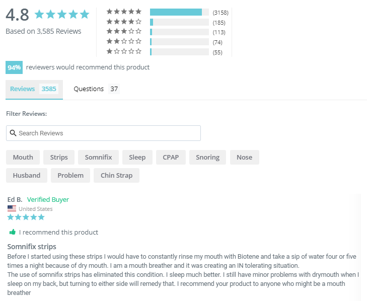
Image source: Somnifix.com
Hassle-Free Customization
Some orders need a bit of tweaking before they can be added to a cart. While this is an unavoidable part of the shopping process, it can also act as a significant source of friction towards conversion when not done correctly.
When creating an interactive element that’s part of the order process, UX designers need to prioritize clarity, ease of use, and stability.
The last thing a product page needs is a customization form that’s hard to understand, unresponsive, or buggy. The experience needs to be seamless and pleasant.
If placing an order on your product page depends on customization, consider involving a professional UX designer. Find someone with experience in creating interactions that feel like a natural part of the shopping process rather than a schlep.
Mixam shows us a beautiful example of a product page that manages to simplify a cumbersome order customization process.
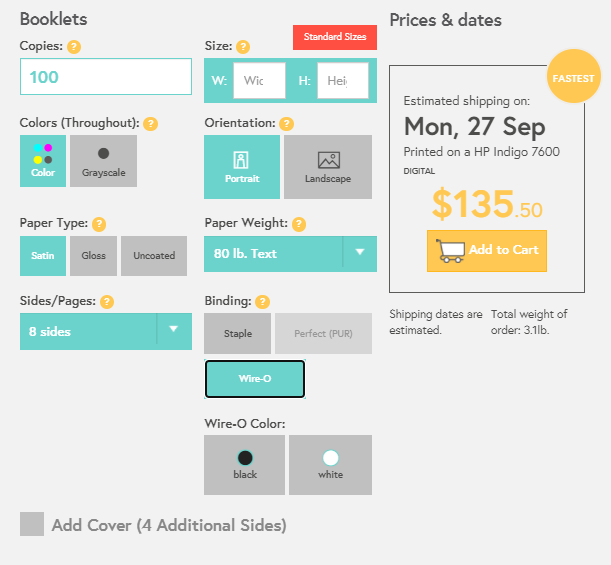
Image source: Mixam.com
Here’s a summary of the many reasons why this element adds value to the shopping experience:
- Quote calculations are done instantly, without the need to press a “submit” button.
- All fields and field groups are clearly and logically labeled.
- High-quality tooltip flyouts give visual context to each of the terms used in the form.
- There are no stutters or bugs when using the form. Every interaction is smooth and elegant.
- The form is attractive; the colors are complementary and the layout is extremely accessible.
Some Final Thoughts
This list of crucial product page components isn’t exhaustive. There’s plenty of other awesome ideas where these came from.
Nor are all of these components mandatory for your site. Some will work and some won’t.
The important thing is that you think about whether they will resonate with your typical customer. Critically assess each of these five components against what you know about your store’s buyer personas and make an informed decision.
Also, remember to build data about your site visitors’ behavior on these pages before and after you implement any changes. This way, you’ll be able to know exactly how effective they were.
Good luck!


on
When it comes to ecommerce, it is so important to take the extra time to compose a great product page. A great product will attract your customers, but if it isn’t great, it might not get the job done.
on
I think one of the best articles for those who want to start their e-commerce business. These components on the product page really increase the conversion rate. thanks
on
Hey, Karl
I came to your blog for probably the first time, and your blog post is really very interested and informative. Thanks for sharing amazing knowledge.
on
Thanks for sharing!
Excellent post, I think site owners ought to learn a lot from this blog site its really user-friendly. Thanks