
All e-commerce businesses need user-friendly websites. Neither users nor Google will forgive a poorly-designed UX. It will affect both your search engine rankings as well as sale conversions.
In an attempt to create a better UX, most B2B site owners blindly follow the B2C e-commerce design. However, the purchase process of B2C and B2B models are considerably different.
Following the same UX design principles as that of a B2C e-commerce site is less likely to boost your B2B conversions. The purpose of a B2B e-commerce site is to make the buyer’s journey easier and, therefore, the UX design should be prepared accordingly. B2B buyers usually don’t need to go on exploring your website extensively, since they already know what they want.
Here are four UX design tips that will boost your B2B online sales conversions.
1. Smooth Site Navigation
Navigation is one of the first UX design factors you will need to address if you want to attract and keep your prospects on your B2B site longer. Although your customers already know what they want, you need to make it easier for them to find it. So, understand the buyer’s intentions before building the website navigation.
Usually, B2B websites need detailed product descriptions because of their complex nature and extensive specifications. Extremely detailed product specs, technical data, and compatibility should be taken into consideration when building the site navigation. Customize your B2B site navigation to make it easier for readers to explore more about your products.
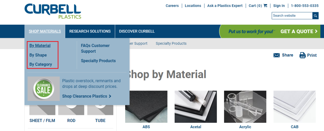
For example, Curbell Plastics, a fabrication company, allows visitors to explore their site by material, shape, and category of the products. Using different shapes in the reductive navigation is perhaps the best way to make it easier for the target audience to find the desired products or services.
It also includes creating appropriate B2B purchase pathways. Buying paths for B2B often requires the ability to choose customer-specific shipping methods, the option to save order lists in the shopping cart, flexible pricing options, and even the ability to create purchase orders. You may need to review the purchase order as well. Make sure to incorporate all these elements into your site navigation to provide a seamless experience for your target audience.
2. Content Is Truly King
While you can use videos and images generously in B2C e-commerce sites, their use can be limited when it comes to B2B sites. This isn’t to say graphics aren’t necessary for your B2B website, but content will unquestionably play a more critical role. Apart from providing the relevant information to your clients, you can also use on-site content, such as product descriptions and on-site blog.
However, you can’t afford to overwhelm your target audience with too much information. From the UX point of view, you need to prioritize and optimize the content. Make sure to create a consistent and well-planned visual hierarchy throughout your website. Try to bring out the most from your content.
The content needs to be valuable, informative, and educational. The sooner your prospects will see the value proposition, the higher are their chances of staying longer on your site. So, keep the core information in the pre-scroll area.

Explain your products or services using minimum words. Get straight to the point and tell your customers what they want. For example, instead of providing extensive details of their services, Achievers tells their audience how their services will turn into tangible ROI. They make sure to back up their services with customer statistics.
3. Place Your Call-To-Action Perfectly
B2B websites need a perfectly placed Call-to-Action (CTA) just like their B2C counterparts. First, make sure the CTA always appears above the fold, especially for the desktop version of your site. Avoid fancy styles and excessive use of colourful visuals. In most cases, keeping it simple is your best bet as fancy graphics can be a significant distraction.
Avoid placing your CTA before everything else. You shouldn’t be begging users to take action before they have even reviewed your product or service. If you are using a pop-up, make it visible when the user decides to leave the page without taking any action.
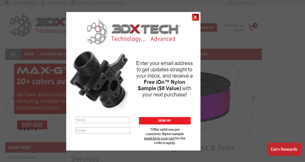
3DXTech, a 3D printing company, uses an exit pop-up to entice its customers into registering for its email list. It also displays an “Earn Rewards” button at the bottom right-hand corner of the page. The CTA is simple, visible, and avoids using a distracting color scheme.
4. Make Your Brand Credibility Visible
It takes a lot more time to place a B2B business order as it involves considerable investment for the long term and several decision makers. Trust will be the most critical factor in the final decision-making process, and trust comes from brand credibility. This is why gaining credibility should be a part of your UX design considerations from the beginning.
One of the easiest ways to improve the credibility of your brand is to incorporate customer testimonials on your website. Word-of-mouth is the best way to build a bond of trust in the B2B world. Your prospects are going to take into consideration what your existing customers think about your business. If your site fails to provide them with authentic references and testimonials from present or former clients, they'll be more likely to choose a competitor.

Zip Grow, a manufacturer of high-density vertical farming equipment, has created a dedicated client testimonials page. The page comprises detailed testimonials from clients along with the photographs of their farms and produce.
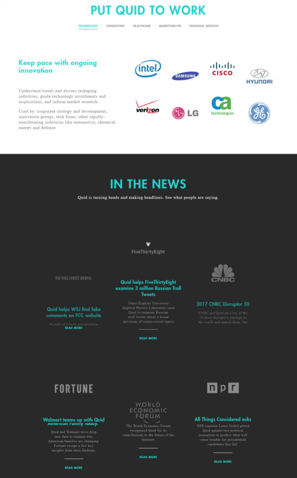
Alternatively, you can also create a logo wall of your notable clients or a list of certifications and awards. Quid takes this approach a step further by adding the latest developing news stories about their company along with a logo wall of their existing and past clients on their home page. These seemingly small statements often have a significant impact on your target audience.
Wrapping Up
Although the purpose of B2C and B2B e-commerce websites is the same, they can’t follow the same UX design principles. You need to design the site keeping in mind the complexity of the B2B customers’ journey and their unique needs. Hopefully, these four tips will help you build not only a user-friendly but also a highly profitable website. What UX design steps have you taken to improve the conversion rates of your B2B e-commerce site? Let us know in the comments below.


on
Thanks a lot for creating an awesome post. Appreciate for the great post.