In most cases, an e-commerce website has one primary goal: to convert online visitors into paying customers. Every part of the website should play a role in this conversion process, from the homepage to the checkout window. Shoppers need to be able to find products quickly and easily, or you risk losing potential sales.
It certainly isn’t easy to win the approval of online users in 2019. Any tech-savvy web surfer looks for three main things when they land on a new page: speed, design, and authority. According to the Website & UX Statistics of 2018 - 2019, 53 percent of mobile searchers will leave a website after just three seconds if nothing catches their eye. Even more will click away if they don’t like the layout or if the page loads slowly.
Along with snagging the attention of their visitors, e-commerce websites also need to lead to a successful purchase. A big part of this sales process is the user’s navigation experience.
- Can they find what they’re looking for quickly?
- Are products organized intuitively?
- Do they know how to use the site efficiently?
Here are some of the main steps to reduce user confusion and make your e-commerce website easy to navigate. Each tip will help increase conversions and keep customers returning for more.
1. Create Your Site’s Visual Hierarchy Around Scanning Patterns
Believe it or not, human brains have common tactics for scanning web pages. Eye tracking technology indicates that people tend to scan visual-oriented websites in a “Z” pattern, whereas they scan text-heavy pages in an “F” pattern.
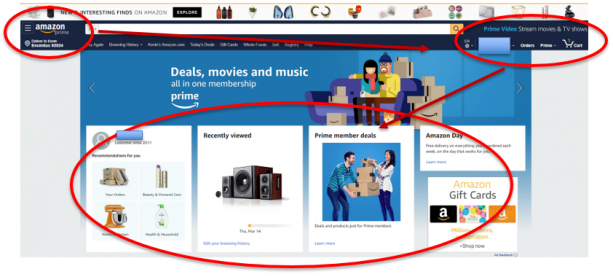
If you look at some of the most popular e-commerce websites, such as Amazon or eBay, you’ll notice that the visual hierarchy of the site is designed in accordance with the “Z” scanning phenomenon. In a nutshell, visual hierarchy refers to the visual components of a website arranged from top to bottom based on their importance.
When a user visits a page, their eyes instinctively begin to scan the visual elements before processing the words. That said, it’s important that an e-commerce website’s design plays on this intuitive scanning pattern. On a homepage, this simple design technique encourages users to naturally scan over certain parts of your site before others. Therefore, it makes sense to put the most important things in line with this Z-pattern.
If you look at Amazon’s homepage, you’ll notice the layout is designed with these site elements arranged in the Z-pattern.
Think about it this way: when a visitor reaches your page, what are the main pieces of information you want them to see? Once you decide, design your own Z-pattern around these key aspects.
Typically, you’ll want to keep an easy-to-use navigation bar at the top of your site where the first line of the “Z” is traced. Whether you’re planning to start an online store or add pages to your current e-commerce website, it’s vital that your main menu stays visible. Users will intuitively look for a menu at the top of the page. So don’t make it difficult for them to hunt down your search bar, categories, or labels.
2. Make It Easy for Users to Search Your Website
When a modern-day user is on the hunt for a specific result, they expect to receive their answer within seconds. Recent data from Forrester Research revealed that 43 percent of visitors on a retail website go immediately to the search box. Additionally, these searchers were found to be two to three times more likely to convert, making the search bar one of the most important parts of the site.
Unfortunately, slapping a search box widget at the top of your site isn’t going to cut it. On-site search engines must be smart and well-maintained, especially on e-commerce sites. As soon as a person begins to type in their search, a list of detailed suggestions should appear so that they are steered in the right direction. Additionally, the searches conducted on your site should be monitored to identify trends and ensure that customers are finding what they’re looking for quickly.
If you haven’t already, you need to incorporate an autocomplete feature within your search function based on your catalog. This is especially crucial for e-commerce sites with lots of items.
Don’t let your search bar gather dust; be sure you are using it as a tool to learn about your visitors’ behavior and adapt your site for increased navigability and higher conversion rates.
3. Keep Your Website’s Design Simple and Clean
Most users these days will form an initial impression of your website within seconds of looking at the landing page. If they find it unattractive, they’ll leave. Because internet users are so quick to judge a site by its cover, your graphic elements must grab their attention instantly.
You can achieve this by structuring your site simply. Don’t include distracting ads, too much color, or lots of text. Ideally, the user should know exactly what your website is all about and be able to dive into the shopping experience immediately. Take Zappo’s homepage for example.
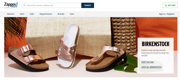
The simplicity of this homepage gets straight to the point and doesn’t send any mixed signals. The message is very concise: we sell shoes, check out what we have, here are some new arrivals. The design is crisp and doesn’t need to use any glamour and glitz to get the point across.
Another note: if you use a big image on the homepage (or anywhere else on the site), make sure the file is compressed and loads quickly. Nearly 40 percent of users will leave a website if an image takes too long to load. Keep that bounce rate low by optimizing your photos and keeping things clean-cut.
4. Make the Customer’s Checkout Experience Transparent
In order to facilitate the purchasing process, your site must make it simple to add items to the cart, review the cart, and conduct the checkout process. Consider installing a classic shopping cart icon at the top of the screen so that customers can find their saved items within seconds. It may seem obvious to you, but the cart and buying process need to be even more obvious to your customers.
Additionally, no one likes when there are hidden fees added in right before the last step in the checkout. You need to make this clear early on. Customers should be able to accurately determine exactly what they’re paying for and how much it will cost long before they even pull their card out. The more steps and deceit involved in your checkout process, the more likely it is that users will switch to another site before completing the purchase.
Getting people to submit their financial information is the final, most defining step of the conversion process. Keep it painless for consumers on your site.
The Main Points to Remember
One online search will reveal hundreds of different tips on what to do (and what not to do) when it comes to building an e-commerce site. It’s impossible to abide by all the guidelines, but if you stick to any, make it these: play on consumers’ instincts, make the site easy to use, and keep it simple.