What if changing your call to action button from green to red increased conversions by 20%? How much would a 20% rise in online sales mean to your company? And what if changing its position added another 20%? How about changing the text from “Free Trial” to “Try It Free” added another 10%?
With minimal investment and effort, you can transform your website’s revenue-generating potential. It only requires some small changes to a single call to action. Now, imagine if you made similar changes to all the call to actions on your site and email campaigns.
There are many elements that, with simple tweaks, can make a big difference. Before we go into detail and show successful (and unsuccessful) examples, let’s start by setting the ground rules:
1. What works for others will not necessarily work for you.
Successfully optimizing engagement and conversion depends on many factors, including your buyer personas and your product. Therefore, replicating another company’s optimizations may not have the same effect on your visitors. If we were lawyers, we would write “results may vary” in fine print at the end of this article. As marketers, we will simply say – try it for yourself and test what works best for you. And speaking of testing . . .
2. Test every change you make.
A/B testing your changes is absolutely necessary. Don’t make any change, no matter how seemingly irrelevant, without testing its effects. Those effects may not always lead instantly to conversions. It’s possible that certain changes will have other positive effects on customer experience, such as increased visitor time on page or increased scroll through the content.
Elements to Tweak
Try starting with these elements, which can be quickly tweaked for maximum effect.
1. Call to Action Buttons
Test different sizes (bigger and more noticeable is usually better), colors (go for contrast), and messaging (opt for actionable urgency).
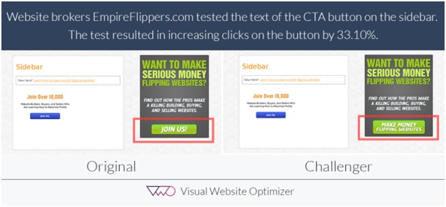
Visual Website Optimizer tested the messaging in a CTA button for Empire Flippers. The result of changing the CTA button’s text from “Join Us” to “Make Money Flipping Websites” increased conversions by a staggering 33.10%.
Hubspot ran a similar test changing only the color of the CTA button of their Performable home page. They tested a green button and a red button, thinking that the green would be more effective, due to its “green means go” connotation and because it was being used on many web 2.0 company pages. The red button, associated with stopping at traffic lights and warnings was not widely used.
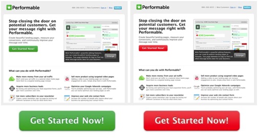
Surprisingly however, the red button outperformed the green by 21%! As you can see, the red button contrasted more with the other colors on the page and drew people’s attention much more.
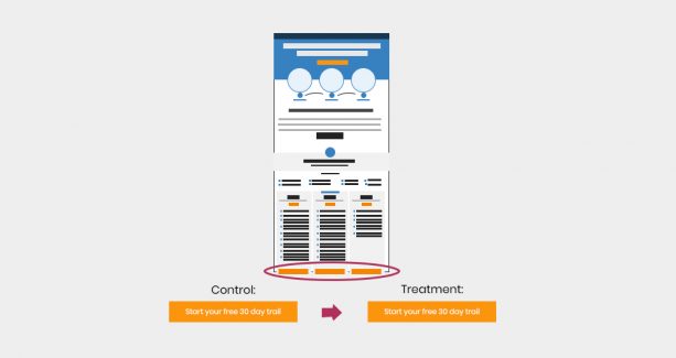
Unbounce also ran a CTA button A/B test on one of their own PPC landing pages. In this experiment, they only changed one word. In going from “Start your free 30 day trial” to “Start my free 30 day trial,” they increased their click-through rate by 90%!
2. Forms
The forms you use to collect your leads also have a big impact on your conversions. Form fields and elements are relatively easy to switch around. Testing their effects can increase your lead generation results significantly. Test for the number of fields you require, as well as the design of the form. Also, test for field bottlenecks. That is, are users abandoning your form at a specific field? Removing that field (or replacing with another) may result in a major boost to your form’s conversion rate.
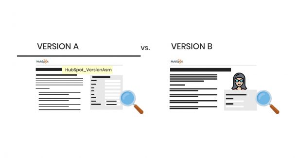
In this Hubspot lead collection form test on Unbounce, adding a “hero shot” of a smiling woman, surprisingly, did not help conversions. In fact, Version A, without the image, had 24% more submissions.

We can reason that adding the image pushed the form further down the page or that the stock-photo-looking woman was not relatable to the target audience. Whatever the true reason, the testing proved that for this company, this optimization effort was a fail.
In another test reported by WhichTestWon, the A version of this lead collection form increased B2B leads by 368.5%.
Although version A is almost as long as version B, it has been cleverly designed to require less information and less effort from visitors. As well as feeling less cumbersome. It also includes “trust seals” that provide the looked-for atmosphere of security and credibility.
3. Copy
Words are powerful. The ones you choose to display on your home page can make a big difference. Choose texts that are actionable, like in this:
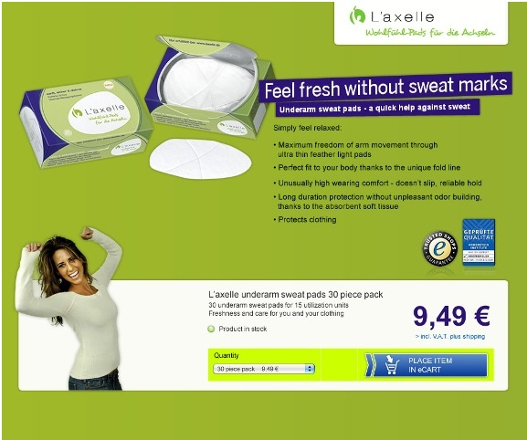
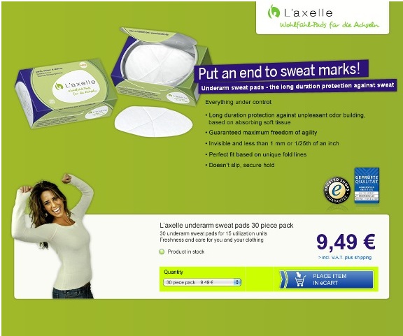
L’Axelle changed their text from portraying comfort to being action-oriented and solving a problem. The result was a 93% increase in CTR.
4. Images
While words are powerful, the old adage that “a picture says a thousand words” often rings true in web design. Choose images that convey the message you want your visitors to take away.
For example, in this secure hosting company test shown on KISSmetrics, the company changed the image on their home page from a globe to a padlock. The padlock, associated with safety and security - the exact message the company was trying to communicate, converted two to three times more than the globe.


5. Pricing
Reducing a price may improve the quantity you sell. However, there is an easier element to optimize when it comes to pricing. Changing how openly you communicate your price may do wonders for your conversion rate without necessarily impacting your profit for each item.
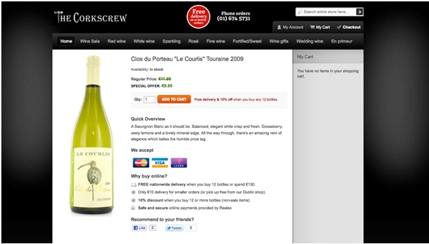
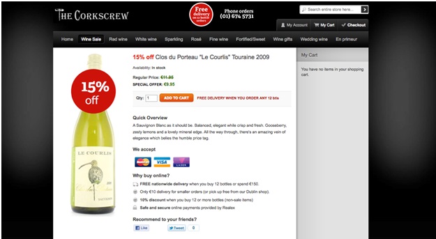
ABtests.com shows us that when CorkScrew made it more clear that a product was on sale, they sold a lot more. The price did not change, but the emotional response to the “special” brought 148% improvement to this product page.
In another experiment, MarketDialer tested the effect of including the price on their landing page. Displaying the price led to a 100% increase in leads generated from the page.


There is Greatness in Simplicity
The lesson of all these great examples is clear and simple: making smart, small changes, and easy design tweaks that do not require heavy resources. Then, testing them thoroughly, can yield highly profitable results.
We have shown many examples of companies that did just that. By changing a color here or a word there, and without spending a lot of time or money, increased their clicks, leads, and sales.
Brian Dean has also written a great blog about CRO guide that includes a bunch of great A/B testing experiments, UX tips, techniques and case studies. I highly recommend it.
Small simple changes, if correctly informed, can take your website revenues from good to amazing!