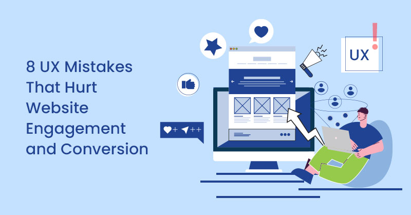
One of the easiest ways to analyze your users and their online behavior is through usability tests. There is no doubt that testing usability can provide amazing information regarding your websites. However, not everyone believes that usability testing translates directly into higher revenue.
One element that could convince both stakeholders and team members to tip the scales in favor of continuous usability testing is seeing the hard data. We've prepared seven usability improvement ideas supported by real-life case studies that will show you how insights gained from usability testing helped increase conversion.
Also on TechWyse
How to Improve Conversions by Switching to a Responsive Design
6 Web Conversion Rate Optimisation Tips to Implement Now
1. Find out What People are Looking for on Your Website
This seems like a very easy thing to figure out, but if you think deeply about this question, the results may surprise you. It is useful to find out what your visitors are coming to your website for, especially when your website is very general. One way to do so is to browse Google Analytics and research keywords people use in Google to find your website. We recommend pairing it with user research, which will provide you with more qualitative insights directly from the users. Consider using surveys or feedback widgets.
Case Study
Weather Channel utilized user research and customer feedback to improve their knowledge about people visiting their website. One of the things they discovered is the fact that people were mainly look at information and concerns for tornado alerts. Therefore, they decided to cate towards this need in their design. What’s interesting is that the multivariate test proved that a version with Flash animations, often underestimated or even frowned upon by web designers, outperformed other variations. Read the full case study here to learn more about it.
2. Make Sure you Know Your User Personas
Creating user personas can be underestimated by people who think they know the users just by being in touch with them. Truth is, a documented user persona can keep the whole team in the right mindset. This is especially important for creating websites and mobile apps, where sticking to the online behavior and patterns of your target audience can impact conversion rates.
Case Study
Uncommon Practice wanted to create a fresh design for their product launch. The modern layout was tested against somewhat dated variation, featuring a traditional web form. Contrary to the expectations, the not-so-trendy design won, resulting in 19.55% increase in conversions. Understanding the target audience preferences proved to be a key in this process.
As it turns out, the average age of their audience is 45 and up. This group did not like the modern design and would rather sign up using a traditional web form. In this case, it was important to know what youtarget audience is. You need to know their wants and cater to their needs. Read the full case study.
3. Investigate Online Behavior of Your Users
Google Analytics is certainly useful when it comes to uncovering signs that something is not working with your website. However, it has a major drawback - it doesn’t tell you why these things happen. Fortunately, you can usability tools to automated tests or even record people browsing your website.
Case Study
Headsets.com noticed a high bounce rate when browsing their Google Analytics reports. They couldn't figure out the reason, so they decided to run usability tests to see how users interacted with their website. They discovered that their navigation was to blame. It was organized by headset type and potential clients (and even returning customers!) were not knowledgeable enough to make correct choices. It resulted in them moving around the website a lot.
Headsets.com decided to ask their visitors a question concerning the phone people wanted to plug the headset into. This proved to have an impact on the conversion with 10% increase. See the case study.
4. Investigate Whether Users are Able to Easily Achieve Their Goal on Your Website
This is a combination of the two points described above. Knowing what people are looking for on your website is one thing, but making sure they’re able to successfully find what they need is another. This time, you can use tests or visitor recording to see how visitors behave on the website. Alternatively, you may ask people directly, using surveys or feedback widgets. Both methods help uncover issues in navigation, labeling, or design that prevent people from achieving their goal.
Case Study
The Great Orchestra of Christmas Charity is one of the biggest non-governmental charities in Europe. People can also support it online, through the organization’s website. After performing user tests, it showed that online visitors were confused by the navigation of the website to the point that they didn't know where to click to donate the money.
The charity decided to implement several changes, from moving the donation page up in the side menu to making it more visible and to changing the label “Support it” to “Pay Online”. This made the process more straightforward. As it turned out, the website donations increased by 420%.
5. Check Whether Your Navigation Structure Make Sense to Web Visitors
The rule of thumb here is - you know the content of your website, so the navigation makes sense to you even if it’s flawed. What you can do to make sure it is intuitive for users, is to run a card sorting test. This allows you to find out how people would organize content on your website and also gives you a better idea of how to name your categories and subcategories.
Case Study
Harvard Business Services helps people incorporate their companies in Delaware. Before testing, the navigation bar consisted of 10 tabs:
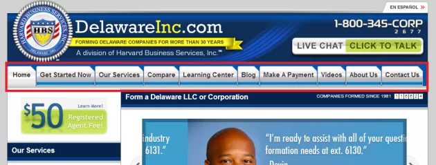
In order to improve the usability, the bar was redesigned in terms of categorizing and labeling:
- A new tab “How to Incorporate” was introduced to serve as an introduction to the users
- The tabs’ labels were renamed to be more specific - “Compare Prices” instead of “Compare”, “Form a Company Now” instead of “Get Started Now”
- The least action-based tabs, such as “Blog”, “About Us” and “Contact Us” were removed.

Tests uncovered that the variation with fewer and more actionable tabs saw 15.68% increase in total orders. Read the full story here.
6. Test Your Web Forms to Spot Weak Spots
Web forms constitute an integral part of many websites, especially e-commerce, but also SaaS or travel services. They are the spot where people either complete their purchase or leave the website, possibly, for good. Form testing tools allow you to evaluate the usability of each field in your form and explore abandonment and completion rates. This way you are able to pinpoint the problematic spots and improve them.
Case Study
Expedia found out that one field in their transaction form caused confusion among web visitors and resulted in high abandonment rate.
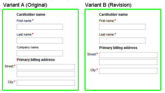
As it turned out, people were confused by the visual proximity of “Company name” field and the “Billing address” section. They would enter the bank name into the company field and follow with its address in the fields below. This led to failed transaction, which frustrated users and prompted them to leave the website. Just by observing the results, a simple change led to higher conversions for Expedia. Check out the case study.
7. Test Web Forms For More Usable Alternatives in Mind
As it was addressed in the previous point, form testing tools allow you to see which fields are the most problematic. Chances are, the whole form would suffer from high abandonment rates. This is often the case for websites that deal with complicated, technology-related topic. The strategy of removing problematic fields and rewording their labels might not work. This is a moment where you can think about additional help for users in the form of prompts or examples of filled out forms. You can even replace the form with more engaging and visual alternatives, like sliders.
Case Study
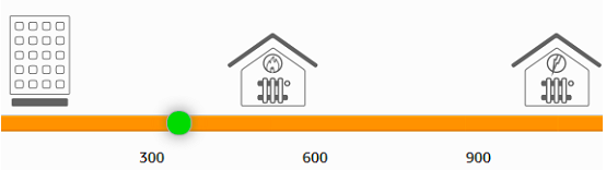
Optimal Energy is a price comparison system for energy distributors’ clients. Form tests uncovered that 81% of the users abandon the website without completing the form. This prompted the company to employ a more usable variation of the otherwise complicated form. What they decided to do was to remove the most problematic fields, introduce prompts that help fill the form out and, finally, allow people to use a straightforward slider.
As you can see tweaks inspired by usability tests not only result in better user experience, but can also directly affect conversion. Continuous user testing paired with more conventional conversion rate optimization tests, like click tracking or A/B Testing, can have spectacular results on your end dollar.
Do you know a success story that shows how usability improvement affects conversion rate? Share it in the comments!