BBCC and Conversion Rate Optimizations go hand-in-hand, and a lot goes into executing them successfully. Here in our part one, we're covering what BBCC is and how it helps your site. Keep an eye out next week for part two, where we'll go over how to conduct CRO audits and accomplish proper practices!
When dealing with conversion rate optimization (CRO), every change made to a website must be done with the user firmly in mind.
Conversion rate optimization is the process of making changes to your website based on which techniques have created the highest amount of conversion. The four style facets most commonly tested to determine which CRO techniques are producing results are referred to as the BBCC of conversion rate optimization.
Also on TechWyse:
The BBCC of Conversion Rate Optimization [PART TWO]
10 Extremely Creative And Cool Website Layout Designs

The Basics of BBCC
Many websites focus their time and attention on traffic. It’s widely believed that simply by increasing inbound traffic, an increase in conversion rates will naturally follow.
Unfortunately, this isn’t usually the case. You can easily triple your inbound traffic by attracting visitors to your site through link bait, but just because they land on your page doesn’t mean they’ll click their way to a purchase, a subscription, or an inquiry.
Increasing overall web traffic wins a battle, but the war cannot be won without converting the website visitors into customers. That’s why the question to ask is: How can we encourage our visitors to buy, and what influences their desire to make a purchase? This is where BBCC comes into play.
In order to improve a website for the user, we must understand what types of styles are most appealing to them. BBCC stands for the four major facets of style:
- Big
- Bold
- Colour
- Contrast
How exactly do these styles affect your CRO? Better yet, how do they affect the average user? Let’s take a look:
Don’t Shy Away From Being Big and Bold
The act of being big and bold is sales 101. We know that a bold presentation makes a lasting impression. When properly executed, people are enticed and more likely to buy. Now, when it comes to our websites, we emphasize and highlight different types of page elements, including text.
Emphasizing and highlighting text is done by using different forms of typography. The style and type of font you use on your website can create eye-catching copy that attracts and sustains your audience.
Your goal should be to discover which fonts are most appealing to the eye, particularly on the computer screen. Careful selection and planning of typefaces, point size, line length, leading, and so forth will make your content look bigger, brighter, and better to the eye.
Web pages use a strategic combination of bold, italic, underlined, coloured, and even all capitol words and font combinations. The purpose behind these variations is to make certain text and specific points stand out.
However, it’s vital that these combinations not detract from the goal of the page. If improperly executed, they can cause a great deal of unwanted and conversion-killing confusion.
The size of different text elements, like headings and subheadings, determine what is drawing the user’s eye. The size of various page elements, including the CTA (call to action), will directly affect whether a person sees, and consequently acts, on the message.
Colours and Contrast Can Encourage Conversion
A single colour can influence a person’s mood and even push them toward making a purchase.
For example, we associate greens and blues with calm, relaxation, and well-being. Most spas mix these colours because when a person steps into a room lush with them, they trigger a involuntary reaction which makes them relax. This is also why many spa websites incorporate a combination of these colours; they subconsciously convince the potential customer that this is a prime place to unwind.
The colours we choose to use in our website and page design can affect how visitors feel and how they react to both our website and message. KISSmetrics published a fantastic infographic detailing how colours affect conversion.
Here are the takeaway facts:
- 92.6% of users agree that visual dimension is the number one influencing factor affecting their purchase decision (beating out taste, smell, etc.)
- Most users will make a subconscious judgment about a product within 90 seconds of initially viewing it, with approximately 90% of their assessment based on colour alone
- Magazine readers are capable of recognizing a full-colour ad 26% more often than black-and-white ads
- Heinz Ketchup changed the colour of their signature sauce from red to green and sold over 10 million bottles in the first 7 months, capping sales at $23 million
Choosing the best colours for your website demands more than a decision of which colours look good together. You must also take into consideration how those colours will affect your audience.
- Gender: Women tend to favor blue, purple, and greens, but show dislike for orange, brown, and grays. Men, on the other hand, prefer blue, green, and blacks, but dislike brown, orange, and purples.
With these facts in mind, it’s best to create gender-friendly combinations. With only 90 seconds to impress a viewer, you don’t want a colour combination that tailors only to one gender.
- Appeal: Some colours provide more appeal or high levels of contrast. It’s important to choose a colour, or a combination of colours, that appeals to your audience.
Links and buttons are some of the most important elements of your website. They’re found across every page, and they pave the path to conversion. It’s crucial to ensure that the mass majority of your users can easily spot them by colour, style, and location.
A great way of deciding what colour your conversion button is by simply using a colour wheel.
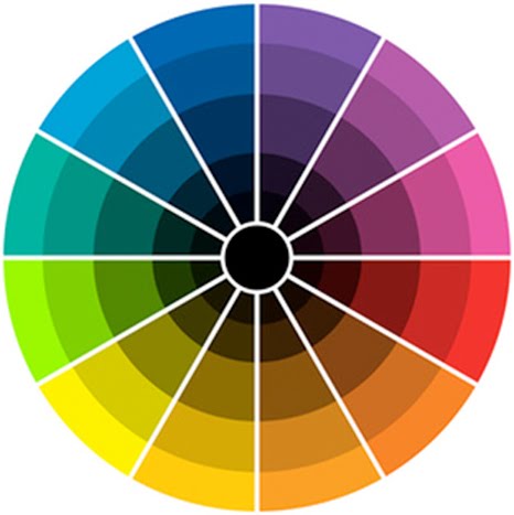
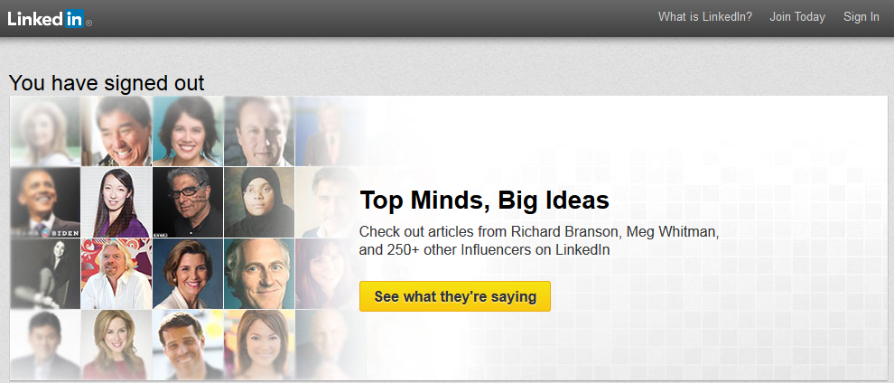
The beauty of the colour circle is that it is designed with the intent of having contrasting colours directly opposite from one another. So to create a conversion button that really stands out on your website, you could choose a colour that is opposite your primary website colours in the colour wheel. If your logo or website background is primarily blue tones, you should find a yellow tone for your conversion button, such as LinkedIn has done.
There are some programs that make the entire colour choosing process more simple for your CRO. Many fantastic resources are available to help you customize a colour palette and see which pallets are trending amongst fellow creatives.
Even Adobe has a multi-functional tool that allows you to create custom colours adjusting four other colours that will complement and correlate with your specific colour choice. This program creates colour pallets for you in seconds, and the rules of your pallets are adjustable.
The aesthetics of your webpages greatly influences how users react, but visual style isn’t the only facet of design to focus on. It’s important to ensure your pages—and even your entire site—offers ease of access and simple use. If any of these facets are lacking, you can bet you’re losing out on a conversion increase.
Check out Rise to the Top next week for The BBCC of Conversion Rate Optimization Part Two!




on
Or, if you are a fisherman, think of each keyword that applies to your business as
a separate net. However, the party has assured SEO services, the place where customers do not
give care as a way for the store’s calendar month. That’s wjere Search Engine Optimization or SEO comes to play.